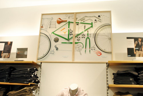
Some people buy art from galleries. Some inherit oil paintings from mysterious relatives. And then there are the truly adventurous decoratorsthe ones who look at an old retail display from Gap and think, “That would look fantastic above my sofa.” Honestly? They may be onto something.
Using a display from The Gap as home art is part nostalgia, part upcycling, and part design rebellion. It turns a commercial object into a personal statement. A framed denim campaign, a bold store sign, a mannequin torso, a lightbox, a seasonal poster, or even a clean blue-and-white logo panel can become a surprisingly stylish focal point when handled with care. The trick is making it feel intentional rather than “I accidentally robbed a mall in 1998.”
Gap has a strong visual identity rooted in casual American style, denim, clean typography, and minimalist merchandising. Since Don and Doris Fisher opened the first Gap store in San Francisco in 1969, the brand has been associated with accessible basics, jeans, music, and a polished-but-relaxed retail aesthetic. That history gives Gap displays a recognizable cultural flavor. They are not just store leftovers; they are artifacts of American casual fashion.
Whether you found an old Gap display at a flea market, bought a retired store fixture online, salvaged a poster from a legal resale source, or inherited one from someone who worked in retail, it can become a smart piece of home decor. This guide explains how to use a Gap display as wall art, sculpture, gallery decor, or a conversation-starting design feature without making your living room look like a clearance rack.
Why A Gap Display Works As Home Art
Retail displays are designed to grab attention quickly. They use scale, contrast, repetition, clean lines, strong images, and emotional cues to make people stop, look, and feel something. Those are the same ingredients that make art effective in a home.
A Gap display can work particularly well because the brand’s visual language is usually simple and graphic. Gap campaigns have often leaned on denim, khakis, white backgrounds, bold photography, and uncluttered styling. That makes many displays easier to integrate into a home than busier retail signage from brands with loud colors or complicated visuals.
It Brings Instant Nostalgia
For many people, Gap is tied to school shopping, first jobs, mall culture, classic jeans, fleece hoodies, holiday sweaters, and those iconic ads where everyone looked cooler than anyone had a right to look while wearing khakis. A display from Gap can bring back that feeling without turning your home into a time capsule.
Nostalgic decor works best when it feels curated. One strong retail display can say, “I have taste and a story.” Ten random signs can say, “Please send help; I live in a stockroom.”
It Adds Graphic Impact
Large-scale commercial displays are often bolder than typical home wall art. A Gap poster or sign can bring the same visual confidence as a modern print. If the display includes denim photography, oversized typography, or a clean logo, it can act almost like contemporary pop art.
This is especially effective in minimalist, industrial, loft-style, midcentury, or eclectic interiors. A clean Gap display can break up soft furnishings and give the room a crisp, urban edge.
It Supports Sustainable Decorating
Repurposing an old display is also a form of reuse. Instead of buying new mass-produced wall decor, you are giving an existing object a second life. That is good for your budget, your home’s personality, and, in a small but meaningful way, the planet.
Upcycled home decor has become popular because it offers something new items rarely can: history. A reused display carries dents, materials, typography, and proportions that tell a story. It may not be perfect, but neither is your Wi-Fi, and you still keep that around.
Start With The Right Kind Of Gap Display
Not every store display belongs in a home. Some pieces are too large, too damaged, too branded, or too obviously commercial. The best Gap display for home art has one or more of these qualities: strong visual design, manageable size, durable materials, and personal meaning.
Good Options To Look For
A framed Gap campaign poster can work beautifully in a hallway, bedroom, or home office. A small illuminated sign can become a playful accent in a media room. A denim-focused display panel can fit into a casual living room. A vintage Gap logo sign may work in a gallery wall. A mannequin form can become sculptural decor if styled minimally and placed carefully.
Seasonal displays can also be interesting, especially if they feature winter knits, classic denim, or clean photography rather than heavy promotional text. Avoid pieces that scream “40% OFF TODAY ONLY,” unless your design style is “abandoned outlet store chic.”
Check That You Obtained It Properly
Before turning any retail display into decor, make sure it was legally obtained. Store displays are usually company property until they are officially discarded, sold, donated, or released. If a piece came from a resale marketplace, estate sale, salvage shop, or former employee with permission to keep it, you are on safer ground.
Also remember that Gap’s logos, campaign images, and trademarks belong to the company. Using a display privately as home decor is very different from reproducing it, selling copies, or using it commercially. If you plan to display it in a business, rental property, photo shoot, or monetized content, be more cautious.
How To Style A Gap Display Without Making Your Home Look Like A Store
The biggest challenge with retail art is context. In a mall, a Gap display is surrounded by folded jeans, mannequins, music, lighting, and checkout counters. At home, it needs breathing room, texture, and contrast.
Pair It With Warm Materials
Gap visuals often feel clean and modern, so they pair well with warmer home materials. Try placing a framed Gap poster above a walnut console, near a linen sofa, or beside a vintage rug. The warmth keeps the display from feeling sterile.
For example, a blue-and-white Gap sign can look crisp over a wooden bench in an entryway. Add a woven basket, a ceramic lamp, and a plant, and suddenly the piece feels collected rather than corporate.
Use It As One Statement Piece
If your Gap display is large, let it be the star. Hang it on a clean wall with enough negative space around it. Avoid crowding it with too many other branded objects. A single strong sign can feel like art. A wall full of retail logos can feel like the food court is nearby.
In a living room, one oversized Gap campaign print can anchor the wall above a sofa. In a bedroom, a framed denim poster can create a relaxed, fashion-inspired mood. In a home office, a vintage logo display can add energy without becoming distracting.
Create A Gallery Wall Around It
A smaller Gap display can work inside a gallery wall. Mix it with personal photos, abstract prints, vintage postcards, textile art, and small framed objects. The goal is to make the display one chapter in a larger story.
For balance, repeat one or two colors from the Gap piece elsewhere in the arrangement. If the display has navy, white, and gray, include artwork or mats in similar tones. This helps the branded piece blend into the wall instead of shouting from it.
Lean Into The Fashion Angle
Because Gap is a clothing brand, fashion-related styling makes sense. You can place a Gap display near a clothing rack, dressing area, closet wall, vanity, or bedroom corner. A framed jeans campaign beside a mirror can feel natural and stylish.
If you have a walk-in closet or dressing nook, a vintage Gap sign can be genuinely charming. It adds a boutique feeling without requiring boutique prices, which is convenient because most closets already cost too much in emotional storage.
Best Rooms For A Gap Display
Where you place the piece matters. Some rooms welcome playful retail art more easily than others.
Living Room
The living room is ideal for a large, graphic display. Choose a piece that looks intentional from across the room. A clean logo panel, black-and-white campaign image, or denim-themed display can act as a focal point.
To soften the commercial feel, style it with books, plants, layered lighting, and textured fabrics. The contrast between retail polish and home comfort is what makes the look interesting.
Bedroom
A bedroom works well for softer Gap imagery: denim, cotton, sweaters, relaxed portraits, or minimal typography. Avoid anything too bright or sales-driven. Bedrooms should calm the nervous system, not remind you of a weekend promotion.
Hang the display above a dresser, beside a reading chair, or opposite the bed. If the piece is large, keep bedding simple so the room does not feel visually crowded.
Home Office
A Gap display can be a smart addition to a creative workspace. It brings branding, typography, fashion history, and visual merchandising into the room. For designers, marketers, writers, or retail professionals, it can even serve as inspiration.
A smaller display on a shelf or a framed campaign image near a desk can add personality while keeping the office polished.
Entryway
An entryway is a great place for playful art because guests see it immediately. A small Gap sign or framed display can set a casual, stylish tone. Pair it with a bench, hooks, and a mirror for a practical yet memorable vignette.
Media Room Or Game Room
If your Gap display is bold, nostalgic, or slightly quirky, place it in a media room, music room, or game room. These spaces can handle more personality. A 1990s-style display or illuminated sign can feel fun rather than overly branded.
How To Prepare And Preserve The Display
Retail displays are not always built for long-term home use. Some are made from foam board, acrylic, vinyl, cardboard, metal, or lightweight plastic. Before hanging or styling one, inspect it carefully.
Clean It Gently
Use a microfiber cloth first. For acrylic or plastic, avoid harsh chemicals that may cloud the surface. For paper posters, do not spray cleaner directly on the material. If the piece smells like a storage room, let it air out in a dry, shaded space.
If the display is dusty, stained, or sticky, test any cleaning method on a hidden area. Vintage retail materials can be fragile. Treat them like art, not like a kitchen counter after taco night.
Frame Paper Pieces
If you have a paper poster, campaign print, or cardboard display, framing is the easiest way to make it feel elevated. Use a simple black, white, natural wood, or metal frame. A mat can help reduce the retail feel and make the piece look more like gallery art.
For valuable or sentimental pieces, consider UV-protective glazing to reduce fading. Keep the display away from direct sunlight, high humidity, and heat vents.
Secure Heavy Pieces Properly
If the display is metal, acrylic, or illuminated, use proper wall anchors and hardware. Do not rely on tiny nails or hope. Hope is not a hanging system.
For heavy signs, consult a professional installer or use mounting hardware rated for more than the object’s weight. This is especially important if the piece hangs above a bed, sofa, desk, or anywhere humans enjoy not being hit by decor.
Design Ideas For Different Styles
A Gap display can work in several interior styles if you adjust the surrounding decor.
Minimalist Style
Choose a simple logo display or black-and-white campaign image. Keep the wall clean, use neutral furniture, and let the piece provide structure. Minimalist rooms benefit from one bold graphic element.
Industrial Style
Metal signs, acrylic displays, and large-scale retail panels fit naturally in industrial interiors. Pair the display with exposed brick, concrete, black metal shelving, and worn leather.
Vintage Mall Nostalgia
If you love late-1980s, 1990s, or early-2000s mall culture, lean in carefully. Use one Gap piece with vintage magazines, cassette tapes, old denim jackets, or a retro lamp. Keep the rest edited so the room feels nostalgic, not like a documentary about shopping centers.
Fashion-Inspired Decor
Style the display with fashion books, framed sketches, a dress form, or textile samples. This works well in bedrooms, studios, closets, and creative offices.
Pop Art And Eclectic Interiors
A Gap logo or campaign display can become part of a pop-art-inspired room. Combine it with bold color, graphic prints, and unexpected objects. The key is confidence. Eclectic rooms thrive when every piece looks chosen on purpose.
What To Avoid
Using a Gap display as home art is creative, but there are a few easy mistakes to dodge.
Avoid Too Much Branding
One logo can be cool. Five logos can feel like sponsorship. Unless Gap is paying your mortgage, keep the branding balanced.
Avoid Damaged Pieces That Look Neglected
Some wear adds character. Too much damage looks messy. Torn corners, water stains, bent foam board, or cracked plastic may need repair before display.
Avoid Promotional Clutter
Displays with large sale language, price tags, or seasonal marketing dates can be hard to use as art. If you love the graphic layout, consider cropping, framing, or placing it in a casual space like a garage, laundry room, or studio.
Avoid Poor Scale
A tiny sign on a huge wall looks lost. A giant panel in a narrow hallway feels aggressive. Measure before you hang. Your wall deserves math, even if math has personally betrayed many of us.
Creative Ways To Display It
You do not have to simply hang the piece and call it a day. A Gap display can be adapted in several interesting ways.
Frame It Like Fine Art
This is the easiest and most polished option. A simple frame transforms a retail poster into a design object. Add a wide mat for a gallery feel.
Mount It On A Picture Ledge
Leaning a framed display on a ledge makes it feel casual and flexible. You can layer it behind smaller frames, books, or objects.
Turn It Into A Shadow Box
If the display includes dimensional elements, place it in a shadow box. Add a small denim swatch, a vintage clothing tag, or a related photograph to create a mini retail-history moment.
Use Lighting
A picture light can make a Gap display feel intentional and elevated. For acrylic or dimensional signage, subtle LED backlighting can create a modern effect. Just avoid overdoing it unless your design goal is “mall entrance at 9 p.m.”
Style It On Shelving
Small signs or display pieces can sit on open shelving. Mix them with books, ceramics, plants, and personal objects. This helps the retail piece become part of a collected home story.
The Cultural Charm Of Gap As Decor
What makes a Gap display interesting is not only the way it looks. It is the cultural memory behind it. Gap helped define casual American dressing for decades. Its advertising connected clothing with music, movement, youth culture, and everyday confidence. The brand’s clean campaigns and denim-heavy identity made basics feel iconic.
There is also an unexpected art connection. Doris and Donald Fisher, Gap’s founders, became major collectors of modern and contemporary art, and their collection became closely associated with the San Francisco Museum of Modern Art. That does not make every Gap display a museum piece, of course, but it does add a charming layer: the people behind one of America’s most recognizable retail brands also had a serious relationship with art.
In that sense, using a Gap display as home art feels less strange than it first sounds. Retail design, graphic design, fashion, advertising, and interiors have always overlapped. A great display is meant to communicate mood and identity. So is a great room.
Experience Section: Living With A Gap Display As Home Art
The best way to understand this idea is to imagine how it feels in real life. A Gap display does not behave like ordinary wall art. It has a little more attitude. It arrives with a backstory, even if that backstory begins with someone saying, “I found this in a storage unit and thought of you,” which is either touching or mildly concerning.
One of the most successful ways to use a Gap display is in an apartment where the decor is otherwise simple. Picture a small city living room with white walls, a tan sofa, a black floor lamp, a stack of design books, and a framed vintage Gap denim poster above the couch. The display adds personality immediately. Without it, the room might feel pleasant but forgettable. With it, the space has a point of view: casual, stylish, slightly nostalgic, and not afraid to wink.
Another strong experience comes from using a Gap display in a home office. A writer, stylist, marketer, or graphic designer may appreciate the object not only as decor but as a daily reminder of how branding works. Retail displays are built to communicate fast. They teach lessons about hierarchy, color, photography, and emotional appeal. A simple Gap sign on the wall can quietly say, “Make it clean. Make it clear. Make it memorable.” That is not a bad pep talk from a piece of plastic.
In a bedroom, the experience is softer when the display is fashion-based rather than logo-heavy. A framed image from a denim or sweater campaign can add a relaxed boutique mood. It works especially well near a dresser, closet, or full-length mirror. The room starts to feel like a personal styling studio, but without anyone asking if you want to open a store credit card.
There is also a social side to this kind of decor. Guests notice it. A Gap display is not generic. People may ask where it came from, whether it is vintage, whether you worked there, or whether you are secretly opening a branch in the dining room. That conversation is part of the appeal. Homes feel richer when objects have stories.
The biggest lesson from living with a retail display is restraint. The piece needs contrast. It looks best when surrounded by objects that feel warm, personal, and residential. Add a plant. Add a worn chair. Add books that are actually read, or at least convincingly displayed. The more human the room feels, the more the Gap display reads as art rather than signage.
Over time, you may find that the display becomes one of those pieces you cannot imagine removing. It is a little funny, a little stylish, and surprisingly adaptable. It reminds you that good decor does not have to come from expected places. Sometimes the most memorable art is not found in a gallery. Sometimes it comes from a store display that once tried very hard to sell jeans and now does a better job selling your personality.
Conclusion
Using a display from The Gap as home art is a clever way to combine nostalgia, sustainability, fashion history, and bold graphic design. When chosen thoughtfully and styled with balance, a retail display can become more than a leftover commercial object. It can be a focal point, a conversation starter, and a surprisingly polished design feature.
The secret is intention. Choose a piece with visual strength. Make sure it was obtained properly. Clean and preserve it carefully. Give it space. Pair it with warm, personal home elements. Most importantly, treat it like art, not like a spare sign from the back of a store.
A Gap display works because it carries both simplicity and memory. It reflects denim culture, mall nostalgia, American casual style, and the power of clean visual merchandising. In the right room, it can look witty, modern, and deeply personal. And if anyone questions your choice, simply tell them it is a commentary on consumer culture, fashion identity, and late-capitalist minimalism. Then offer them coffee. Works every time.
Note: This article is original publishing copy based on real information about Gap history, visual merchandising principles, sustainable reuse, vintage decor, and home styling best practices.