If HTML is the skeleton of a webpage, CSS is the stylist who decides whether that skeleton shows up in sweatpants or a perfectly tailored suit. And right in the middle of that styling magic sits one of the most important concepts in front-end development: the CSS box model.
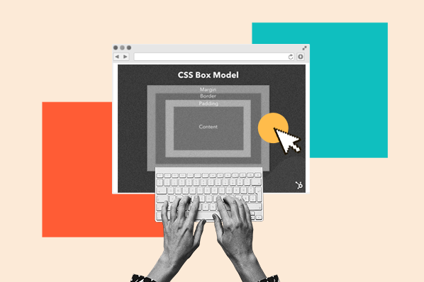
The CSS box model explains how every element on a webpage takes up space. Whether you are styling a button, a paragraph, a product card, a navigation menu, or that suspiciously stubborn image that refuses to align, CSS sees it as a rectangular box. That box has layers: content, padding, border, and margin. Once you understand how those layers work together, CSS layout starts feeling less like a mystery novel and more like a friendly measuring tape.
This basic walkthrough of the CSS box model will explain what each part does, how element size is calculated, why box-sizing matters, and how to debug layout problems without emotionally negotiating with your browser at 2 a.m.
What Is the CSS Box Model?
The CSS box model is the system browsers use to calculate the size and spacing of elements on a web page. Every HTML element is treated as a box, even if it does not visually look like one. A heading, a paragraph, a link, an image, a form field, and a div all occupy rectangular space in the document layout.
That rectangular space is made of four main areas:
- Content: The actual text, image, video, or child elements inside the box.
- Padding: The space between the content and the border.
- Border: The line or frame surrounding the padding and content.
- Margin: The space outside the border that separates the element from other elements.
Think of the box model like a framed picture hanging on a wall. The picture itself is the content. The mat around the picture is the padding. The frame is the border. The empty wall space between this frame and the next frame is the margin. Suddenly, CSS sounds less terrifying and more like interior decorating with semicolons.
The Four Parts of the CSS Box Model
1. Content: The Main Attraction
The content area is where the actual element content appears. For a paragraph, this is the text. For an image, this is the image itself. For a button, it is the button label. When you set width and height in the default CSS box model, you are usually setting the size of the content box only.
In this example, the content area of the card is 300 pixels wide and 180 pixels tall. But that does not automatically mean the total visible element will be 300 by 180 pixels. Padding and borders can make it larger, which is where many beginners first meet the famous CSS question: “Why is this box bigger than I told it to be?”
2. Padding: Breathing Room Inside the Box
Padding creates space inside an element, between the content and the border. It is perfect when content feels cramped. Without padding, text can sit awkwardly against the edge of a button or card, like a passenger pressed against an airplane window during turbulence.
The first value controls the top and bottom padding. The second value controls the left and right padding. This makes the button more comfortable, easier to read, and nicer to click.
Padding is part of the element’s visible area. If the element has a background color, the padding area also shows that background. This makes padding useful for designing cards, buttons, alerts, navigation links, and content sections.
3. Border: The Element’s Outfit
The border wraps around the content and padding. It can be thin, thick, solid, dashed, dotted, rounded, colorful, dramatic, or so subtle that it simply whispers, “I have boundaries.”
A border adds to the element’s total visible size when using the default box model. For example, if a box has a content width of 300 pixels and a 2-pixel border on each side, the visible width increases by 4 pixels before padding is even considered.
Borders are useful for separating content, making interactive elements obvious, building cards, styling form fields, or showing validation states such as error messages.
4. Margin: Space Outside the Box
Margin creates space outside the border. It separates one element from another. If padding is the personal space inside your house, margin is the yard between your house and your neighbor’s house. It is not part of the element’s background and does not receive background color.
This gives the section 40 pixels of space below it. Margins are commonly used to create vertical rhythm in a layout, separate headings from paragraphs, and prevent elements from crashing into each other like shopping carts with bad steering.
How the Default Box Model Calculates Size
By default, CSS uses box-sizing: content-box. That means the declared width and height apply only to the content area. Padding and border are added outside that declared size.
The total visible width is calculated like this:
So even though you wrote width: 300px;, the actual visible box becomes 350 pixels wide. This is not a browser bug. This is CSS politely following the rules while making you question your life choices.
The Magic of box-sizing: border-box
The box-sizing property changes how browsers calculate the size of an element. The most popular value is border-box, which tells the browser to include padding and border inside the declared width and height.
Now the entire visible box remains 300 pixels wide. The content area shrinks to make room for the padding and border. This sizing method is often easier to work with, especially in responsive web design, because elements behave more predictably.
Many developers apply border-box to every element using a global reset:
This tiny snippet can save you from many layout headaches. It is not magic, but on a stressful deadline, it can feel suspiciously close.
Padding vs. Margin: The Classic Beginner Confusion
Padding and margin both create space, but they create space in different places. Padding works inside the element. Margin works outside the element.
Use padding when you want content to move away from the element’s edge. Use margin when you want the entire element to move away from other elements.
In this example, the card content gets 24 pixels of internal breathing room, while the card itself gets 32 pixels of space below it. Padding improves comfort inside the card. Margin improves spacing around the card.
Understanding Margin Collapse
Margin collapse is one of those CSS behaviors that feels strange until you know what is happening. Vertical margins between certain block-level elements can combine into one margin instead of adding together.
You might expect 50 pixels of space between the heading and paragraph. In some cases, the margins collapse, and the browser uses the larger margin instead. That means the space may become 30 pixels rather than 50 pixels.
Margin collapse usually happens with vertical margins, not horizontal margins. Padding, borders, flexbox, grid layout, and certain overflow settings can prevent or change collapsing behavior. If your spacing looks smaller than expected, margin collapse may be the invisible guest at the party.
Block Boxes, Inline Boxes, and Display Types
The CSS box model applies differently depending on the element’s display type. Block-level elements, such as div, p, section, and headings, naturally start on a new line and usually expand to fill the available width.
Inline elements, such as span, a, and strong, flow within text. Width and height do not affect normal inline elements the same way they affect block elements. Padding and borders can appear, but vertical spacing may not behave the way beginners expect.
If you want an inline element to behave more like a block while still sitting inline with text, use inline-block.
This is useful for badges, labels, navigation links, and small interface elements that need padding, border, and predictable dimensions.
A Practical CSS Box Model Example
Let’s build a simple content card. This example uses the box model in a practical way: content for the text, padding for internal spacing, border for structure, and margin for external spacing.
The card stays readable because padding gives the text room to breathe. The border defines the card’s shape. The margin centers the card and adds space below it. The border radius softens the corners. Nothing here is overly complicated, but together these properties create a polished layout.
How to Inspect the Box Model in DevTools
Modern browser developer tools make the CSS box model much easier to understand. In Chrome, Firefox, and other major browsers, you can right-click an element and choose Inspect. The DevTools panel usually shows a visual diagram of the element’s box model, including margin, border, padding, and content dimensions.
This diagram is incredibly helpful when debugging layout problems. If a button looks too large, check its padding. If two sections are too far apart, inspect their margins. If an image is overflowing its container, compare its content width with the parent’s width. DevTools lets you see the invisible spacing that your eyes can only complain about.
Common CSS Box Model Mistakes
Forgetting That Padding Adds Size
A common beginner mistake is setting a fixed width and then adding large padding without considering the final size. With the default box model, the element becomes wider than expected. Using box-sizing: border-box usually solves this problem.
Using Margin When Padding Is Needed
If text is too close to the inside edge of a card, padding is the answer. Margin will move the entire card, but it will not create internal breathing room. The box model rewards choosing the right type of space.
Adding Margins Everywhere
Margins are helpful, but too many random margins can make a layout messy. A better approach is to create consistent spacing rules. For example, give sections predictable bottom margins or use layout tools like flexbox and grid with the gap property.
Ignoring Mobile Screens
A box that looks fine on desktop may overflow on mobile if it has fixed width, large padding, and no responsive rules. Use percentages, max-width, border-box sizing, and media queries to keep layouts flexible.
How the CSS Box Model Helps Responsive Design
Responsive design depends on predictable sizing. When you understand the box model, you can build layouts that adjust gracefully across desktops, tablets, and phones.
This container fills the available width on small screens, stops growing after 1100 pixels, has internal spacing, and stays centered. Because border-box is used, the padding does not unexpectedly increase the total width beyond the viewport.
That matters on mobile. A layout that is just a few pixels too wide can cause horizontal scrolling, which is the web design equivalent of leaving a banana peel in a hallway.
Best Practices for Working With the CSS Box Model
- Use
box-sizing: border-boxglobally for more predictable sizing. - Use padding for internal spacing and margin for external spacing.
- Inspect elements with DevTools when spacing behaves strangely.
- Avoid relying on random margins; use a consistent spacing system.
- Use
max-widthwith flexible widths for responsive layouts. - Remember that borders and padding affect visible size unless border-box is active.
- Use
gapin flexbox and grid layouts when spacing between items is needed.
Why the CSS Box Model Matters
The CSS box model is not just a beginner concept. Professional developers use it every day. It affects page layout, responsive design, component systems, design consistency, accessibility, readability, and user experience.
When you understand the box model, you can answer practical layout questions quickly. Why is this card wider than expected? Why is this button too cramped? Why is this section too far from the next one? Why does this element overflow on mobile? Many of these problems begin with content, padding, border, margin, or box sizing.
The box model is also the foundation for more advanced CSS topics. Flexbox, CSS Grid, positioning, overflow, container queries, and component-based design all become easier when you understand how elements occupy space.
Real-World Experience: Lessons From Working With the CSS Box Model
One of the fastest ways to understand the CSS box model is to stop treating it as theory and start noticing it in real projects. The first time many developers truly learn the box model is not while reading documentation. It is usually while fixing a layout that looks perfectly fine in their imagination and wildly confused in the browser.
A classic experience goes like this: you create a card with width: 300px, add padding: 20px, include a border, and then wonder why three cards no longer fit neatly in a row. The math is simple, but the surprise feels personal. The browser is not being rude. It is simply adding the content width, padding, and border according to the default box model. Once you switch to box-sizing: border-box, the layout suddenly behaves like it went to finishing school.
Another common lesson comes from buttons. A button without padding may technically work, but it often looks unfinished and feels uncomfortable to click. Add horizontal and vertical padding, and the button instantly becomes more usable. That small change improves both appearance and user experience. The box model is not just about measurements; it affects how people interact with the page.
Margins teach their own memorable lessons. Beginners often add margins to everything, then wonder why spacing becomes inconsistent. A heading has a margin. A paragraph has a margin. A section has a margin. Soon the layout looks like every element negotiated its own real estate contract. In real projects, it is usually better to create spacing rules: sections get consistent vertical spacing, cards use internal padding, and layout containers use gap where appropriate.
DevTools also becomes a best friend. Inspecting the box model diagram can reveal problems in seconds. You may discover that an element is not misaligned at all; it simply has default margin from the browser stylesheet. Headings, paragraphs, lists, and forms often come with default spacing. Once you know this, you stop blaming yourself and start writing cleaner reset or base styles.
The CSS box model also teaches patience with responsive design. Desktop layouts can hide spacing problems because there is plenty of room. Mobile screens expose everything. Large fixed widths, oversized padding, and forgotten borders can create horizontal scrolling. Using flexible widths, max-width, and global border-box sizing helps avoid those tiny layout disasters that make users pinch, zoom, and quietly leave.
In day-to-day web development, the box model becomes a mental checklist. Is the content size correct? Is the padding too large? Is the border adding unexpected width? Is margin creating or collapsing space? Is box-sizing set properly? These questions sound basic, but they solve a huge number of layout bugs.
The biggest experience-based lesson is this: good CSS is often not about adding more code. It is about understanding the space that already exists. The box model gives you that understanding. Once you can see every element as a layered box, layouts become easier to build, easier to debug, and much less likely to make you whisper dramatic things at your monitor.
Conclusion
The CSS box model is one of the core ideas every web designer and front-end developer should understand. It explains how content, padding, border, and margin work together to determine the size and spacing of every element on a webpage. Once you understand this model, CSS becomes more predictable, layouts become easier to debug, and responsive design starts making a lot more sense.
Remember the basic rule: content is the main area, padding creates internal space, border wraps the element, and margin creates external space. Add box-sizing: border-box to your toolkit, use DevTools often, and be intentional with spacing. The CSS box model may look simple, but it is the quiet engine behind clean, readable, professional web layouts.
Note: This article is written for web publication and is based on established CSS documentation, browser behavior, and practical front-end development experience.