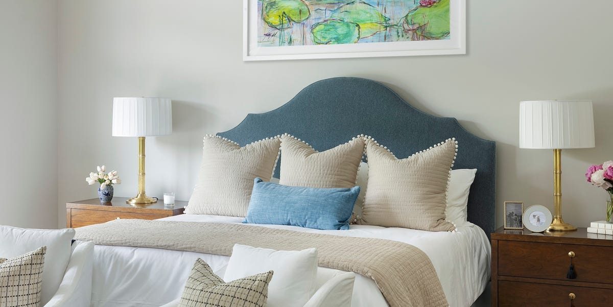
Note: This article is based on real designer recommendations, paint-brand guidance, and long-standing color trends across American interiors. Always sample paint in your own room before committing, because lighting has a mischievous little personality.
Some paint colors enter a room like a viral dance trend: loud, everywhere, and slightly embarrassing six months later. Others quietly stick around for decades because they do the hard work beautifully. They flatter architecture, play nicely with furniture, forgive changing decor, and never make your living room look like it lost a bet with a color wheel.
That is why designers keep returning to timeless paint colors: warm whites, creamy neutrals, soft greiges, classic blues, earthy greens, elegant blacks, and grounded browns. These shades are not boring. They are dependable. Think of them as the best friend who shows up on moving day with coffee, tape, and no unnecessary opinions.
Below are 20 paint colors that have earned their reputation as designer-approved classics. Some are famous for whole-house color schemes. Others shine on cabinets, trim, doors, bedrooms, dining rooms, or dramatic powder rooms. Together, they create a practical palette for anyone who wants a home that feels current today and still handsome ten years from now.
Why Some Paint Colors Become Timeless
A timeless paint color usually has three qualities: balance, flexibility, and emotional comfort. It is rarely too icy, too neon, too muddy, or too committed to one trend. Instead, it has subtle undertones that allow it to shift gracefully with daylight, lamplight, wood tones, stone, textiles, and artwork.
Designers often favor colors that work across many interior styles. A warm white can suit a farmhouse kitchen, a modern apartment, or a traditional colonial. A muted navy can look nautical, tailored, moody, or glamorous depending on what sits beside it. A sage green can feel botanical without turning the room into a salad bar.
The real secret is not choosing the “most popular” paint color. It is choosing a color that supports the room instead of stealing every scene. Your walls should not have to audition for Broadway unless you specifically hired them for drama.
The 20 Timeless Paint Colors Designers Keep Recommending
1. Benjamin Moore White Dove OC-17
White Dove is one of the most beloved warm whites for good reason. It has enough softness to avoid looking sterile, but it still feels clean and fresh. Designers often use it on walls, trim, cabinetry, and ceilings because it behaves well in both traditional and modern rooms. It is especially useful when you want white walls that do not shout, “Welcome to the dentist.”
2. Benjamin Moore Swiss Coffee OC-45
Swiss Coffee is a creamy off-white with a cozy, inviting personality. It pairs beautifully with natural wood, woven textures, stone, brass, and earthy colors. In bedrooms and living rooms, it creates a relaxed backdrop that feels warm without becoming yellow. If your home needs softness rather than sharpness, Swiss Coffee is a strong candidate.
3. Sherwin-Williams Alabaster SW 7008
Alabaster is a warm off-white that has become a modern classic. It is gentle, versatile, and flattering in spaces that need brightness without a cold edge. Use it in open-plan areas, kitchens, hallways, or bedrooms where you want a calm foundation. It also works well with black accents, pale oak floors, and linen upholstery.
4. Sherwin-Williams Pure White SW 7005
Pure White is crisp but not harsh, making it a smart choice for trim, ceilings, cabinetry, and walls. It has just enough softness to coordinate with many other colors. Designers like it because it can bridge warm and cool palettes, which is helpful if your home has mixed finishes and you are not planning to replace every knob, lamp, and life decision.
5. Sherwin-Williams Greek Villa SW 7551
Greek Villa is a creamy white that brings a sun-washed, classic feeling to interiors and exteriors. It looks especially good in homes with warm wood, natural stone, rattan, and layered neutral decor. It is a reliable choice for homeowners who want a light color with charm rather than a stark gallery-white effect.
6. Benjamin Moore Natural Cream OC-14
Natural Cream is a soft neutral that sits between cream, beige, and greige. It is polished without feeling fussy. Designers often reach for colors like this when a room needs warmth but not obvious color. It can make kitchens, hallways, and living rooms feel finished, calm, and quietly expensive.
7. Benjamin Moore Revere Pewter HC-172
Revere Pewter has been a favorite for years because it balances gray and beige in a way that works with many furnishings. It is not the icy gray that dominated the early 2010s, and it is not a heavy beige from a forgotten waiting room. It is a flexible greige that can suit living rooms, dining rooms, bedrooms, and open spaces.
8. Benjamin Moore Edgecomb Gray HC-173
Edgecomb Gray is another classic greige, but it leans softer and warmer than many grays. It is excellent for rooms where you want subtle depth but still need lightness. It pairs well with white trim, oak flooring, black accents, and muted blues. It is also forgiving, which is a wonderful trait in paint and people.
9. Sherwin-Williams Agreeable Gray SW 7029
Agreeable Gray became popular because it does exactly what its name promises: it agrees with almost everything. It is a warm greige that can handle open floor plans, rental refreshes, family rooms, and transitional interiors. The color is easy to live with and easy to decorate around, making it a practical long-term choice.
10. Sherwin-Williams Accessible Beige SW 7036
Accessible Beige proves beige never truly disappeared; it just went to therapy and came back better. This shade is warm, grounded, and more sophisticated than builder-basic beige. It works well with black hardware, warm woods, creamy whites, and organic textures. For homeowners who want comfort without dullness, it is a timeless neutral.
11. Benjamin Moore Pale Oak OC-20
Pale Oak is a soft, airy neutral with a delicate warmth that can read as off-white, taupe, or pale greige depending on the light. It is ideal for bedrooms, living rooms, and spaces where you want a quiet backdrop. Designers appreciate colors like Pale Oak because they make rooms feel layered without demanding attention.
12. Sherwin-Williams Sea Salt SW 6204
Sea Salt is a soft blue-green-gray that has earned its place in bathrooms, bedrooms, laundry rooms, and coastal-inspired spaces. It feels fresh, soothing, and natural. Unlike brighter aqua shades, Sea Salt has enough gray to stay elegant. It is the paint equivalent of taking a deep breath near an open window.
13. Benjamin Moore Palladian Blue HC-144
Palladian Blue is a gentle blue-green that feels classic rather than trendy. It works beautifully in bedrooms, bathrooms, sunrooms, and kitchens. The color has a historic softness, making it suitable for older homes, but it can also look crisp in modern spaces with white trim and natural wood.
14. Benjamin Moore Van Courtland Blue HC-145
Van Courtland Blue is a refined blue-gray with quiet sophistication. It is a strong choice for bedrooms, offices, dining rooms, and even ceilings. Because it has a muted quality, it pairs well with earthy neutrals, warm metals, antiques, and tailored furniture. It gives color without chaos, which is basically interior design diplomacy.
15. Benjamin Moore Hale Navy HC-154
Hale Navy is one of the great classic navy paint colors. It is deep, elegant, and versatile enough for walls, cabinetry, built-ins, islands, exterior shutters, and front doors. Designers love navy because it offers drama while still acting like a neutral. Hale Navy can look traditional with brass and wood, or modern with crisp white and matte black.
16. Sherwin-Williams Naval SW 6244
Naval is another rich navy that feels grounded and timeless. It is excellent for offices, bedrooms, libraries, and dining rooms where you want depth. On cabinetry, it delivers a tailored, custom look. The key is to pair it with enough contrast, such as warm whites, leather, brass, woven textures, or pale stone.
17. Sherwin-Williams Tricorn Black SW 6258
Tricorn Black is a clean, strong black that designers often use for doors, trim, stair rails, furniture, and accent walls. It has a confident simplicity. Black paint can sound intimidating, but used strategically, it sharpens a room and makes other colors look intentional. It is the eyeliner of interiors: powerful, classic, and best applied with some control.
18. Sherwin-Williams Iron Ore SW 7069
Iron Ore is a soft black-charcoal that feels less severe than pure black. It is popular for exteriors, interior doors, cabinetry, fireplaces, and moody rooms. Because it has depth without being flat, it works beautifully with stone, wood, brass, leather, and creamy whites. It is dramatic, but it does not scream.
19. Benjamin Moore Cushing Green HC-125
Cushing Green is a muted, historic green that feels earthy and collected. It works well in studies, kitchens, mudrooms, bedrooms, and built-ins. Green has become a modern favorite, but shades like this have older roots, which is why they age gracefully. Pair it with warm white, aged brass, walnut, terracotta, or soft gray.
20. Benjamin Moore Tucker Chocolate HC-75
Tucker Chocolate is a rich brown that feels warm, dramatic, and surprisingly elegant. Brown has returned in a big way, but classic chocolate shades never really left well-designed rooms. Use it in dining rooms, libraries, powder rooms, or exteriors when you want depth and warmth. It pairs beautifully with cream, blue, olive, rust, and natural wood.
How to Choose the Right Timeless Paint Color for Your Home
Start With the Light, Not the Paint Chip
A paint chip in a store is basically a tiny liar under fluorescent lighting. Always test large samples in the actual room. Look at them in morning light, afternoon light, and evening lamplight. A creamy white can look perfect at noon and oddly buttery at night. A gray can turn blue. A beige can become peach. Paint is innocent; lighting is the troublemaker.
Respect Your Fixed Finishes
Floors, countertops, tile, brick, stone, and large furniture pieces matter more than a trending color list. If your home has warm oak floors, a cold white may look disconnected. If your kitchen has cool marble, a yellow cream may feel off. Timeless color is not universal; it is contextual. The right paint should make your existing materials look like they were invited to the same dinner party.
Use Contrast Intentionally
Many classic rooms work because of contrast. White walls with black doors. Cream cabinets with navy islands. Greige walls with crisp trim. Sage green built-ins against warm neutral walls. Contrast adds structure and prevents safe colors from becoming sleepy. The goal is not to make every surface match; the goal is to make every surface make sense.
Best Rooms for These Classic Paint Colors
For whole-house color schemes, start with White Dove, Alabaster, Swiss Coffee, Pale Oak, Edgecomb Gray, Agreeable Gray, or Accessible Beige. These colors flow well from room to room and allow furniture, art, and textiles to change over time.
For kitchens, consider White Dove, Pure White, Natural Cream, Hale Navy, Cushing Green, or Iron Ore. These colors look excellent on cabinetry and can make a kitchen feel custom without requiring a complete renovation. A navy island or green lower cabinets can add personality while staying grounded.
For bedrooms, try Sea Salt, Palladian Blue, Van Courtland Blue, Pale Oak, Swiss Coffee, or Cushing Green. These shades create calm without feeling bland. They are especially good when paired with layered bedding, warm lamps, and natural textures.
For dining rooms, offices, and powder rooms, deeper colors like Hale Navy, Naval, Iron Ore, Tricorn Black, and Tucker Chocolate can create intimacy. Small rooms do not always need white paint to feel good. Sometimes they want drama, a mirror, a nice sconce, and the confidence to be tiny but fabulous.
Designer-Style Pairing Ideas
Warm White + Natural Wood + Black Accents
Pair White Dove, Alabaster, or Greek Villa with oak, walnut, black hardware, and linen upholstery. This combination feels clean, organic, and timeless. It works in kitchens, living rooms, and bedrooms because it balances softness with structure.
Greige + Brass + Blue Textiles
Revere Pewter, Edgecomb Gray, Agreeable Gray, and Pale Oak all look beautiful with brass lighting and blue fabrics. The result feels classic but not stiff. Add a patterned rug and the room suddenly looks designed rather than accidentally assembled during three separate online sales.
Navy + Cream + Warm Leather
Hale Navy or Naval paired with cream walls, leather chairs, wood furniture, and brass details creates a polished, library-like atmosphere. This palette is excellent for offices, dens, dining rooms, and built-ins.
Sage Green + Terracotta + Woven Texture
Cushing Green, Sea Salt, or Palladian Blue can work beautifully with terracotta pots, jute rugs, rattan chairs, and warm white trim. This nature-inspired palette feels calm and collected, not trendy.
Common Mistakes to Avoid With Timeless Paint Colors
The first mistake is assuming white is always safe. White is highly sensitive to undertones and light. A room with little natural light may make a crisp white look flat or gray. A warmer white may be better.
The second mistake is painting every room gray because it seems neutral. Cool gray can look elegant in the right space, but it can also feel cold when paired with warm floors and beige furniture. Today’s most livable neutrals usually have warmth, softness, or subtle color.
The third mistake is ignoring finish. Matte walls can hide imperfections and feel soft. Satin or semi-gloss trim adds durability and contrast. Cabinetry often needs a finish that can handle cleaning. A timeless color in the wrong finish can still disappoint, like wearing a tuxedo to mow the lawn.
The fourth mistake is choosing a paint color from a photo without considering editing, lighting, and screen settings. A color that looks perfect online may behave differently in your home. Samples are cheaper than regret, and much easier to carry.
Extra Experience: What Living With Timeless Paint Colors Really Teaches You
After spending time around home projects, designer advice, and real rooms that have survived more than one decor trend, one lesson becomes clear: timeless paint colors are not chosen because they are invisible. They are chosen because they are adaptable. They give a home enough personality to feel considered, but enough restraint to let life happen around them.
A warm white living room, for example, may sound simple on paper. But in practice, it becomes a flexible stage. In spring, it can handle pale blue pillows and fresh greenery. In fall, it can support rust, olive, and wool textures. During the holidays, it does not argue with garland, candles, or that one ornament nobody likes but everyone is emotionally attached to. The color works because it does not trap the room in one season.
Greige teaches a similar lesson. Many homeowners choose it because they want “neutral,” but the best greiges do more than sit quietly. They soften transitions between rooms. They make white trim look intentional. They calm down busy flooring or patterned fabrics. A good greige is especially useful in open-concept homes, where one paint color may need to cooperate with a kitchen, dining area, sofa, hallway, and possibly a dog bed shaped like a tiny sofa.
Blue and green classics offer another kind of experience. They show that color can be timeless when it comes from nature or history. Sea Salt, Palladian Blue, Van Courtland Blue, and Cushing Green have a relaxed quality because they remind us of sky, water, foliage, and aged painted wood. They add emotion without feeling forced. In bedrooms and bathrooms, these shades can make a space feel calmer almost immediately, even before the towels are folded like a hotel and reality returns.
Darker colors teach courage. Many people fear navy, charcoal, black, or chocolate brown because they worry the room will feel smaller. Sometimes it will feel smaller, but in a good way: cozier, more intimate, more finished. A powder room painted Iron Ore or Hale Navy can feel jewel-box-like. A dining room in Tucker Chocolate can make dinner feel special even if the meal is takeout eaten with suspiciously mismatched forks. Dark paint works best when the room has thoughtful lighting, contrast, and texture.
The most practical experience is this: timeless paint does not eliminate decision-making, but it reduces future repainting. When the wall color is flexible, you can change pillows, rugs, art, lamps, or bedding without starting from zero. That saves money, time, and the emotional strain of standing in a paint aisle holding 47 chips that all appear to be named after fog.
Another lesson is that timeless color often looks better when layered. A room painted Swiss Coffee may feel plain if everything else is also plain. Add wood, woven shades, a vintage mirror, a textured rug, and warm lighting, and suddenly the same paint looks elegant. Paint is not the whole design; it is the atmosphere that helps the design breathe.
Finally, timeless colors reward patience. They may not deliver the instant shock of a trend color, but they age gracefully. They allow your home to grow with you. They make room for new art, changing furniture, family life, better lighting, and the occasional questionable throw pillow. In the end, the best paint color is not the one that gets the loudest reaction online. It is the one you still enjoy on an ordinary Tuesday morning.
Conclusion
Timeless paint colors are popular because they solve real design problems. They brighten dark rooms, warm up sterile spaces, anchor open floor plans, add drama where needed, and create backdrops that can evolve over time. Whites like White Dove, Swiss Coffee, Alabaster, and Greek Villa remain favorites because they are soft and flexible. Greiges like Revere Pewter, Edgecomb Gray, Agreeable Gray, and Pale Oak continue to work because they bridge warm and cool elements. Blues, greens, blacks, charcoals, and browns add depth while staying classic when chosen in muted, balanced tones.
The smartest approach is to sample first, study the undertones, and consider your room’s light and fixed finishes. Designer-approved paint colors can guide you, but your home gets the final vote. Choose a shade that supports the way you actually live, not just the way a room looks in a perfectly staged photo with one elegant chair and no visible phone chargers.