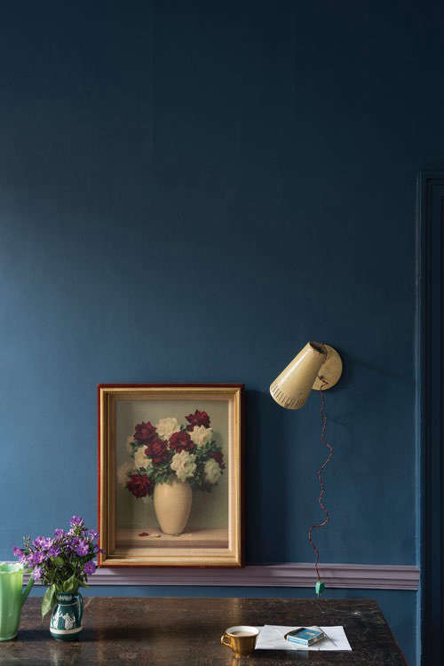
Some paint colors politely blend into the background. Stiffkey Blue No. 281 is not one of them. This rich Farrow & Ball shade arrives with the confidence of a well-dressed guest who somehow knows everyone at the party. It is deep, moody, coastal, traditional, modern, and slightly mysterious all at once.
Often described as an inky navy, Stiffkey Blue is inspired by the dark blue tones found in the mud and cockles around Stiffkey Beach in Norfolk, England. That may not sound glamorous at first. “Inspired by mud” is not exactly the tagline of a luxury spa. But in practice, this complex blue paint color can make walls, cabinets, doors, and furniture feel dramatically more polished.
Used well, Stiffkey Blue No. 281 paint creates depth without making a room feel gloomy. Used carelessly, it can turn a sunny kitchen into a very elegant cave. The difference comes down to lighting, finish, surrounding colors, and how boldly you are willing to commit.
What Color Is Stiffkey Blue No. 281?
Stiffkey Blue is a dark navy paint color with a noticeable richness that separates it from standard primary-blue shades. It is not a bright nautical blue, and it is not a nearly-black blue-gray pretending to be interesting. Instead, it lands somewhere in the sweet spot between classic navy, charcoal, and ocean water at dusk.
In bright daylight, Stiffkey Blue often reveals more of its blue character. In dim rooms or under warm evening lighting, it can appear much darker and more dramatic, sometimes reading almost like a softened black. That changing personality is one of the reasons people love it. It is basically the paint equivalent of a person who looks equally good in jeans and at a black-tie wedding.
The shade has a traditional backbone, but it does not feel stuck in the past. It works beautifully in Victorian homes, Colonial-style spaces, cottages, modern apartments, and updated suburban interiors. It can look historic when paired with antique brass and wood paneling, or clean and contemporary when combined with pale oak, white plaster, and streamlined furniture.
Why Stiffkey Blue Paint Is So Popular
Deep blue paint colors have staying power because they feel both familiar and special. Navy has long been associated with confidence, craftsmanship, and classic design, but Stiffkey Blue feels more layered than a typical department-store navy. It has enough depth to be dramatic without becoming too severe.
Another reason Stiffkey Blue No. 281 stands out is its versatility. It can be used as a statement color in a powder room, an all-over wall color in a study, a cabinet color in a kitchen, or a high-impact exterior color for a front door. It can also work on trim, built-ins, bookshelves, stair railings, and even ceilings for homeowners who enjoy making guests look up and say, “Well, that is unexpectedly fabulous.”
Dark paint colors also have a talent for making architectural details feel more intentional. Plain baseboards become elegant. Built-in shelving becomes a feature. A basic door suddenly looks like it belongs in a home with a library ladder and a secret inheritance.
How Lighting Changes Stiffkey Blue
Lighting is the boss of every paint color, and Stiffkey Blue is particularly sensitive to it. Before committing to gallons of paint, test a sample in the exact room where it will live. A paint chip viewed under store lighting is useful, but it is not a legally binding contract with your living room.
North-Facing Rooms
North-facing rooms often receive cooler, softer daylight. In these spaces, Stiffkey Blue can look more charcoal-toned and more intense. That does not make it a bad choice; it simply means you should lean into the cozy effect. Add warm wood, brass lighting, cream textiles, and warm white accents so the room feels intentional rather than chilly.
South-Facing Rooms
South-facing rooms usually receive warmer, stronger light. This is where Stiffkey Blue often shows its richer blue side. In a sunny dining room or kitchen, it can feel energizing rather than heavy, especially when paired with pale countertops, natural wood, and light-colored flooring.
Artificial Light Matters Too
Warm bulbs can make Stiffkey Blue appear softer and slightly more blackened at night. Cooler LED lighting can bring out more of the blue. Test the shade during morning, afternoon, and evening, then turn on every lamp you plan to keep. Paint color has a social life; it behaves differently around different lighting companions.
Best Rooms for Stiffkey Blue No. 281 Paint
Kitchen Cabinets
Stiffkey Blue kitchen cabinets can create a high-end look without requiring a complete kitchen renovation. The color works especially well on lower cabinets, islands, pantry doors, and built-in storage. Pair it with warm white walls, creamy quartz, marble with soft veining, aged brass hardware, or unlacquered brass faucets.
For a balanced kitchen, use Stiffkey Blue on the base cabinets and choose lighter upper cabinets or open shelving. This keeps the room grounded while preserving brightness. In a larger kitchen, painting all cabinetry Stiffkey Blue can look spectacular, particularly when natural light, light flooring, and reflective surfaces help break up the depth.
Powder Rooms and Bathrooms
A small bathroom is one of the best places to take a color risk. Stiffkey Blue can make a powder room feel like a tiny jewel box rather than a neglected closet with plumbing. Pair it with white tile, polished nickel, antique brass, a warm stone floor, or a vintage-inspired mirror.
For moisture-prone spaces, choose a durable, washable finish designed for kitchens and bathrooms. A dark blue bathroom wall may sound intimidating, but with good lighting and a crisp white sink, it can feel boutique-hotel chic instead of basement-laundry-room sad.
Living Rooms, Libraries, and Home Offices
Stiffkey Blue is especially effective in rooms meant for reading, thinking, relaxing, or pretending you are about to write the great American novel. It creates a grounded background for books, art, leather furniture, warm wood, and textured fabrics.
For a more dramatic look, paint the walls, trim, doors, and built-ins in the same shade. This technique, often called color drenching, visually blurs the edges of the room and makes architectural details feel more sculptural. For a lighter approach, use Stiffkey Blue on one wall, built-ins, or a fireplace surround.
Bedrooms
In a bedroom, Stiffkey Blue can feel serene, enveloping, and slightly cinematic. It pairs beautifully with linen bedding, oatmeal upholstery, walnut furniture, and warm metallic accents. Add a soft cream ceiling if you want contrast, or carry the blue up onto the ceiling for a cocooning effect that makes bedtime feel like an event.
Front Doors and Exterior Details
Stiffkey Blue makes a front door feel substantial and polished. It works well with red brick, limestone, white siding, natural stone, and weathered wood. The color can look nearly black from a distance but reveal a richer blue tone up close, which gives an entryway a subtle sense of depth.
For exterior applications, use a finish formulated for outdoor wood or metal and prepare the surface carefully. Exterior paint is not the place to rely on vibes alone. Clean, sand, prime as recommended, and follow the manufacturer’s technical instructions for dry time and weather conditions.
Best Colors to Pair With Stiffkey Blue
The easiest way to make Stiffkey Blue work is to give it companions that either brighten, warm up, or deepen the room. It is a confident color, but even confident colors enjoy good company.
Soft Whites and Off-Whites
Soft gray-white shades, creamy whites, and warm off-whites help Stiffkey Blue feel sophisticated rather than severe. Farrow & Ball often recommends Ammonite as a complementary white because its soft gray undertone creates a calm, balanced contrast.
Avoid pairing Stiffkey Blue with an extremely icy, bright white unless you want a very crisp and formal look. In some homes, stark white can make deep navy feel colder than expected.
Warm Woods
Oak, walnut, cherry, and medium-toned wood bring warmth to Stiffkey Blue walls and cabinetry. Wood prevents the color from feeling overly formal and adds an organic contrast that works in both traditional and modern interiors.
Brass, Bronze, and Aged Metals
Warm metals are excellent partners for this dark navy. Brass cabinet pulls, bronze sconces, antique gold frames, and aged copper accessories all stand out against Stiffkey Blue. The contrast adds warmth and a little glow, especially in rooms with limited natural light.
Terracotta, Rust, and Ochre
For a bolder palette, combine Stiffkey Blue with rust, burnt orange, terracotta, mustard, or ochre accents. These warm tones sit opposite blue on the color wheel, creating a lively contrast without making the room feel like a sports team locker room.
Greens and Natural Textures
Olive green, sage, moss, rattan, woven baskets, linen, jute, and houseplants all work beautifully with Stiffkey Blue. This combination creates a relaxed, nature-inspired look that feels less formal than navy-and-white decorating.
Stiffkey Blue vs. Other Dark Farrow & Ball Colors
Choosing between dark paint colors can feel like selecting a favorite child, except the children are all moody and wear excellent coats. Stiffkey Blue is often compared with several other deep Farrow & Ball shades.
- Stiffkey Blue vs. Hague Blue: Hague Blue generally reads greener and more teal, while Stiffkey Blue feels more like a true inky navy.
- Stiffkey Blue vs. Railings: Railings tends to look darker and more blue-black. Stiffkey Blue usually reveals more visible blue, especially in well-lit rooms.
- Stiffkey Blue vs. Down Pipe: Down Pipe is more charcoal-gray with blue undertones. Stiffkey Blue is the better choice when you want the room to clearly read as blue.
- Stiffkey Blue vs. De Nimes: De Nimes is lighter, softer, and more muted. It is better for homeowners who want blue without committing to a dramatic dark wall.
The best choice depends on your room’s orientation, furnishings, floor color, and tolerance for drama. Samples are cheaper than repainting, and repainting is cheaper than pretending you love a color you absolutely do not love.
Choosing the Right Paint Finish
Stiffkey Blue can look noticeably different depending on sheen. The color itself remains the same, but the finish changes how light moves across the surface and how practical the painted area will be.
| Surface | Recommended Finish Type | Why It Works |
|---|---|---|
| Low-traffic walls and ceilings | Very matte emulsion | Creates a soft, chalky, deeply pigmented look. |
| Kitchens and bathrooms | Durable washable matte finish | Offers easier cleaning and better practicality around moisture and splashes. |
| Cabinets, trim, and interior doors | Eggshell or durable mid-sheen finish | Provides resilience while keeping the color rich and refined. |
| Front doors and exterior trim | Exterior eggshell or gloss finish | Helps protect exterior surfaces while giving the color visual impact. |
Matte finishes make Stiffkey Blue feel velvety and atmospheric. Glossy finishes make it sharper, more reflective, and more formal. A high-gloss Stiffkey Blue front door can feel polished and tailored, while a matte Stiffkey Blue library can feel like the room is quietly holding a very good secret.
How to Paint With Stiffkey Blue Successfully
- Order a sample first. Paint it on a large movable board or sample sheet so you can test it around the room.
- Check it during the day and at night. Morning sun, cloudy weather, overhead lights, lamps, and candles all change the way dark blue appears.
- Use the recommended primer and undercoat. Dark paint performs best over the correct foundation, especially when covering a lighter wall.
- Consider the finish before buying. A beautiful color in the wrong sheen can create unnecessary maintenance headaches.
- Plan the entire palette. Think beyond walls: flooring, countertops, hardware, window treatments, upholstery, and art all influence the final result.
- Paint more than one surface when appropriate. A single Stiffkey Blue accent wall can work, but painting trim, doors, or built-ins too often creates a more finished look.
Common Mistakes to Avoid
The biggest mistake is expecting Stiffkey Blue to behave like a medium blue. It is dark. It is dramatic. It has opinions. That is why people choose it.
Do not select it from a tiny online image and assume your room will match. Screen settings, sunlight, surrounding colors, and camera editing can all distort paint colors. Test it properly.
Another mistake is forgetting that dark walls need lighting support. You do not need a room flooded with daylight, but you should have a plan for layered lighting: ceiling fixtures, lamps, sconces, under-cabinet lighting, or picture lights. Dark blue looks luxurious when it is intentionally illuminated and merely gloomy when it is left alone with one exhausted ceiling bulb.
Finally, do not ignore contrast. Stiffkey Blue needs balance. Add lighter upholstery, pale stone, warm wood, metallic accents, art, or textured fabrics so the room feels layered rather than flat.
Is Stiffkey Blue No. 281 Right for Your Home?
Stiffkey Blue is an excellent choice for homeowners who want color with depth, character, and long-term appeal. It is especially suited to kitchens, powder rooms, studies, entryways, dining rooms, bedrooms, built-ins, and front doors.
Choose it when you want a room to feel grounded, elegant, cozy, or memorable. Skip it when your goal is a bright, airy, low-contrast space with minimal visual weight. Stiffkey Blue is not trying to be quiet. It is trying to make your home feel more like yours.
Living With Stiffkey Blue: Practical Experiences and Design Lessons
Stiffkey Blue tends to create a strong first impression, but the more interesting part is what happens after the paint dries and people actually live with it. The following practical scenarios reflect the kinds of results homeowners often seek when using a deep navy paint color in real spaces.
In a small powder room, Stiffkey Blue can turn an ordinary utility space into a memorable design moment. A typical setup might include dark blue walls, a white pedestal sink, warm brass hardware, and a simple mirror with a thin gold frame. At first, the room may feel darker than expected. Then the lighting is adjusted, a warm bulb is installed, and suddenly the same room feels intentional and cozy rather than cramped. The lesson is simple: dark paint does not always need more square footage. Sometimes it needs better lighting and a little confidence.
In kitchens, Stiffkey Blue is often most successful when used as a grounding element rather than a total takeover. Imagine a kitchen with pale counters, natural oak floors, and soft white walls. Painting the island or lower cabinets Stiffkey Blue adds contrast without swallowing the room. The color makes everyday details, such as brass pulls and wood stools, feel more expensive. It also hides minor cabinet scuffs better than a pale white finish, although no paint color can fully protect cabinets from a household where someone opens drawers with the determination of a raccoon looking for snacks.
In a home office or library, the experience is different. Stiffkey Blue can make a room feel quieter and more focused, particularly when paired with bookshelves, warm lamps, and textured curtains. Instead of reflecting light around the room, the dark blue surface absorbs some of it and creates a more intimate atmosphere. This can be useful in a workspace because it visually reduces distractions. A bright white office can feel energetic, but a deep blue office can feel like a place where serious thinking happens, even if the main task of the day is answering emails and searching for a missing charger.
For entryways and front doors, Stiffkey Blue offers a more subtle experience. From the street, it may appear nearly black or charcoal. Up close, especially in daylight, the blue becomes clearer and more interesting. This makes it a strong choice for homeowners who want something distinctive but not loud. It feels classic beside brick, stone, white siding, or natural timber, and it works with both brass and black exterior hardware.
Bedrooms painted in Stiffkey Blue often feel unexpectedly restful when balanced with soft bedding and warm neutrals. The key is to avoid making every element dark. Cream sheets, oatmeal curtains, pale rugs, wood nightstands, and warm bedside lamps keep the space comfortable. The blue becomes the backdrop rather than the entire story. Many people are surprised that a dark bedroom does not necessarily feel smaller; when walls and trim are painted in the same tone, the corners soften and the room can feel calm, enveloping, and wonderfully separate from the rest of the house.
Note: Stiffkey Blue No. 281 is highly responsive to natural light, artificial light, and finish sheen. Always test a sample in your actual room before committing to a full project.