Movie titles usually announce themselves with booming letters, dramatic shadows, and enough visual effects to make a graphics card request paid leave. Negative-space typography takes the opposite approach. Instead of adding more, it quietly removes just enough material to reveal a second image hiding inside the words.
That wonderfully sneaky idea drives a personal design project created by Romanian advertising creatives Luca Costea and Eduard Cîrstea. The pair reimagined ten famous movie titles in stark black and white, inserting a memorable symbol from each film into the empty areas within or between the letters. The results are not official studio logos, but minimalist visual interpretations that reward anyone willing to look twice.
Some references reveal themselves immediately. Others sit there with the innocent expression of a cat beside a broken vase. Together, these designs demonstrate how negative space, movie symbolism, and creative typography can summarize an entire story with one carefully shaped gap.
What Is Negative Space in Graphic Design?
Negative space is the area around, inside, or between the visible elements of a composition. Although it may look empty, it plays an active role in controlling balance, readability, emphasis, and visual direction. In typography, the enclosed space inside letters such as “A,” “O,” and “P” is called a counter. Designers can reshape these counters or the gaps between letters to create hidden images.
The technique works because the human eye constantly separates foreground from background. We first recognize the bold letterforms as positive space. A moment later, the brain notices that an apparently blank section forms a balloon, a shark, a moon, or another meaningful object. That delayed discovery turns reading into a tiny visual puzzleand people enjoy solving puzzles, especially when no one asks them to calculate the tip afterward.
Used well, negative space can improve clarity while adding a second layer of meaning. It also gives a layout room to breathe, focuses attention, and allows simple shapes to communicate mood or narrative without overcrowding the design.
Ten Movie Titles Transformed Through Negative Space
Each title in the series uses a recognizable feature from its movie. The clever part is that the reference does not sit beside the lettering like a decorative sticker. It becomes part of the lettering itself.
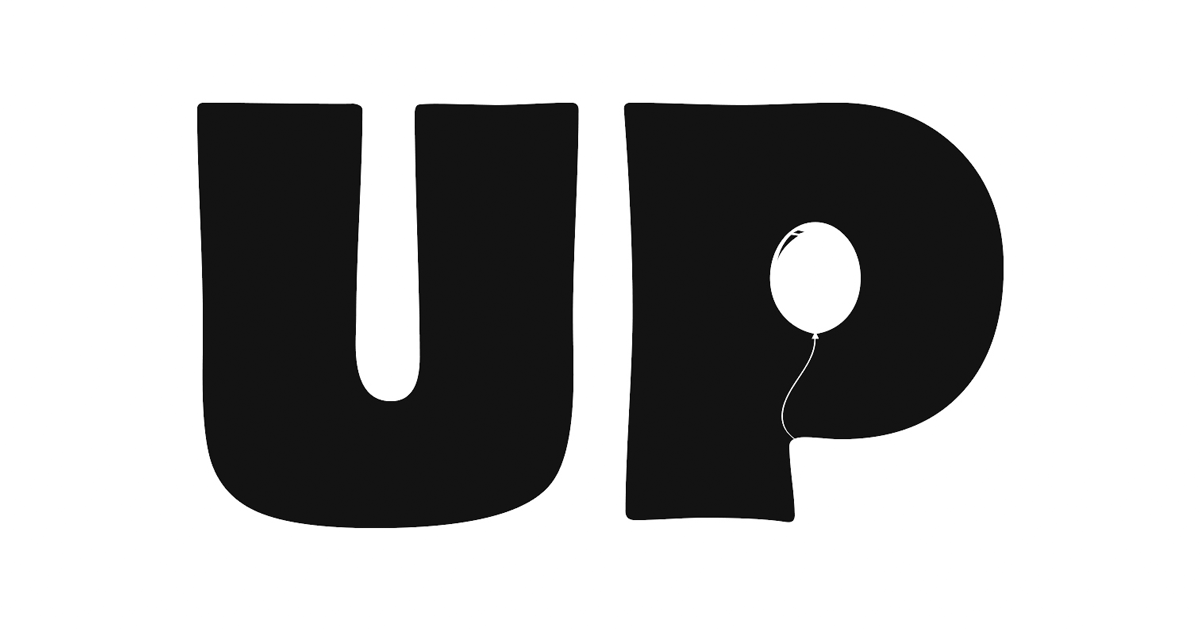
1. Up: One Balloon Does the Heavy Lifting
The design for Up places a small white balloon inside the rounded counter of the letter “P.” A delicate string hangs beneath it, transforming an ordinary opening in the letter into the movie’s most recognizable symbol.
It is a beautifully economical choice. Pixar’s story follows retired balloon salesman Carl Fredricksen, who attaches thousands of balloons to his house and flies toward Paradise Falls. The alternative title treatment reduces that enormous airborne spectacle to a single balloon, yet the reference remains instantly understandable. One tiny oval says “adventure, memory, and airborne real estate” without requiring a single cloud.
2. Jaws: The Letter “A” Develops Teeth
In the Jaws title, the triangular counter of the letter “A” becomes the open mouth of a shark. Jagged black teeth interrupt the white interior, making the danger appear to rise from inside the typography.
The concept captures the film’s most frightening idea: the threat is concealed until it is already too close. The title remains readable from a distance, but a closer glance reveals that the “A” would very much like to eat the rest of the alphabet. Because the shark attacks from below the surface in the film, hiding its mouth inside a letter is thematically appropriate rather than merely decorative.
3. Black Swan: Ballet Shoes Hidden in the “W”
The Black Swan design uses the central strokes of the letter “W” to suggest a ballerina’s legs and pointe shoes. The shapes emerge through narrow cutouts, allowing the dancer to exist as part of the word rather than as a separate illustration.
This is a fitting symbol for a psychological drama centered on Nina, a gifted ballerina whose pursuit of perfection gradually erodes her grip on reality. The elegant letterform looks controlled and refined, while the hidden body introduces a subtle sense of pressure and confinement. The dancer is not merely near the title; she appears trapped within it, which is an excellent visual summary of artistic obsession.
4. Batman: Gotham’s Symbol Appears in the “M”
The word Batman is built from heavy, rounded letters, but the lower center of the “M” contains a small white bat silhouette. The familiar emblem appears without changing the overall readability of the title.
The solution works because Batman’s symbol is already one of popular culture’s most recognizable graphic shapes. Instead of placing a giant bat behind the wordas superhero branding often does with the subtlety of a rooftop explosionthe designers hide it in a tiny gap. The Dark Knight’s identity becomes a secret within plain sight, matching a character who operates through shadows, concealment, and theatrical entrances.
5. Rocky: A Punching Bag Hangs Inside the “O”
For Rocky, the counter of the letter “O” becomes a miniature training space. A white punching bag hangs from the top of the opening, suspended inside the bold black letter.
The symbol immediately evokes the repetitive training that defines Rocky Balboa’s journey. The original film follows an underdog Philadelphia boxer who receives an unlikely opportunity to fight heavyweight champion Apollo Creed. Rather than illustrating the final match, the title focuses on preparationthe lonely hours, repeated punches, and stubborn persistence that make the emotional payoff possible. It is less “glorious championship belt” and more “one more round before breakfast,” which feels exactly right for Rocky.
6. Apollo 13: The Moon Occupies the “O”
The second “O” in Apollo 13 contains a white crescent-like lunar shape marked with dark craters. The moon fits naturally within the circular counter, turning a standard letter into a destination that remained tragically out of reach.
The historical Apollo 13 mission was headed toward the moon when an oxygen-tank failure endangered the crew and forced NASA to concentrate on bringing the astronauts safely home. The negative-space moon therefore carries more emotional weight than a generic spacecraft icon would. It represents the objective, the distance, and the mission that had to be abandoned. That is an impressive workload for one small circle.
7. Whiplash: Drumsticks Become Part of the “I”
The Whiplash title transforms the narrow vertical space around the letter “I” into a pair of drumstick-like forms. Their rounded tips are carved from the black typography, creating a musical clue that feels precise and slightly severe.
That severity suits the film. Whiplash follows ambitious jazz drummer Andrew Neiman as an abusive instructor pushes his pursuit of greatness toward obsession. The tall, compressed typography resembles the rigid discipline of a rehearsal room, while the hidden sticks point directly to the instrument at the center of the conflict. Nothing looks loose or playful. Even the empty space appears to have been ordered to practice until midnight.
8. World Trade Center: Twin Vertical Gaps Carry the Meaning
The World Trade Center treatment arranges the title in two stacked lines, with “CENTER” set in especially tall, condensed letters. Two narrow vertical channels formed around the central letter suggest the paired towers through absence rather than direct illustration.
This is the most restrained and solemn design in the collection. The designers avoid flames, debris, or sensational imagery. Instead, the missing white columns become the primary symbol. The approach demonstrates how negative space can communicate loss: viewers recognize not only a shape, but also the meaning of something no longer physically present. The typography remains monumental, yet the gaps quietly command the greatest attention.
9. 127 Hours: A Figure Is Trapped Inside the “H”
In the 127 Hours title, a tiny human silhouette appears wedged between the vertical strokes of the letter “H.” The surrounding black forms resemble rock walls, while the figure occupies a painfully narrow sliver of white space.
The image refers to Aron Ralston’s entrapment in a Utah canyon, the ordeal dramatized in the film. It is one of the series’ most narrative designs because the viewer can understand the central conflict without seeing a landscape, a photograph, or even a complete human body. The scale difference does the storytelling: huge dark walls, tiny vulnerable person, absolutely no convenient customer-service desk nearby.
10. Men in Black: The Neuralyzer Hides in the Final “I”
The final “I” in Men in Black contains a small white silhouette of the neuralyzer, the pen-shaped device agents use to erase witnesses’ memories after alien encounters. The object fits so naturally into the letter that it may go unnoticed during the first reading.
That delayed recognition is perfect for a movie about a secret organization hiding extraterrestrial activity in plain sight. The official story follows Agents Kay and Jay as they monitor alien life on Earth and respond to an intergalactic threat. By concealing the franchise’s signature gadget inside an ordinary letter, the design behaves like the Men in Black themselves: present, professional, and hoping you did not notice anything unusual.
Why These Negative-Space Movie Titles Work
They Use Symbols Viewers Already Understand
A balloon, shark mouth, bat emblem, punching bag, moon, and pair of drumsticks require little explanation. Each object has a strong relationship with its film, allowing the design to communicate quickly. A weaker symbol would force the audience to study the title for too long, turning a pleasant discovery into unpaid detective work.
The Hidden Images Fit the Natural Anatomy of Letters
The best examples do not fight the typeface. A moon belongs comfortably inside an “O.” A balloon fits inside a “P.” A shark’s mouth naturally occupies the triangle of an “A.” This relationship between symbol and letter structure makes the designs feel inevitable, as though the images had been living inside the alphabet and were simply waiting for someone to turn on the lights.
Black and White Keeps the Visual Puzzle Clear
The series uses only black lettering and white background space. Without gradients, textures, photographs, or competing colors, the figure-ground relationship remains easy to read. Viewers can switch rapidly between seeing the word and seeing the embedded symbol.
The Designs Preserve Legibility
Clever typography fails when the hidden image destroys the title. Here, most alterations are small enough that the movie names remain readable. The visual joke arrives after recognition rather than replacing it. That balance is vital for posters, logos, book covers, and advertising, where communication must survive even when the designer is having an extremely artistic afternoon.
A 500-Word Experience: Learning to See What Is Not There
Studying these ten movie titles changes the way a person looks at ordinary lettering. At first, the eye behaves normally: it reads the words, identifies the movies, and prepares to move on. Then the balloon inside the “P” of Up becomes visible. The shark appears inside the “A” of Jaws. Suddenly, every gap looks suspicious.
That second-look experience is the real pleasure of negative-space design. The first viewing delivers information; the second delivers discovery. A successful title creates a brief moment in which the brain reorganizes the same shapes and sees something entirely different. Nothing on the page has moved, yet the image feels transformed. It is the graphic-design equivalent of finding money in a coat pocket, except the money is a tiny shark and the coat is typography.
A useful way to experience the technique firsthand is to cover the hidden symbol with a finger and read only the word. Then uncover it and observe how quickly the symbol takes control of the composition. In Apollo 13, the “O” initially functions as a letter. Once the cratered moon is recognized, it becomes difficult to see it as an ordinary counter again. The same shift occurs with the trapped figure in 127 Hours. The white opening stops feeling empty and begins to feel claustrophobic.
Trying to create a similar design reveals how difficult the process is. Begin with a favorite movie and list five objects associated with it. Then examine the title letter by letter. Circular symbols may fit into “O,” “P,” “D,” or “Q.” Tall objects may occupy an “I” or the gap between two vertical stems. Triangular objects may work inside “A” or “V.” The challenge is not simply finding a clever reference. The hidden image must fit the title’s existing geometry while preserving readability.
For example, imagine redesigning Jurassic Park. A dinosaur tooth might fit into the “A,” a claw mark could interrupt the “K,” or a long-necked silhouette might appear between two tall letters. Most early ideas would probably look forced. That is normal. Negative-space typography rewards subtraction, and subtraction requires discipline. Designers often need to remove details until the symbol works at a glance.
Testing the image at different sizes is another revealing experience. A design may look brilliant on a large monitor but disappear on a phone screen. Strong negative-space marks usually survive reduction because they depend on bold silhouettes rather than tiny details. The balloon in Up and the shark mouth in Jaws remain recognizable even when the title is small. More delicate concepts may need wider spacing or simpler contours.
The emotional effect also varies by movie. The bat in Batman feels playful and triumphant. The dancer in Black Swan feels elegant but constrained. The missing tower shapes in World Trade Center feel quiet and mournful. This range proves that negative space is not merely a visual trick. Empty areas can suggest humor, danger, isolation, secrecy, aspiration, or absence depending on how they are shaped.
After spending time with designs like these, blank space no longer seems blank. It becomes material: something that can be carved, directed, balanced, and filled with meaning without adding another object. That awareness can improve more than movie-title typography. It can influence logo design, photography, website layouts, advertising, packaging, and illustration. The lesson is delightfully inconvenient for anyone who thought empty space meant the work was finished.
Final Thoughts
These ten famous movie titles show how minimalist typography can contain an entire cinematic idea. By embedding familiar symbols into letter counters and surrounding gaps, Luca Costea and Eduard Cîrstea created designs that are readable, memorable, and fun to decode.
The strongest examples work because the hidden image is both visually natural and narratively relevant. The balloon belongs inside Up. The shark belongs inside Jaws. The trapped figure belongs inside 127 Hours. Nothing feels added merely to show off a clever trick.
Negative space reminds designers that communication does not always improve when more elements are introduced. Sometimes the smartest creative decision is to remove one small pieceand let the audience discover everything hiding in the gap.