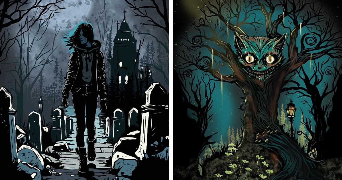
Some artists paint cheerful gardens. Others sketch charming cafés, sunny beaches, or bowls of fruit that have never experienced an existential crisis. I apparently prefer haunted staircases, suspicious moons, ghostly strangers, and forests where every tree looks like it knows my browsing history.
This collection of 21 spooky digital artworks began as a small October challenge. My original plan was to create three or four eerie illustrations, post them online, and return to drawing respectable things. Instead, the project grew tentacles. One unsettling idea led to another until I had developed an entire visual neighborhood populated by anxious ghosts, impossible buildings, oversized insects, and one deeply untrustworthy teapot.
Each piece was made digitally using a combination of rough sketches, textured brushes, layered lighting, color adjustments, and a heroic number of undo commands. Rather than relying only on obvious monsters or graphic horror, I focused on atmosphere. Empty rooms, unusual proportions, hidden faces, and ordinary objects placed in the wrong context can be far more disturbing than a creature shouting, “Hello, I am the villain.”
Below are the stories, ideas, and creative decisions behind the complete haunted collection.
Building a World of Spooky Digital Art
Before drawing the individual pieces, I established a visual language for the series. The palette would rely heavily on charcoal black, faded blue, bruised purple, dirty cream, rust red, and a sickly green that looked as though it had recently received bad medical news.
I also wanted the collection to feel related without making every image identical. Repeated elementsincluding crescent moons, crooked windows, moths, long shadows, and tiny glowing eyesbecame visual clues connecting one scene to another. Viewers could enjoy each eerie digital painting separately or imagine that all 21 scenes existed in the same strange universe.
Most compositions began with simple grayscale shapes. Working without color helped me judge whether the focal point was clear and whether the shadows created enough tension. Color arrived later, usually in restrained amounts. A single warm window inside a cold landscape could guide the eye more effectively than covering the entire canvas with neon orange.
The 21 Spooky Digital Artworks
1. The House That Watches Back
The first artwork depicts a narrow Victorian house with two illuminated attic windows resembling eyes. The front door forms a slightly open mouth, while tangled vines create the suggestion of veins across the exterior walls.
I kept the surrounding street almost completely empty. That negative space makes the house feel isolated and gives viewers nowhere else to look. The funny part is that I originally intended to draw a harmless abandoned building. Halfway through the sketch, the windows started staring at me. Creative projects occasionally become self-employed.
2. Midnight Tea for Nobody
This scene shows a formal dining table prepared for six guests, although every chair is empty. A teapot pours black liquid into a cup without anyone holding it, and one place setting includes a small handwritten card reading, “You are late.”
The horror comes from stillness rather than action. Nothing is attacking anyone. The room is simply waiting with tremendous passive aggression. Soft candlelight and deep surrounding shadows helped create an atmosphere that feels elegant at first and increasingly uncomfortable the longer you look.
3. The Moon Collector
A towering figure walks through a field carrying several miniature moons inside glass jars. Its face is hidden beneath a wide hat, but pale hands emerge from sleeves that are much too long.
I imagined the character as neither hero nor villain. Perhaps it protects fallen moons. Perhaps it steals them. Perhaps it sells artisanal lunar lighting on the internet. Leaving its purpose unexplained made the image more mysterious and allowed viewers to invent their own folklore.
4. Don’t Wake the Forest
In this dark fantasy illustration, enormous sleeping faces are embedded in tree trunks. A child carrying a lantern walks between them while roots quietly curl around the path behind her.
The scale contrast was essential. By making the child tiny and the trees impossibly large, I wanted the forest to feel ancient and powerful. The artwork suggests that nature is not empty scenery. It may be conscious, dreaming, and mildly annoyed that someone brought a bright lantern into its bedroom.
5. The Last Train Home
A ghostly commuter sits alone inside an old subway car. Outside the windows, there are no tunnels or stationsonly stars and floating doors. An electronic sign above the seats reads, “Final stop: Before.”
This piece grew from the strange loneliness of late-night public transportation. Even familiar places can become surreal when almost everyone has gone home. I used repeating handles and seats to create order, then disrupted that order with an impossible view beyond the windows.
6. Portrait of a Forgotten Friend
The central figure in this digital portrait has a carefully painted coat, hands, and hair, but the face has been replaced by a fogged mirror. A faint second figure appears in the reflection.
Rather than designing a conventional monster, I explored the fear of forgetting someoneor being forgotten by them. The missing face gives the viewer an empty space to fill with a personal memory, which can be more emotionally unsettling than any row of sharp teeth.
7. The Hallway Between Dreams
This artwork presents a hotel corridor that seems to stretch forever. Every door is numbered 13, the carpet pattern resembles crawling insects, and a distant silhouette appears slightly closer each time the image is viewed. At least, that is what I tell people.
The corridor was built using exaggerated perspective and repeating geometric shapes. Repetition creates visual rhythm, but when repeated elements are almost identical rather than perfectly identical, the result feels unstable. One door is taller. One lamp leans. One shadow points in the wrong direction.
8. Moth Queen
A pale figure stands beneath a streetlight while hundreds of moths form a crown around her head. Her dress dissolves into wings near the bottom of the composition.
I wanted this image to feel beautiful before it felt frightening. Delicate details, symmetrical shapes, and muted gold light attract the viewer, while the unnatural eyes and insect-like anatomy introduce discomfort. Beauty and horror make excellent roommates, although neither of them remembers to buy toilet paper.
9. The Neighbor Upstairs
This humorous horror artwork shows a tenant staring at the ceiling at 3:07 a.m. Above him, an enormous shadow with too many legs drags a chair across the floor.
Anyone who has lived beneath a noisy neighbor knows that supernatural explanations eventually become reasonable. The piece uses a simple cutaway composition, allowing the viewer to see both apartments while the character below remains tragically uninformed about the architecture of the creature above.
10. The Garden of Teeth
At first glance, this image resembles a peaceful botanical garden. A closer look reveals that the white flowers are tiny teeth, the stems resemble gums, and the gardener is carrying an alarmingly large pair of pliers.
The idea came from combining two things that should never be combined: dentistry and relaxing outdoor activities. I used soft morning light and cheerful composition to disguise the disturbing details. The contrast between pleasant presentation and unpleasant subject matter became one of my favorite techniques in the collection.
11. Under the Bed
Instead of showing a child frightened by a monster beneath the bed, this piece reverses the familiar scene. A small monster hides underneath while a pair of human feet approach across the bedroom floor.
The monster’s expression is terrified, and it clutches a stuffed toy for protection. This reversal adds humor while asking viewers to reconsider which character should actually be feared. Spooky art does not always have to be grim; sometimes the creature deserves a tiny emotional-support rabbit.
12. The Lighthouse Keeper’s Dream
A lighthouse rises from a black ocean, but its beam illuminates an enormous eye beneath the waves. The keeper stands on the balcony, unaware that something below has noticed the light.
The composition relies on a strong diagonal beam cutting through a field of darkness. Most of the sea remains visually quiet, allowing the barely visible eye to become the reward for careful viewers. Suggestion is often more effective than complete revelation, especially when the suggested object could swallow a fishing boat.
13. The Puppet’s Day Off
A wooden marionette sits in a café drinking coffee while a human puppeteer hangs limply from strings outside the window. The puppet appears exhausted but satisfied.
This surreal horror artwork began as a joke about creative burnout and gradually became a story about control. The café interior uses warm browns and reds, while the exterior is cold and gray. That color separation makes the puppet’s temporary freedom feel comfortable, even though the larger situation is objectively terrible.
14. The Door in the Lake
A freestanding door rises from the center of a perfectly still lake. It is slightly open, and warm light spills across the water. There is no boat, bridge, or visible way to reach it.
This was one of the simplest images in the project, yet it generated some of the strongest reactions. Viewers wanted to know what was behind the door and whether entering it would be brave, foolish, or both. The absence of an answer is the main subject of the artwork.
15. Family Photo, 1899
This fictional antique portrait features seven formally dressed family members. Six face the camera. The seventh has turned toward something standing outside the frame.
I added scratches, faded edges, uneven exposure, and subtle facial distortions to imitate the mood of a damaged historical photograph without copying a real family image. The final result looks almost normal, which is exactly the problem. The most effective detail is the hand resting on one person’s shoulder despite nobody standing behind him.
16. The Library After Closing
Books float through a dark library while letters escape from their pages and gather into a shadowy figure between the shelves. A librarian calmly stamps a return date onto a human skull.
Creating hundreds of books individually would have been a poor life decision, so I designed several reusable shelf groups and adjusted their scale, perspective, and lighting. This allowed the environment to feel detailed without requiring me to age 40 years during production.
17. Static at the Window
A television screen stands outside an apartment window on the 12th floor, displaying a live image of the person watching it from inside. Behind that person on the screen is a figure absent from the actual roomor perhaps simply difficult to see.
The limited palette of blue-gray, black, and electronic white gives the image a cold digital atmosphere. Subtle visual noise and compression artifacts make the screen feel unstable, while the repeated frame-within-a-frame composition creates a sense of being observed.
18. The Birthday Guest
A child’s birthday party continues around a long table, but one chair is occupied by a tall black shape wearing a tiny paper hat. Nobody looks directly at it. A slice of cake has been placed carefully in front of the guest.
This artwork is less about a visible threat than a shared agreement not to mention it. The cheerful decorations and bright balloons increase the tension because the celebration refuses to stop. Apparently, even unknowable entities must RSVP.
19. When the Portrait Blinked
A museum guard shines a flashlight toward an old oil portrait. The painted figure’s eyes are closed, while a security monitor in the corner shows them wide open.
I combined painterly textures with crisp modern surveillance elements to separate the artwork from the surrounding gallery. The scene plays with conflicting evidence: the guard sees one reality, the camera records another, and the viewer is forced to decide which machine or person is unreliable.
20. The Town Beneath the Floorboards
A homeowner lifts a loose floorboard and discovers a miniature town glowing underneath the house. Tiny residents gather in the streets, all staring upward. In the town square stands a statue shaped exactly like the homeowner.
This was the most technically complex piece because it required two scales of architecture in one composition. Warm miniature lights pull the eye downward, while the large dark room above frames the discovery. The unsettling question is not how the town got there, but how long its residents have been studying the person upstairs.
21. Goodnight, Little Universe
The final artwork shows a bedroom floating in deep space. A sleeping figure lies beneath a blanket while planets orbit the bed and a vast hand reaches gently through the stars to switch off the bedside lamp.
I wanted the series to end with something eerie but strangely comforting. The hand may belong to a cosmic monster, a protective guardian, or the universe itself. Not every unknown presence needs to be hostile. Sometimes the darkness is simply telling us that the gallery is closed and we should finally go to sleep.
How I Created the Haunted Atmosphere
Starting With Silhouettes
Each composition began as a group of rough shapes rather than detailed line art. Large silhouettes helped me judge visual balance quickly. If a scene did not feel interesting in black, gray, and white, adding detailed eyeballs and expensive-looking fog was unlikely to rescue it.
Using Light as Part of the Story
Light was rarely included only for decoration. A flashlight revealed something hidden. A window suggested an unseen occupant. A candle isolated one object while allowing another to disappear into darkness. By treating every light source as a storytelling tool, I could guide attention without placing a giant arrow labeled “SCARY THING HERE.”
Keeping the Color Palettes Limited
Restrained colors made the collection feel unified and allowed small accents to carry more visual weight. Red appeared sparingly in warning signs, eyes, flowers, and thread. Pale yellow suggested weak artificial light, while blue and purple established nighttime distance. Green was reserved for objects that should probably not be touched without gloves.
Adding Texture Without Creating Clutter
Grain, scratches, fog, paper fibers, and rough brush marks gave the scenes a tactile quality. However, I avoided applying every texture everywhere. Detailed surfaces were balanced with smooth areas so the viewer’s eye had places to rest. Even a haunted illustration needs decent interior organization.
My Experience Making 21 Spooky Digital Artworks
Creating this series changed the way I think about horror digital art. At the beginning, I assumed that making an image spooky meant adding darker colors, sharper teeth, or perhaps a legally concerning quantity of spiders. Those elements can work, but they are not enough by themselves. An illustration becomes memorable when it suggests a story that continues beyond the visible frame.
The first few artworks were too direct. I drew monsters standing in obvious poses and filled the backgrounds with dramatic fog. Technically, the scenes looked polished, but they did not create much curiosity. The viewer could understand everything immediately: there was a creature, it was dangerous, and running would be a sensible lifestyle choice.
My approach improved when I began removing information. I hid characters behind curtains, cropped figures at the edge of the canvas, and allowed shadows to cover important details. I stopped explaining exactly what was happening. The images became quieter, but they also became more unsettling because viewers had to participate. Their imagination supplied the missing movement, sound, and history.
One practical challenge was maintaining consistency across 21 separate pieces. It was tempting to change styles whenever I discovered a new brush or visual effect. Digital tools provide endless possibilities, which is both wonderful and dangerous. An artist can easily spend two hours testing smoky watercolor brushes and then realize that no actual painting has occurred.
To control that temptation, I created a small set of rules. I reused a limited palette, kept the same general approach to shadows, and selected only a few main texture brushes. I also saved recurring objectssuch as windows, moth silhouettes, picture frames, and background treesin a personal asset library. Reusing these components saved time while helping the fictional world feel connected.
The project also taught me to protect the early sketching stage. Rough ideas are fragile. When I tried to make a sketch beautiful too quickly, I became attached to details that did not serve the composition. By keeping the first version loose and unattractive, I could move walls, change poses, delete characters, or rotate the entire canvas without feeling that I had destroyed precious work.
Some of the best ideas arrived by accident. In “The House That Watches Back,” the eye-shaped windows were originally ordinary rectangles distorted by a perspective adjustment. In “The Garden of Teeth,” a flower petal looked strangely dental when I zoomed out. Instead of correcting those accidents, I followed them. Spooky digital artwork often benefits from small visual mistakes because imperfection makes familiar objects feel less reliable.
Working on the collection late at night added another unexpected dimension. A scene that looked harmless at 2:00 p.m. could feel significantly more sinister at 1:30 a.m., especially after the refrigerator made one of its unexplained mechanical sighs. I learned to review every image in daylight before deciding whether it was genuinely atmospheric or whether I was simply tired and afraid of my own coat hanging on the door.
The audience responses were equally valuable. Different viewers noticed different details and invented explanations I had never considered. Some interpreted the Moon Collector as a guardian. Others believed it had stolen every moon from abandoned worlds. Several people were more concerned about the floating teapot than the shadow creatures, which seems reasonable. A creature may attack once; an unsupervised hot beverage can create an ongoing insurance problem.
Most importantly, completing all 21 pieces showed me that a themed art challenge can become more than a collection of disconnected illustrations. Repeated symbols, consistent colors, and unanswered questions can transform separate images into a shared visual mythology. By the end, I no longer felt as though I was inventing random spooky scenes. I felt as though I was documenting glimpses of a place that already existed somewhere just beyond the screen.
I still do not know who lives in the watching house, where the final train goes, or why the birthday guest received the largest slice of cake. That uncertainty is the part I enjoy most. A finished image does not need to close every door. Sometimes its job is to leave one door slightly open, turn off the hallway light, and let the viewer decide whether to step through.