Most of us use maps the way we use elevators: we step in, press a button, and expect to arrive somewhere useful without thinking too hard about the machinery. But unusual maps refuse to behave. They turn countries into swollen balloons, make cities look like circuitry, reveal invisible rivers below the ocean, or show how culture travels farther than borders ever could.
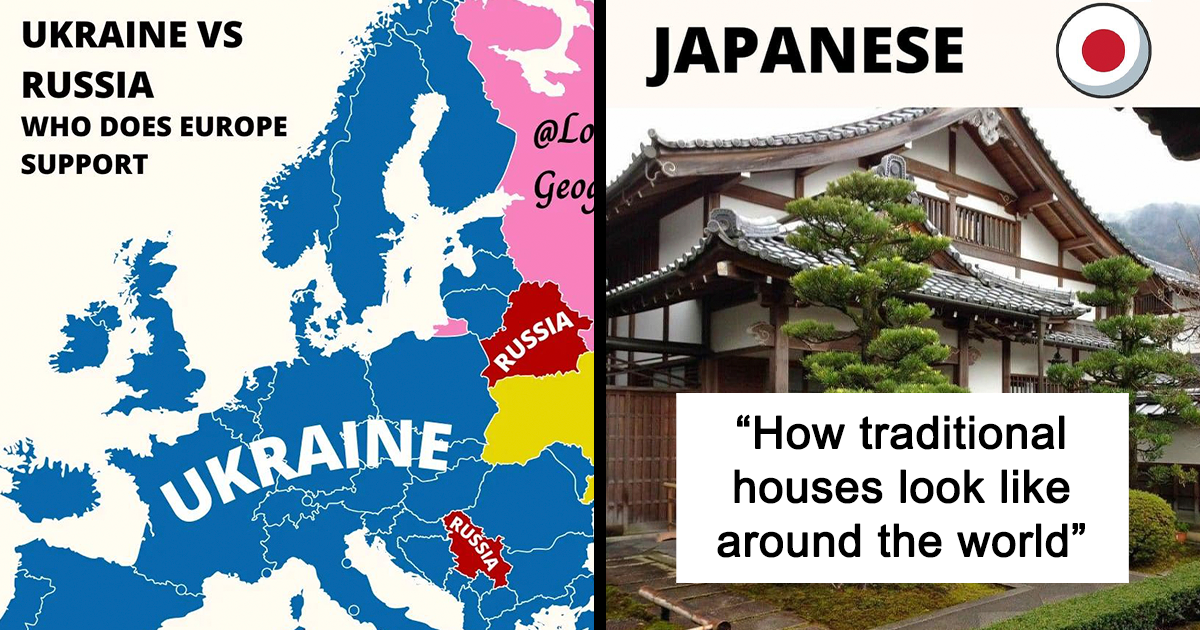
The Instagram account Lover Of Geography, featured in a popular map roundup, helped prove that cartography is not just about finding the nearest coffee shop. Its posts included comparisons of traditional houses, aerial views of cities, social and legal snapshots, and country-by-country search trends. In other words, the account treated the world like one enormous detective board with better colors.
That is the real magic of unusual maps: they do not merely show where things are. They show relationships, patterns, absences, movement, risk, history, and occasionally the alarming fact that your childhood classroom map made Greenland look like it was preparing to invade the planet. Every flat map involves trade-offs, because a round Earth cannot be transferred to a flat page without distortion.
Why Unusual Maps Feel So Powerful
A map can shrink a complicated subject into one glance. It can show population growth, migration, wildfire exposure, transportation routes, language patterns, or nighttime electricity use without requiring the reader to wrestle a spreadsheet to the ground. Government agencies, scientists, and planners use maps for exactly this reason: spatial data often makes trends easier to notice than a long table of numbers.
Still, a map is never just “the facts.” Someone selected the data, boundaries, colors, projection, scale, labels, and time period. A beautiful map can be useful, misleading, funny, heartbreaking, or all four before lunch. The trick is to enjoy the surprise while keeping one eyebrow politely raised.
30 Unusual Maps That Make the Familiar Feel Strange
1. Culture You Can Almost Walk Into
- Traditional houses by country. A map of national home styles can make architecture feel like geography wearing a hat. Roof angles, wall materials, courtyards, shutters, and balconies reveal how climate, history, local resources, and taste have shaped everyday shelter.
- Cities viewed from above. Satellite-style comparisons of cities reveal personalities that street level hides. Some places resemble tidy grids, others look like spiderwebs, river deltas, or a bowl of noodles that obtained municipal zoning approval.
- Languages that ignore political borders. A language map can remind viewers that countries are legal structures, while speech is a living thing. Dialects drift across frontiers, survive in valleys, hop across oceans, and refuse to carry a passport.
- Food-origin maps. Maps of where crops, spices, coffee, tea, potatoes, cacao, or tomatoes originated can turn dinner into a geography lesson. Suddenly a sandwich is not just lunch; it is a tiny international summit meeting.
- Maps of surname clusters. Family names can create surprising regional constellations. They show migration, settlement patterns, language roots, and the stubborn tendency of some towns to produce three generations of people named Mike.
- Maps of traditional clothing. Regional dress maps reveal how textiles, weather, religion, trade, and local identity can be stitched into a single garment. They are especially useful reminders that culture rarely fits neatly inside a national outline.
The original Lover Of Geography collection demonstrated this cultural approach through posts about traditional homes, city views, social patterns, and internet search behavior. Historical and cultural maps are often most valuable when they invite curiosity rather than pretend to provide the final word on a complex place.
2. The Planet Refuses to Stay Flat
- The “real size of countries” map. Put Greenland beside Africa on a globe-friendly projection and the old classroom illusion collapses faster than a cheap lawn chair. Equal-area maps make clear that polar regions often appear much larger on Mercator-style world maps.
- Population cartograms. In a population cartogram, countries or states expand and shrink according to the number of people living there. Geography becomes stretchy putty, but the visual quickly shows where humanity is concentrated.
- Nighttime lights from space. Earth-at-night maps show glowing cities, shipping activity, infrastructure, and dark rural regions. They are beautiful enough to frame, but they also help researchers study urban growth, electrification, disasters, and light pollution.
- Seafloor maps. A bathymetric map is basically a topographic map for the ocean floor. It reveals mountains, trenches, underwater volcanoes, ridges, and canyons hiding beneath the blue part of the globe that most wall maps treat like empty wallpaper.
- River-basin maps. Political borders can make land look neatly divided, but watersheds tell a more physical story. A drop of rain does not care which country issued its passport; it follows gravity.
- Plate-tectonic maps. Maps of tectonic plates turn earthquakes and volcanoes from isolated headlines into parts of a giant moving puzzle. They are a useful reminder that the ground beneath our feet is not as emotionally committed to staying still as we are.
Cartograms deliberately alter geographic size to emphasize a variable such as population, while map projections must balance area, shape, distance, and direction. NASA and NOAA also use mapping to show nighttime lights, ocean depth, and environmental systems that cannot be understood from a standard road atlas alone.
3. Invisible Systems Hiding in Plain Sight
- Global shipping-lane maps. Cargo routes can make the oceans look as busy as interstate highways. They reveal the hidden choreography behind bananas, smartphones, sneakers, fuel, and every package that somehow travels 8,000 miles to arrive with a dented corner.
- Undersea internet-cable maps. The internet feels weightless until you see the cables. Then it becomes clear that emails, video calls, games, and bad takes on social media often travel through very physical strands resting on the ocean floor.
- Flight-route maps. A world map filled with curved flight paths looks like someone attacked a globe with glowing spaghetti. Yet it also reveals which cities function as global hubs and which routes are shaped by geography, politics, and economics.
- Time-zone maps. Time zones are one of humanity’s most successful agreements to be confusing. Their boundaries zigzag around political borders, islands, and local preferences, proving that noon is partly astronomy and partly administrative paperwork.
- Commute-time maps. A commute map measures access rather than distance. Two homes may sit five miles apart, but one may be 15 minutes from work and the other 75 minutes away because roads, trains, rivers, and traffic all enjoy having opinions.
- Migration-flow maps. Arrows showing migration patterns can reveal economic opportunity, conflict, education, climate pressure, family ties, and historical connections. They also help explain why cultural traditions often travel far beyond their original homelands.
Modern cartography increasingly combines satellite imagery, census information, transportation data, and interactive layers. NASA’s mapping tools can display global imagery and environmental events, while labor and population agencies use geographic visualization to make economic and demographic patterns easier to explore.
4. Maps With Consequences
- Flood-risk maps. A flood map can look dry and technical until you realize it may influence insurance, construction, emergency planning, and whether a neighborhood is prepared for the next major storm.
- Wildfire-smoke maps. Smoke maps reveal how a fire in one region can affect air quality hundreds or even thousands of miles away. They turn the atmosphere into a shared room with no walls and occasionally terrible ventilation.
- Heat-island maps. These maps show how pavement, limited tree cover, building density, and dark surfaces can make some neighborhoods significantly hotter than nearby areas. A few blocks can feel like a different climate.
- Tree-canopy maps. Urban tree maps can identify where shade, cooling, habitat, and stormwater benefits are plentifulor conspicuously absent. They are a useful reminder that a tree is not merely a decorative broccoli-shaped object.
- Environmental-burden maps. Maps that layer pollution indicators with demographic data can help identify places that may need closer analysis, investment, public-health attention, or stronger environmental protections.
- Public-health maps. Health maps can show patterns in access to care, chronic conditions, prevention, disability, and social factors. They should be read with care, because a color on a map is not a diagnosis and a county average is not a person.
These are the maps where visual storytelling becomes especially serious. FEMA uses mapping tools for natural-hazard risk, the EPA combines environmental and demographic information in screening tools, and the CDC provides map-based public-health measures at several geographic levels.
5. Maps That Ask Better Questions Than They Answer
- Historical-border maps. Old borders can reveal empires, colonial rule, vanished countries, disputed territories, and the strange fact that political maps age faster than milk left in the sun.
- Maps of legal rights and restrictions. These maps can be powerful snapshots of how laws vary across regions. They must always include a date, a source, and a giant invisible warning label: laws change, and context matters.
- Maps of internet searches. Search-interest maps reveal what people were curious about during a particular moment. They can be funny, but they are not a census of public opinion; search behavior is messy, uneven, and deeply influenced by platforms.
- Dark-sky maps. A map of artificial light pollution reveals where stars are still visible and where the night sky has been overwhelmed by city glow. It is both a science map and a tiny tragedy for anyone who likes looking up.
- Personal memory maps. These maps use homes, favorite streets, childhood routes, breakups, vacations, losses, and lucky corners instead of official boundaries. They prove that the most meaningful map of a city may exist only in someone’s head.
- The “what is missing?” map. Sometimes the strangest map is one that highlights blank spaces: unmapped communities, missing data, inaccessible transit, unrecorded histories, or neighborhoods overlooked by official systems. Absence can be geographic information, too.
Maps have always reflected the knowledge, technology, and assumptions of the people who made them. Historical collections show that cartography evolves alongside exploration, science, politics, and technology; today’s digital maps are more detailed, but they still require careful interpretation.
How To Read Unusual Maps Without Being Fooled by a Pretty Gradient
Before sharing a map that has made your brain do a small backflip, check five things: the source, the date, the geographic scale, the legend, and the definition of the data. A map of “happiness,” “crime,” “wealth,” or “health” may use different measurements than you expect. A country-level average can hide huge regional variation, while a dramatic color scale can make small differences look like a meteorological apocalypse.
Pay special attention to projection and area. A map designed for navigation may not be the best choice for comparing country size. A map designed to show population may use distorted shapes on purpose. A map designed for public health or environmental screening should be treated as a starting point for investigation, not a final verdict about a community.
Most importantly, ask what the map leaves out. Does it show totals or rates? Does it show current data or an old snapshot? Does it separate correlation from cause? Does it include rural areas with the same care as urban ones? A good map makes you curious. A great map makes you curious and skeptical.
The Experience of Letting Strange Maps Rearrange Your Mental Furniture
Browsing unusual maps can feel like walking through a familiar house after someone quietly moved every wall overnight. The continents are still there. Oceans are still being oceans. Your hometown has not physically wandered into another hemisphere. Yet a new map can suddenly reveal that the version of the world living in your head was built from a handful of classroom posters, movie scenes, airport diagrams, and whatever your navigation app decided to show at a useful zoom level.
That first surprise is often visual. A population cartogram makes a large country shrink and a smaller one swell. A nighttime-light map turns the Earth into a constellation of electricity. A bathymetric map makes the ocean feel less like blue emptiness and more like a hidden continent with mountain ranges, trenches, and terrain dramatic enough to deserve its own prestige television series. These maps encourage the viewer to stop treating geography as background decoration.
Then comes the more personal experience. A map of language, migration, housing, food, or transit can make a person see their own routine differently. The route to work becomes part of a broader transportation system. A favorite dish becomes a story of climate, trade, agriculture, and migration. A neighborhood park becomes a patch of cooling tree canopy rather than just the place where someone loses a frisbee every Saturday. The map does not replace lived experience; it gives that experience a wider frame.
Some maps also create healthy discomfort. A flood-risk map can change how someone thinks about a home. A heat map can reveal why one neighborhood feels harder to walk through in summer. A public-health or environmental map can show patterns that deserve more than a shrug and a motivational poster. The experience is not always entertaining, but it can be clarifying. That is one reason mapping remains useful far beyond geography classrooms and trivia nights.
At their best, unusual maps produce humility. They remind us that the world is too complicated to fit neatly into a single picture, but also too interesting to ignore. One map may show where people live. Another may show where light reaches, where languages overlap, where hazards gather, where history lingers, or where data has gone missing. Put them together and the planet becomes less flat, less obvious, and much more alive. Which is honestly rude of it, because now a regular atlas may never feel exciting enough again.