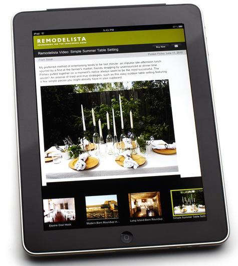
There are home design apps that shout, “Look at me, I have 3D rendering, augmented reality, and enough buttons to land a small aircraft.” Then there is Remodelista, the design world’s quietly confident friend who walks into a room, notices the bad cabinet pulls, and somehow fixes your entire taste level before coffee. The story of the Remodelista updated iPhone/iPad apps is not only about one app refresh from the early golden age of Apple mobile design. It is also about how design inspiration, product sourcing, and remodeling research moved from desktop browsing to fingertips, couch cushions, subway rides, job sites, and, let’s be honest, bed at 11:47 p.m. when “just one more kitchen idea” becomes a personality trait.
Remodelista built its reputation as a sourcebook for the considered home: edited, useful, minimalist-but-not-cold, stylish-but-not-silly, and highly focused on products, materials, rooms, and real spaces that age better than trend-cycle confetti. When its iPhone and iPad apps were updated, the improvements reflected exactly what readers wanted from a design app: bigger images, smoother browsing, stronger search, category discovery, bookmarking, product information, and a more direct path from “I love that sconce” to “where do I buy that sconce before I forget its name forever?”
Why the Remodelista App Update Mattered
The updated Remodelista iPhone and iPad apps arrived at a fascinating moment in digital design culture. The iPad had recently entered the market, the iPhone was becoming a daily browsing device, and design media was learning that readers did not want tiny, pinched, desktop-style pages crammed into mobile screens. They wanted a mobile experience that respected the image. In home design, the photo is not decoration; it is evidence. A kitchen image shows proportion, light, texture, cabinet spacing, hardware finish, and whether that open shelving fantasy can survive actual bowls.
The original Remodelista app already offered quick access to daily content, the full archive of posts, and product lists associated with articles. The updated version went further. It kept the photo-rich format but added enhanced search, improved browsing through product and post archives, a Buy Now button, content-category search, and the My Design Files bookmarking feature. In plain English: it became less like flipping through a beautiful magazine in a waiting room and more like carrying a portable design research desk.
That distinction is important. Inspiration is lovely, but remodeling demands memory. You need to remember the faucet, the pendant, the tile layout, the hardware finish, the storage idea, the paint direction, and the name of the designer whose kitchen made you whisper, “Oh no, now I hate my backsplash.” A mobile app that lets users save, search, browse, and act is far more useful than one that simply serves pretty pictures.
The Core Features of the Updated Remodelista iPhone/iPad Apps
1. A Photo-Rich Format Built for Design Browsing
Remodelista has always understood that design readers do not skim interiors the way they skim weather reports. They inspect. They zoom mentally, even when their fingers do not zoom physically. They look at cabinet lines, chair silhouettes, countertop thickness, linen texture, and how natural light hits a plaster wall. The updated iPhone/iPad apps preserved the brand’s image-forward experience, making photos the hero rather than burying them under interface clutter.
This was especially valuable on the iPad. A tablet naturally suits interior design content because it feels closer to a magazine, mood board, and shopping catalog in one. Compared with a desktop screen, it is portable. Compared with a phone, it offers enough visual breathing room to appreciate rooms, materials, and product details. The Remodelista app leaned into that advantage by presenting posts with strong images, chronological thumbnails, and tap-friendly navigation.
2. Enhanced Search for Posts and Products
The updated apps made search more powerful, allowing users to explore Remodelista’s sourcebook of both products and posts. That sounds simple until you have tried to find “that black wall-mounted faucet from the bathroom article with the marble sink, maybe from 2010, possibly Italian, definitely expensive-looking.” Design memory is not always precise. Search has to forgive human chaos.
For Remodelista readers, enhanced search was a practical upgrade. Instead of scrolling endlessly through archives, users could look for product categories, room ideas, lighting references, furniture, hardware, or design themes. Search transforms a design app from a passive feed into a working resource. It helps homeowners, renters, stylists, architects, and enthusiastic weekend browsers move from vague interest to specific action.
3. Category Browsing Across 15 Content Areas
The updated Remodelista apps also allowed users to search by 15 content categories, including beloved editorial formats such as 10 Easy Pieces, Steal This Look, Shopper’s Diary, and Lighting. This matters because design inspiration is rarely linear. A reader may not begin with “I need a brass task lamp under $300.” They may begin with “I want my entryway to look less like a shoe crime scene.” Category browsing helps users wander productively.
Editorial categories give structure to discovery. “Steal This Look” appeals to readers who want a room broken down into attainable parts. “10 Easy Pieces” works for comparison shoppers who want curated options without opening 47 browser tabs and losing the will to live. “Shopper’s Diary” offers the pleasure of finding stylish sources, while lighting categories support one of the most misunderstood parts of home design: illumination that does not make everyone look like they are being interrogated.
4. A Buy Now Button for Faster Product Discovery
The Buy Now button may sound ordinary today, but for a design sourcebook app, it represented a useful bridge between editorial inspiration and purchasing. Design content often creates a frustrating gap: readers see a beautiful product, then have to hunt for it through vague captions, expired links, or retailer pages that seem designed by someone who has never wanted to find anything quickly.
By placing product access closer to the image and story, the updated Remodelista app supported a smoother user journey. This did not turn the app into a loud shopping mall. Instead, it respected the way Remodelista readers shop: carefully, with context. A Buy Now button inside a curated design environment is not merely a sales feature; it is a sourcing tool. It helps users connect editorial taste with real-world decisions.
5. My Design Files Bookmarking
My Design Files was one of the most reader-friendly additions because it acknowledged a basic truth: remodeling projects generate more saved ideas than any normal brain can hold. A kitchen renovation alone can involve cabinet fronts, pulls, tiles, appliances, stools, lighting, faucets, flooring, and the emotional support snacks required to survive contractor quotes.
Bookmarking gives order to that storm. Users could store favorite posts and manage ideas inside the app, turning Remodelista from a reading experience into a planning companion. For long-term projects, this is invaluable. A saved product or post can become a reference during a showroom visit, a conversation starter with a designer, or proof that yes, you really did say you wanted matte black hardware before everyone else in the household developed sudden opinions.
How the App Reflected Remodelista’s Editorial Identity
Remodelista’s app worked because it translated the brand’s editorial values into mobile form. The site’s identity has long centered on timeless design, practical sourcing, thoughtful products, and a mix of high and low. It is not about chasing whatever color is trending this week unless that color also happens to look good after the algorithm gets bored.
The updated app did not overload users with gimmicks. Instead, it improved the parts of the experience that mattered: search, images, categories, product access, and saving. That restraint is very Remodelista. The best design tools do not scream for attention; they reduce friction. They let the room, object, material, or idea come forward.
This is also why the update still feels relevant as a case study. Modern app design often prizes novelty, but homeowners and design professionals need clarity. A remodeling app should help users answer practical questions: What style am I drawn to? What products fit this look? Where can I find them? How do I save my favorites? How do I compare options later? The Remodelista update answered those questions with quiet efficiency.
Why iPhone and iPad Were Ideal Platforms for Remodelista
The iPhone made design inspiration pocketable. The iPad made it immersive. Together, they changed how people collected home ideas. Before mobile browsing matured, homeowners often researched from desktop computers, printed pages, clipped magazine spreads, or built folders full of links with names like “kitchen-final-final-real-final.” Mobile apps made the process more immediate.
On an iPhone, a user could browse Remodelista during a commute, in a store aisle, or while standing in a half-painted room wondering whether “warm white” and “cream” are secretly enemies. On an iPad, the same user could sit with a partner, designer, or contractor and review images at a more comfortable size. The tablet became a shared visual tool, especially useful for comparing room concepts and product details.
The updated app’s image quality also mattered. Interior design depends on visual nuance, and early high-resolution Apple displays helped make mobile design content more compelling. A photo of a kitchen, bedroom, or bath loses authority if it looks muddy, tiny, or awkwardly cropped. Remodelista’s photo-rich format aligned naturally with the strengths of Apple’s devices.
SEO Lessons from the Remodelista App Update
Although the update was about mobile apps, it also offers useful SEO lessons for design publishers today. Search engines reward helpful, accessible, well-structured content, and mobile experience plays a major role in how users discover and engage with a website. The same principles that made the Remodelista app useful also support strong organic visibility: clear categories, searchable archives, image-rich content, product relevance, and a smooth path from inspiration to action.
For publishers in home improvement, interior design, architecture, and lifestyle, the key lesson is simple: do not make users fight your archive. Great content becomes more valuable when it is easy to rediscover. Remodelista’s category structure, product sourcebook approach, and bookmarking mindset all support repeat visits. A reader who saves ideas today may return next month with a budget, a contractor, and a dangerous confidence around tile samples.
What Modern Design Apps Can Learn from Remodelista
Keep the Interface Quiet
Design content needs space. A cluttered app interface competes with the rooms and products it is supposed to showcase. Remodelista’s app update succeeded because it improved utility without turning the experience into a button parade.
Make Search Feel Human
Users often search with incomplete memory. Strong search should support product names, categories, materials, rooms, styles, and editorial formats. A good home design app understands that “small white bathroom brass mirror” may be the best a tired renovator can do.
Support Saving and Comparing
Bookmarking is not a bonus feature in design research; it is survival gear. Whether users are planning a whole-house remodel or choosing bedside lamps, they need a place to collect and revisit ideas.
Connect Inspiration to Sources
Beautiful images are powerful, but sourcing gives them practical value. Product lists, Buy Now buttons, and catalog search help users move from admiration to execution.
Practical Examples: How Readers Could Use the Updated App
Imagine a homeowner planning a kitchen refresh. She opens the Remodelista app on an iPad and browses Kitchen of the Week features for layout inspiration. She saves posts with open shelving that actually looks livable, not like a ceramics museum run by a very calm person. Then she searches lighting categories and saves several sconces and pendants. Later, on her iPhone, she checks those saved ideas while visiting a showroom.
Or consider a renter who cannot renovate but wants a more polished bedroom. He searches 10 Easy Pieces for bedside lighting, browses Steal This Look for small-space ideas, and saves products that fit a modest budget. The app becomes less about major remodeling and more about better decision-making. That flexibility is part of the Remodelista appeal: it serves full renovations, small upgrades, and everything between.
A designer could use the app differently, treating it as a mobile reference library. During a client conversation, bookmarked images help clarify taste: warm minimalism versus stark minimalism, rustic texture versus farmhouse overload, vintage charm versus “grandma’s basement but make it expensive.” Visual references reduce misunderstanding, which is a gift to everyone involved.
The Larger Shift: From Magazine Browsing to Mobile Design Sourcebooks
The Remodelista updated iPhone/iPad apps reflected a larger transformation in design media. Traditional shelter magazines inspired readers, but mobile sourcebooks made inspiration searchable, savable, and actionable. Instead of tearing out pages, readers could build digital collections. Instead of guessing where a product came from, they could tap through to sourcing information. Instead of waiting for the next issue, they could browse daily dispatches.
This shift helped reshape how people approach home projects. Design research became more continuous and less formal. A remodel no longer began only with a binder or a showroom visit. It could begin with a saved image during lunch, a product search on a train, or a late-night scroll through lighting ideas while pretending to be “almost asleep.”
Experience Section: Living With the Remodelista Updated iPhone/iPad Apps Mindset
The most useful way to understand the Remodelista updated iPhone/iPad apps is to think about the experience they encouraged: slower looking, smarter saving, and more confident sourcing. In practical use, a design app like this becomes a bridge between dreaming and doing. Many people begin a home project with a mood rather than a plan. They know they want a calmer kitchen, a more useful mudroom, a less chaotic bathroom, or a living room that does not look assembled during a furniture emergency. The app experience helps translate that mood into patterns.
After browsing several Remodelista posts, users begin to notice repeated preferences. Maybe they save rooms with unlacquered brass, simple peg rails, pale wood, linen curtains, and utilitarian lighting. Maybe every saved kitchen has open shelves, soapstone counters, and a quiet palette. Maybe every bathroom they love includes wall-mounted faucets and tile that costs just enough to make the budget spreadsheet cough politely. These repeated saves become a design language. The app does not merely show options; it helps users discover their own taste.
The iPad experience is especially helpful when comparing ideas side by side in real life. A homeowner can sit at the dining table with a partner and review saved posts without crowding around a laptop. The larger screen makes it easier to discuss proportion, finishes, and layout. It also reduces the classic remodeling argument where one person says “modern” and the other hears “airport lounge.” Visual references create a shared vocabulary. That alone can save hours of debate and possibly one dramatic trip to the paint store.
The iPhone experience is more spontaneous. It shines in stores, flea markets, design centers, and job sites. A user can pull up a saved Remodelista post to compare a pendant shape, check a product idea, or remind themselves why they wanted a particular cabinet pull. This is where bookmarking becomes more than convenience. It becomes decision support. Home projects are full of tiny choices that feel harmless until there are 300 of them. Having a portable design file keeps those choices connected to the original vision.
Another valuable part of the experience is restraint. Remodelista’s editorial style encourages thoughtful selection rather than frantic accumulation. That matters because digital inspiration can easily turn into visual junk food. One minute you are saving a practical storage idea; the next, you are convinced your laundry room needs handmade Moroccan tile and a vintage portrait of a horse. The best design apps help users refine, not just collect. Remodelista’s categories, curated product lists, and sourcebook approach support a more disciplined process.
For professionals, the app mindset is equally useful. Designers, stylists, and architects often need quick references that communicate mood without overwhelming clients. A saved Remodelista image can explain warmth, scale, simplicity, or material honesty faster than a long paragraph. Product-linked posts also help move discussions from abstract taste to available options. That is the difference between “I like this feeling” and “Here are three lights that create this feeling.”
Even for casual readers, the experience has lasting value. You may not be remodeling today, but repeated exposure to well-edited spaces sharpens the eye. You start noticing better proportions, better materials, and better storage solutions. You become harder to fool with flimsy trends. This is the quiet power of a good design app: it improves your visual judgment while pretending to be a pleasant scroll. Very sneaky. Very useful.
Conclusion
The Remodelista updated iPhone/iPad apps were more than a routine mobile refresh. They showed how a trusted design source could become more searchable, portable, visual, and practical without losing its editorial soul. With enhanced search, category browsing, product sourcing, a Buy Now button, ad-free access, and My Design Files bookmarking, the app update addressed real reader behavior: people want to discover beautiful ideas, save them, compare them, and eventually use them in actual rooms where actual humans spill coffee.
For today’s design publishers and app makers, the lesson remains clear. A successful home design app does not need to do everything. It needs to do the right things elegantly. It should respect images, simplify navigation, support search, preserve favorites, and connect inspiration to sources. Remodelista understood that the considered home begins with considered tools. And if those tools can live on an iPhone or iPad, all the better. After all, the perfect cabinet pull waits for no one.
Note: This clean HTML body article is prepared for web publishing. Source links are intentionally omitted in the visible article, and the content is synthesized from real Remodelista, Apple, mobile UX, SEO, and home-design app references.