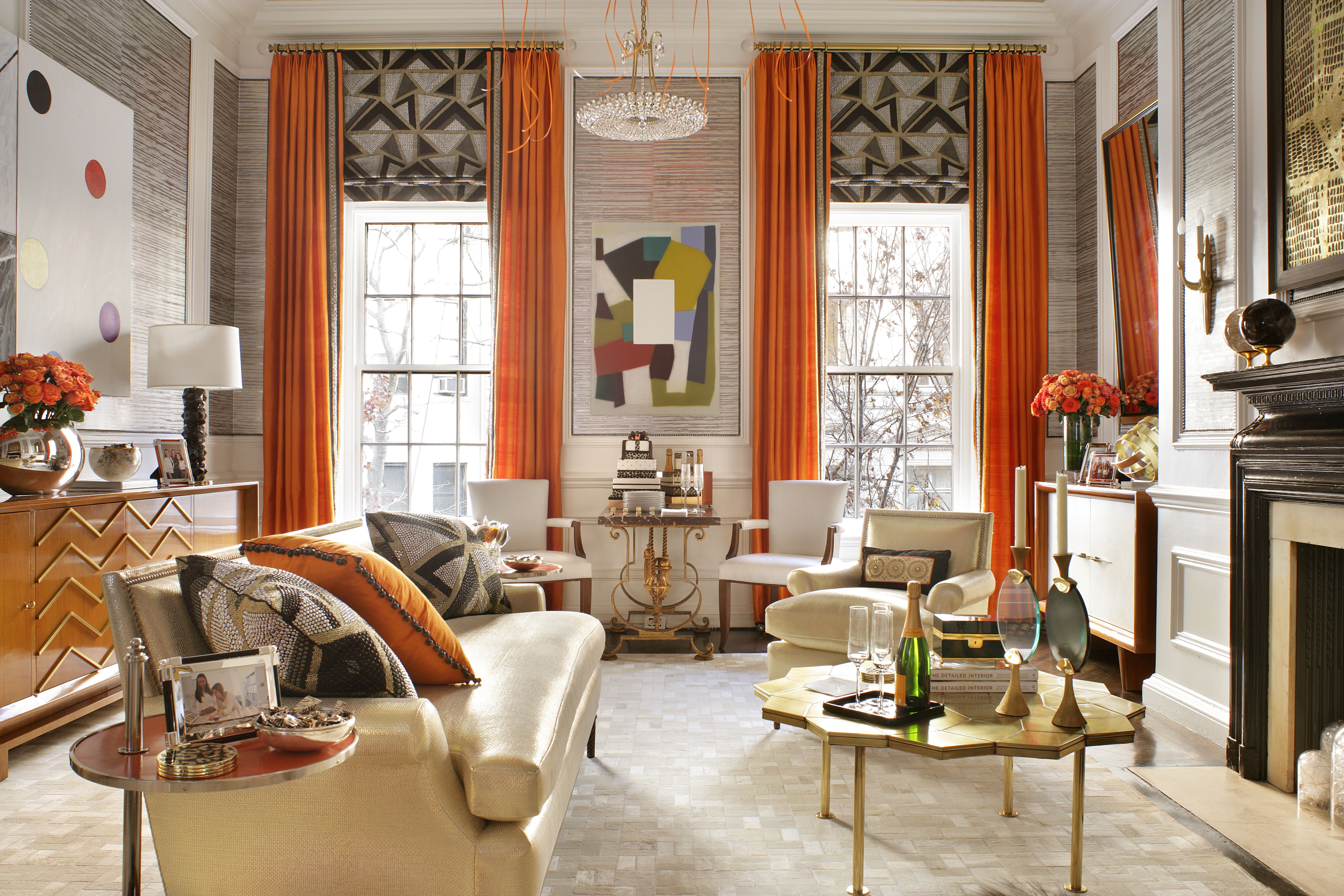
Burnt orange has officially wandered out of the 1970s conversation pit, brushed the shag rug off its shoulders, and stepped confidently back into modern home decor. Once associated with lava lamps, avocado appliances, and sofas large enough to host a small jazz band, this warm, earthy shade is now being reimagined in stylish, sophisticated, and surprisingly versatile ways.
The comeback makes sense. After years of cool gray walls, white kitchens, and interiors that looked like they were politely whispering, homeowners are craving color with personality. Burnt orange delivers warmth without shouting, nostalgia without feeling like a costume party, and depth without making a room look dark or heavy. It sits somewhere between rust, terracotta, amber, and copper, making it one of the most flexible colors in the warm-color family.
Whether you want a full retro-inspired living room, a cozy bedroom, a bold kitchen moment, or just one fabulous pillow that says, “Yes, I have taste,” burnt orange can work beautifully. The key is knowing how to balance it with the right materials, colors, lighting, and scale.
What Is Burnt Orange?
Burnt orange is a deep, warm orange shade with brown, red, and sometimes copper undertones. Unlike bright citrus orange, which can feel energetic and playful, burnt orange feels grounded, cozy, and mature. Think autumn leaves, sunbaked clay, leather armchairs, paprika, desert sunsets, and that perfect vintage ceramic vase you found at a flea market and immediately pretended you had been “collecting” for years.
In interior design, burnt orange works because it behaves like both a color and a neutral. It has enough personality to become a focal point, but its earthy base allows it to blend with woods, stone, woven textures, creamy whites, deep greens, navy blues, and chocolate browns. That combination of warmth and flexibility is exactly why the shade is showing up again in modern homes.
Why Burnt Orange Is Trending Again
Color trends often reflect how people want their homes to feel. Right now, many homeowners are moving away from sterile minimalism and toward spaces that feel layered, lived-in, and emotionally warm. Burnt orange fits perfectly into that shift. It brings comfort, personality, and visual richness without requiring a complete design overhaul.
The Return of ’70s-Inspired Interiors
The 1970s are back in home decor, but thankfully, not every part of the decade got an invitation. Today’s version is less “basement rec room with questionable paneling” and more “warm, collected, textural, and relaxed.” Burnt orange was a signature shade of the decade, often paired with mustard yellow, olive green, brown, and cream. In modern spaces, those combinations are being refined with cleaner lines, better lighting, and more intentional styling.
Instead of using burnt orange on every surface, designers are using it as a strategic accent, a rich wall color, or a statement furniture choice. The result feels nostalgic but not dated. It nods to retro design while still looking fresh enough for a contemporary apartment, suburban home, or cozy bungalow.
Warm Earth Tones Are Replacing Cool Neutrals
For years, cool grays dominated interiors. Gray walls, gray sofas, gray floors, gray everything. Very peaceful. Also, sometimes very “waiting room with a scented candle.” Now, warmer earth tones are taking over because they make spaces feel more human and inviting. Burnt orange belongs to the same family as terracotta, clay, camel, rust, ochre, and warm brown.
These shades pair naturally with organic materials like wood, linen, wool, rattan, stone, leather, and ceramic. That makes burnt orange a strong choice for homeowners who want a cozy interior that still feels elegant and grounded.
How to Decorate with Burnt Orange Without Overdoing It
Burnt orange is charming, but it does have main-character energy. Use too much of it without balance, and a room can start to feel visually heavy. The trick is to decide whether you want burnt orange to be the star, the supporting actor, or the witty side character who steals every scene.
Start Small with Accessories
If you are new to decorating with burnt orange, begin with accents. Throw pillows, blankets, vases, lampshades, artwork, table runners, and small rugs are low-risk ways to test the color. These pieces can instantly warm up a neutral room without requiring paint, upholstery, or a long conversation with your budget.
In a white or beige living room, try two burnt orange velvet pillows on a cream sofa. In a bedroom, add a rust-orange throw at the foot of the bed. In a dining room, use burnt orange napkins, ceramic dishes, or taper candles for a cozy dinner-party look. Small touches allow the color to feel intentional rather than overwhelming.
Make a Statement with Furniture
A burnt orange sofa, armchair, ottoman, or headboard can become the centerpiece of a room. This works especially well when the surrounding palette is calm and neutral. A burnt orange velvet sofa against warm white walls, paired with walnut wood tables and brass lighting, can look polished, cozy, and expensiveeven if you assembled the side table with an Allen wrench and mild emotional distress.
When choosing a large furniture piece, pay attention to fabric. Velvet makes burnt orange feel luxurious and dramatic. Linen or cotton makes it feel casual and relaxed. Leather gives it a vintage, masculine, or midcentury look. Bouclé or textured upholstery can soften the shade and make it feel more contemporary.
Try a Burnt Orange Accent Wall
Paint is one of the most powerful ways to use burnt orange. An accent wall behind a bed, sofa, built-in shelving unit, or dining nook can add depth and warmth. Because burnt orange has a strong presence, it often works best in rooms with good natural light or spaces where you want a cozy, enveloping effect.
For a modern approach, pair a burnt orange accent wall with creamy trim, light oak floors, and simple black hardware. For a more dramatic look, combine it with dark wood furniture, deep green accents, and layered lighting. If painting a whole wall feels like too much commitment, try the shade on a door, ceiling detail, fireplace surround, or built-in cabinet.
Best Colors to Pair with Burnt Orange
Burnt orange plays surprisingly well with others. It can look retro, modern, rustic, bohemian, or refined depending on the color palette around it. Here are some of the best combinations for today’s interiors.
Burnt Orange and Cream
Cream is one of the easiest partners for burnt orange. It softens the intensity of the shade and keeps the room feeling airy. This combination works beautifully in living rooms, bedrooms, and dining areas. Use cream walls, a light rug, and natural linen curtains to let burnt orange furniture or decor shine.
Burnt Orange and Navy Blue
Navy blue brings contrast and sophistication to burnt orange. Because blue and orange sit opposite each other on the color wheel, they naturally create energy. A navy wall with burnt orange artwork, or a burnt orange chair beside a navy sofa, can feel bold but balanced.
Burnt Orange and Olive Green
Olive green and burnt orange are a dream team for earthy interiors. Together, they create a grounded palette that feels connected to nature. Add wood, woven baskets, plants, and aged brass to complete the look. This pairing works especially well in boho, rustic, midcentury, and eclectic homes.
Burnt Orange and Chocolate Brown
If you want a rich, retro-inspired palette, pair burnt orange with chocolate brown. To keep the combination from feeling too heavy, add cream, tan, or light wood. A brown leather sofa with burnt orange pillows and a cream rug can feel warm and sophisticated rather than dated.
Burnt Orange and Soft Pink
For a softer, more modern take, combine burnt orange with blush, dusty rose, or muted peach. This palette feels warm, stylish, and slightly unexpected. It works well in bedrooms, nurseries, powder rooms, and creative spaces.
Burnt Orange and Gray
Gray can still work with burnt orange, especially if the gray has warm undertones. Pairing burnt orange with charcoal, greige, or soft warm gray can make a room feel balanced and contemporary. Avoid icy blue-gray tones, which may clash with the warmth of orange.
Room-by-Room Burnt Orange Decorating Ideas
Living Room
The living room is one of the best places to use burnt orange because it naturally creates a welcoming atmosphere. Try a burnt orange sofa with cream walls and walnut furniture for a polished look. If you prefer a subtler approach, use burnt orange pillows, curtains, or artwork against a neutral sofa.
For a midcentury-inspired living room, combine burnt orange with teak furniture, geometric patterns, globe lighting, and a low-profile coffee table. Just remember: one or two retro references are stylish. Twelve retro references and a fondue fountain may be legally considered a theme restaurant.
Bedroom
In a bedroom, burnt orange adds warmth and intimacy. Use it in bedding, a headboard, wall art, or a painted feature wall behind the bed. Pair it with ivory sheets, wood nightstands, and soft lighting for a restful look. If you want the room to feel calm, keep the rest of the palette simple and let burnt orange act as the cozy accent.
Kitchen
Burnt orange can make a kitchen feel lively and inviting. Consider using it on lower cabinets, bar stools, tile, small appliances, or open-shelf decor. It pairs beautifully with cream walls, brass fixtures, butcher block counters, and deep green or navy accents.
If a full burnt orange kitchen feels too bold, use the color in smaller moments: a runner rug, ceramic bowls, pendant lights, or a painted pantry door. These details add charm without making your kitchen look like it time-traveled from 1974 carrying a casserole dish.
Dining Room
Burnt orange is excellent for dining spaces because it feels warm, social, and appetite-friendly. Try burnt orange dining chairs around a wood table, or use the color on an accent wall with framed art. Add brass candlesticks, woven placemats, and amber glassware for a layered table setting.
Bathroom
Bathrooms are perfect for experimenting with bold colors. Burnt orange tile, wallpaper, towels, or a painted vanity can make a small bathroom feel memorable. Pair the shade with cream tile, black fixtures, and warm wood shelves for a boutique-hotel feel.
Home Office
Because burnt orange is energetic but grounded, it can work well in a home office. Use it behind a desk, on a chair, or in artwork to add creativity and focus. Balance it with natural wood, soft white walls, and good lighting so the room feels inspiring rather than distracting.
Best Materials and Textures for Burnt Orange Decor
Texture is what keeps burnt orange from looking flat. Since the color already has warmth, pairing it with tactile materials makes it feel even richer.
Velvet
Burnt orange velvet is dramatic, cozy, and glamorous. It works beautifully for sofas, pillows, dining chairs, and headboards. Velvet catches light in a way that gives the color movement and depth.
Leather
Rust-orange leather has a vintage quality that feels timeless. A leather armchair or ottoman can add character to a living room, library, or bedroom corner.
Ceramic and Terracotta
Ceramic vases, clay pots, and terracotta tiles naturally complement burnt orange. These materials make the shade feel organic and handcrafted.
Wood
Burnt orange looks especially good with warm woods like walnut, oak, teak, and acacia. Wood helps ground the color and gives the room a natural, welcoming feel.
Brass and Gold Metal
Brass lighting, gold picture frames, and warm metallic hardware pair beautifully with burnt orange. These finishes enhance the color’s warmth and add polish.
Common Mistakes to Avoid
Using Too Many Retro Colors at Once
Burnt orange, mustard yellow, avocado green, and brown can look amazing together, but they need breathing room. Use one or two dominant colors and let the others appear in smaller accents. Otherwise, your room may begin auditioning for a 1970s sitcom.
Ignoring Lighting
Lighting changes how burnt orange looks. In bright daylight, it can appear lively and warm. In dim rooms, it may look darker, rustier, or browner. Always test paint samples and fabric swatches in your actual room before committing.
Forgetting Neutral Balance
Burnt orange needs balance. Cream, warm white, beige, tan, black, natural wood, and woven textures can calm the shade and make the room feel intentional.
Choosing the Wrong Undertone
Some burnt orange shades lean red, while others lean brown, copper, or terracotta. Red-orange feels bold and spicy. Brown-orange feels earthy and subtle. Terracotta-orange feels Mediterranean and organic. Choose the version that matches your home’s existing palette.
How to Make Burnt Orange Look Modern
To keep burnt orange from feeling dated, pair it with clean shapes, natural materials, and edited styling. A burnt orange sofa with sleek black legs, a simple cream rug, sculptural lighting, and minimal artwork will feel much more modern than the same sofa surrounded by heavy drapes, dark paneling, and too many patterned accessories.
Modern burnt orange works best when it has contrast. Use crisp white walls, matte black details, contemporary furniture silhouettes, or large-scale abstract art. Another stylish approach is color blocking: pair burnt orange with dusty rose, olive, clay, or warm beige in simple geometric areas.
Budget-Friendly Ways to Add Burnt Orange
You do not need to redecorate your entire home to enjoy this trend. In fact, burnt orange is often more effective in small doses. Try these affordable updates:
- Swap in burnt orange pillow covers on a neutral sofa.
- Add a rust-colored throw blanket to a bed or accent chair.
- Paint a thrifted side table, stool, or mirror frame.
- Use burnt orange taper candles for a dining table centerpiece.
- Frame abstract art that includes rust, clay, or copper tones.
- Add terracotta planters to shelves, windowsills, or patios.
- Choose a small burnt orange rug for an entryway or kitchen.
These updates are easy to change later, which is ideal if you like following trends but do not want your home to become a museum of past decisions.
Outdoor Decorating with Burnt Orange
Burnt orange is not just for interiors. It works beautifully outside because it echoes natural materials like clay, brick, stone, and autumn foliage. Use it in outdoor cushions, planters, umbrellas, rugs, or painted furniture.
On a patio, burnt orange pairs well with black metal furniture, rattan chairs, wood benches, and greenery. It also looks gorgeous with cream outdoor curtains and string lights. The result is warm, relaxed, and perfect for entertaining.
Experience Notes: Living with Burnt Orange in Real Homes
One of the best things about burnt orange is that it rarely feels boring. In real homes, it has a way of making ordinary corners feel designed. A plain reading nook becomes cozier with a burnt orange chair. A white bedroom feels more layered with rust-colored bedding. A kitchen shelf looks more collected with a few terracotta bowls and amber glass jars.
From a practical decorating perspective, burnt orange is especially helpful when a room feels too cold. Many homes have white walls, gray sofas, black fixtures, and pale flooring. That combination can look clean, but it may also feel unfinished. Adding burnt orange instantly warms the space, almost like turning on a visual fireplace. The room does not just look different; it feels more inviting.
In my experience with styling color palettes, burnt orange works best when it is repeated at least twice in a room. For example, if you add one burnt orange pillow to a sofa and nothing else, it may look random. But if you repeat the color in artwork, a vase, a rug detail, or a lampshade, the room suddenly feels intentional. Designers call this repetition; regular people call it “Oh, that actually looks pulled together.”
Another useful lesson is that burnt orange loves natural light, but it does not require it. In sunny rooms, the color feels cheerful and warm. In darker rooms, it becomes moodier and more dramatic. That means the same shade can behave differently depending on where you use it. A burnt orange velvet pillow in a bright living room might look playful, while the same color on a powder room wall might feel bold and luxurious.
Texture also makes a major difference. Flat burnt orange fabric can sometimes look plain, but velvet, wool, linen, clay, and leather give the shade more depth. If you are worried the color will look too loud, choose textured pieces in muted rust or terracotta tones. They feel softer and easier to live with.
For renters, burnt orange is a dream because it does not require permanent changes. A rug, duvet cover, curtains, art print, or set of dining chairs can completely shift a room’s mood. Even removable wallpaper in a rust or terracotta pattern can create a dramatic accent wall without angering the security deposit gods.
For homeowners, burnt orange can be used more boldly. Painted cabinetry, tiled backsplashes, built-ins, and accent ceilings all work when the rest of the design is carefully balanced. The most successful spaces usually combine burnt orange with calm neutrals, wood, greenery, and good lighting. The least successful spaces tend to use it everywhere at once, which can make a room feel visually hot.
The final experience-based tip is simple: do not decorate from memory alone. The burnt orange you remember from an old family photo may not be the burnt orange you want today. Modern versions are often softer, dustier, richer, and more refined. Test samples, compare fabrics, and look at the color during the day and at night. Burnt orange is forgiving, but it still deserves a proper audition before it gets the starring role.
Conclusion
Burnt orange is back because it offers what many modern homes are missing: warmth, character, and a little bit of joy. It can feel retro, elegant, rustic, artistic, or modern depending on how you style it. Use it in small accents for a gentle update, or go bold with furniture, paint, tile, or cabinetry for a stronger design statement.
The secret is balance. Pair burnt orange with creams, browns, navy, olive green, warm gray, brass, wood, and natural textures. Let it bring energy to the room, but give it enough neutral space to breathe. Done well, this ’70s shade does not feel old-fashioned at all. It feels warm, confident, and completely ready for its comeback tour.