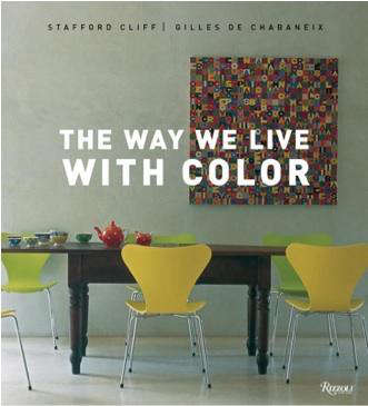
If you have ever stared at a room and thought, “Nice sofa, but why does this place still feel like a waiting room with trust issues?” then The Way We Live with Color is your kind of design book. Written by Stafford Cliff and photographed by Gilles de Chabaneix, this beautifully illustrated volume is not just about paint chips or trendy shades. It is about how color shapes mood, architecture, memory, and daily life. That sounds lofty, yes, but in the best possible way. This is not color as decoration alone. This is color as atmosphere, storytelling, and the secret sauce that makes a house feel lived in rather than staged for a suspiciously perfect real estate listing.
Originally published by Rizzoli as part of the broader The Way We Live series, the book moves from broad design ideas to room-by-room inspiration. Along the way, it explores how different homes, regions, materials, and cultural sensibilities use color to create identity. The result is a design book that feels generous instead of preachy. It offers inspiration without barking orders. It invites you to look harder at walls, floors, furniture, textiles, glass, stone, and light and realize that color is not one decision. It is a thousand tiny decisions working together.
What The Way We Live with Color Is Really About
At first glance, this design book looks like a feast for the eyes. And it is. The pages are packed with interiors that range from crisp and formal to relaxed and sun-soaked. But the deeper lesson is that color is never floating in space by itself. It lives inside architecture. It reacts to texture. It changes under daylight, soft lamp glow, and the kind of overhead lighting that has ruined many a brave paint decision.
One of the most interesting ideas connected to the book is its progression from the general to the specific. Instead of jumping straight into “paint this wall blue and call it a personality,” it begins with housing styles and the way color responds to them. That is smart design thinking. A white clapboard New England house has a different visual rhythm than a Caribbean-inspired home dressed in pale, playful pastels. The architecture is speaking first; color is answering back.
This is why the book still feels relevant. Good design books age badly only when they confuse trends with truth. The Way We Live with Color lasts because it pays attention to principles: balance, proportion, mood, cultural context, and the emotional pull of color in everyday spaces.
Why This Design Book Still Feels Fresh
1. It treats color as a way of living, not just decorating
Some decorating books act like color is a final flourish, the parsley on the mashed potatoes of interior design. This book argues the opposite. Color is structural. It affects how calm, energized, cozy, airy, grounded, or dramatic a room feels. That matters because people do not merely look at rooms. They live in them, nap in them, argue in them, scroll in them, and occasionally eat pizza on the rug in them.
2. It understands that materials carry color too
One of the book’s strongest ideas is that color is not limited to painted walls. Metals, brick, wood, glass, stone, tile, and textiles all contribute to the emotional temperature of a room. A muted green velvet chair, a rust-toned clay tile floor, a smoked-glass lamp, and warm oak shelving are all color decisions, even when no one has opened a paint can. This wider lens makes the book more useful than narrow paint-only guides.
3. It shows contrast without chaos
Colorful homes can go wrong fast. One minute you are feeling “bold and expressive,” and the next minute your living room looks like a bag of jelly beans exploded. The beauty of this book is that it celebrates vivid interiors without turning them into visual noise. The rooms feel edited. Saturated hues are balanced by natural materials, soft neutrals, or repetition of tone. In other words, the book has taste. That helps.
Big Lessons from The Way We Live with Color
Color should respond to architecture
A room with ornate moldings, traditional paneling, or historical bones may want a different palette than a modern loft with steel windows and concrete floors. This does not mean traditional homes must be beige and modern homes must be gray. It means color works best when it feels aware of the room’s lines, scale, and light. In classic spaces, softer layered palettes often amplify elegance. In cleaner, more contemporary spaces, strong blocks of color can emphasize shape and structure.
Warm and cool colors create different emotional weather
Warm tones such as terracotta, ochre, coral, and gold often feel social, welcoming, and energetic. Cool shades like sage, dusty blue, lavender, and misty gray can feel restful, airy, and composed. The design trick is not to choose one camp forever, but to use each where it supports the room’s purpose. A dining room can handle more warmth and drama. A bedroom usually benefits from colors that lower the volume a little. Unless your sleep style is “nightclub, but horizontal.”
Undertones are the tiny tyrants of interior design
If you have ever painted a wall “soft white” only to discover it dried “mildly pink and strangely judgmental,” you have met undertones. The book’s visual approach pairs beautifully with modern color advice: always consider the hidden cast beneath a hue. A gray may read blue, green, violet, or brown. A cream may swing yellow or peach. These undertones matter because they have to live peacefully with flooring, cabinets, upholstery, and natural light. Interior harmony is often less about the main color and more about those subtle undertone relationships.
Texture makes color richer
Flat color can feel one-dimensional. But the same hue becomes more interesting across linen, lacquer, matte paint, velvet, plaster, and ceramic glaze. This is where The Way We Live with Color earns its keep as a design book rather than just a pretty catalog. It reminds readers that blue on a wall is not the same as blue in mohair, blue in enamel, or blue reflected through glass. Texture turns color into an experience.
How to Use the Book’s Ideas in a Real Home
Start with what is not changing
Before picking a palette, look at your fixed elements: flooring, countertops, fireplaces, tile, large rugs, and big furniture pieces. These act like the band members already on stage before your paint color arrives with a tambourine. If your kitchen cabinets have red undertones in the wood, that will affect which whites, greens, or blues feel harmonious. If your stone fireplace leans cool gray, muddy warm taupes may fight it.
Build a palette instead of choosing a hero color in isolation
The smartest color decisions happen in groups. A practical way to think about this is the classic 60-30-10 rule: around 60 percent dominant color, 30 percent secondary color, and 10 percent accent. This prevents a room from feeling either flat or frantic. For example, a living room might use soft greige on the walls, moss green in upholstery, and aubergine in pillows and artwork. Suddenly you have a palette, not just a wall color.
Use the color wheel like an adult, not like a panicked contestant on a game show
Analogous palettes, which use neighboring colors on the wheel, tend to feel calm and cohesive. Think blue, blue-green, and green. Complementary schemes, which pair opposites such as blue and orange or green and red, create more energy and contrast. Both can work beautifully. The difference is control. A complementary scheme often works best when one color leads and the other appears in measured accents.
Test colors in changing light
This tip may sound boring, but boring saves money. Paint samples should be viewed in daylight, at dusk, under lamps, and on cloudy days. Color is moody. It shapeshifts. A pale mushroom tone that looks elegant at noon can turn drab by evening. A blue-green that feels breezy in sunlight may look almost gray after sunset. The book’s photography makes this obvious in a beautiful way: light is never separate from color.
Room-by-Room Inspiration from the Book’s Way of Thinking
Living room: layered confidence
The living room is often where people either play it too safe or take one wild swing and never emotionally recover. A better approach is layered color. Start with a steady base such as warm white, stone, or soft olive. Then add a secondary color through upholstery, curtains, or a rug. Finish with smaller accents in brass, rust, plum, cobalt, or black. The goal is not a rainbow. It is depth.
Kitchen: color with appetite and energy
Kitchens can support more personality than people think. Soft butter yellow, muted green, inky navy, terracotta, and chalky blue all have a long design history in kitchens because they pair well with wood, metal, stone, and ceramic surfaces. If painting cabinets feels like emotional skydiving, bring in color through backsplash tile, bar stools, lighting, or even painted trim.
Bedroom: calm does not have to mean dull
Bedrooms often benefit from cool or softened tones, but peaceful does not equal plain. Dusty rose, sage, smoky blue, lavender gray, and creamy mushroom can create restful rooms with personality. Add tonal variation through bedding, drapery, and a rug so the space feels cocooning rather than blank.
Small spaces: be brave on purpose
Powder rooms, entryways, reading nooks, and hallways are excellent places to test stronger color ideas. Deep teal, oxblood, charcoal green, saffron, or plum can feel luxurious in small doses. Since these spaces are transitional, they can handle more drama without exhausting the people who live there. Think of them as the espresso shot of the house.
What the Book Gets Right About Personal Style
Perhaps the most lovable thing about The Way We Live with Color is that it does not push a single color ideology. It does not insist minimalism is morally superior. It does not tell maximalists to calm down and sit in beige silence. Instead, it shows that successful interiors can be restrained, exuberant, earthy, airy, moody, playful, or formal. The real common thread is intention.
That makes this design book especially useful for readers who want inspiration without imitation. The lesson is not to copy a room exactly. The lesson is to notice why it works. Is the palette unified by undertone? Is the accent color repeated three times? Is a bold wall balanced by natural wood and pale upholstery? Is texture doing as much work as pigment? Once you start asking those questions, color stops feeling mysterious and starts feeling manageable.
Design Book Verdict: Is The Way We Live with Color Worth Reading?
Absolutely. If you love interior design books that are smart, image-rich, and endlessly browseable, this one deserves shelf space. It is ideal for readers who want more than trend reports and more beauty than a technical manual. It works as a coffee-table book, but it is not fluff. It contains real decorating insight, especially for anyone trying to understand how color influences mood, proportion, and the lived experience of a home.
Its greatest strength is that it encourages confidence without oversimplification. It says, in effect, yes, color matters; yes, it can transform the way we live; and no, the answer is not always “paint everything greige and hope for the best.” For homeowners, renters, designers, and dreamy people with too many saved inspiration photos, that is a useful message.
Experiences Related to “Design Book: The Way We Live with Color”
Reading a design book like The Way We Live with Color often changes the way you move through your own house. That may sound dramatic, but it is true. Once you start noticing color with more intention, ordinary spaces stop feeling ordinary. A hallway you ignored suddenly becomes a soft transition between rooms rather than a beige tunnel of chores. The green mug on the kitchen shelf starts talking to the olive dish towel, the old brass faucet, and the dusty blue plate you forgot you loved. Design awareness has a funny way of making the familiar look newly alive.
One common experience many readers have with color books is realizing they were choosing colors backwards. Instead of asking, “What is popular right now?” they begin asking, “How do I want this room to feel when I walk into it on a Tuesday night after a long day?” That shift is huge. It moves color from trend consumption to emotional design. Suddenly the bedroom is not just a place for a stylish paint choice. It is a place for recovery. The kitchen is not just a content-friendly backdrop. It is the center of morning energy, conversation, and routine.
There is also a very practical experience that comes with living more consciously with color: confidence grows through small experiments. Many people do not go from all-white walls to a jewel-toned library overnight. They begin with pillows, a painted side table, a patterned lampshade, or a bolder rug. Then they notice something important. Color does not necessarily make a room feel messy or risky. When chosen with some care, it can make a room feel more complete, more personal, and more forgiving. Ironically, color often brings clarity.
Another experience tied to this topic is the discovery that memory and color are deeply linked. A certain faded peach may remind someone of a grandparent’s house. A chalky sea-glass blue might feel like a beach vacation. Terracotta may bring back a favorite restaurant, a hometown street, or the warmth of late afternoon light. That is why color in interiors can feel so intimate. It is never purely visual. It is emotional and autobiographical. The best homes use color not just to impress visitors, but to reflect the people who live there.
Then comes the humbling phase: lighting. Nearly everyone who starts taking color seriously eventually gets tricked by lighting. The perfect creamy white becomes yellow at night. The elegant gray turns lavender. The “safe neutral” suddenly looks like oatmeal with unresolved feelings. Oddly enough, that frustration is part of the learning process. It teaches patience, testing, and observation. It also teaches that good design is rarely about instant perfection. It is about adjustment.
In the end, the experience of living with color is less about making a home look expensive or impressive and more about making it feel true. A colorful home can be quiet. A neutral home can be rich. A dark room can be comforting. A pale room can still have soul. What books like The Way We Live with Color offer is permission to look closer, trust your reactions, and build a home that feels visually coherent and emotionally alive. That is not just decorating. That is a better way to live with what surrounds you every day.
Conclusion
The Way We Live with Color remains a valuable design book because it understands something timeless: color is not a cosmetic extra. It influences mood, clarifies architecture, deepens texture, and helps shape the character of everyday life. Whether you are drawn to soft tonal layering, crisp classic palettes, or brave saturated accents, the book offers a more thoughtful way to approach decorating with color. It does not ask you to chase every trend. It asks you to pay attention. And in design, that is usually where the magic starts.