Note: This article is written for web publishing and is based on current Adobe InDesign workflows, official feature behavior, and practical layout-design best practices.
Columns in Adobe InDesign are a bit like coffee: one is fine, two feels productive, and five can either look brilliant or make your reader question your life choices. Whether you are designing a magazine spread, brochure, book interior, newsletter, resume, catalog, report, or digital PDF, knowing how to adjust columns in InDesign is one of those small skills that makes your layout look instantly more professional.
The good news? You do not need to wrestle with every text box manually like it owes you money. InDesign gives you several clean ways to change columns, including page column guides, text frame columns, gutters, fixed column widths, and parent-page layouts. Once you understand which column setting controls what, the whole process becomes much less mysterious.
In this guide, you will learn how to adjust columns in InDesign in three quick and easy steps. We will cover the difference between page columns and text frame columns, show exactly where to find the right settings, explain how to fix common layout problems, and share real-world tips that save time when working on professional documents.
What Does “Adjust Columns” Mean in InDesign?
Before clicking around, it helps to know what kind of column you are adjusting. InDesign uses the word “columns” in more than one place, and this is where many beginners accidentally create chaos. Not dramatic movie chaos, thankfullyjust the kind where your text refuses to behave and your coffee goes cold.
Page Columns
Page columns are layout guides. They divide the page area into vertical sections so you can align text frames, images, captions, pull quotes, and other design elements. These columns are adjusted through Layout > Margins and Columns. They do not automatically split your text unless your text frame is built to follow them.
Text Frame Columns
Text frame columns divide the text inside a selected text box. For example, one large text frame can contain two or three columns of flowing text. These settings are adjusted through Object > Text Frame Options, or by pressing Ctrl+B on Windows or Command+B on Mac.
Gutters
The gutter is the space between columns. A narrow gutter can make text feel cramped, while a generous gutter improves readability. Think of the gutter as the polite personal space between columns. Without it, your paragraphs start elbowing each other.
Step 1: Decide Whether You Need Page Columns or Text Frame Columns
The first step is simple but important: decide whether you want to change the page structure or the text inside a frame.
Choose page columns when you want to create or adjust the overall layout grid. This is ideal for magazines, brochures, newsletters, reports, catalogs, and any design where multiple objects need to line up neatly across the page.
Choose text frame columns when you already have a text box and want the words inside it to flow into two, three, or more columns. This is common for article layouts, event programs, menus, product sheets, and book pages with narrow reading measures.
Example: When to Use Page Columns
Imagine you are designing a four-page brochure. You want headlines, photos, captions, and body copy to align consistently. In this case, use page columns as guides. They help you position content with precision, but they do not force every text frame to become multi-column text.
Example: When to Use Text Frame Columns
Now imagine you have one large article text box on a newsletter page. The copy looks too wide and hard to read. Instead of creating several separate text boxes, you can select the frame and divide the text into two or three columns using Text Frame Options. The text will flow naturally from one column to the next.
Step 2: Adjust the Column Settings
Once you know which kind of column you need, you can change the settings in the correct dialog box. This is where InDesign stops being mysterious and starts being very cooperativeassuming you clicked the right thing first.
How to Adjust Page Columns in InDesign
To change page columns, follow these steps:
- Open the Pages panel by choosing Window > Pages.
- Select the page or pages you want to modify. For a whole document, consider editing the parent page so the layout stays consistent.
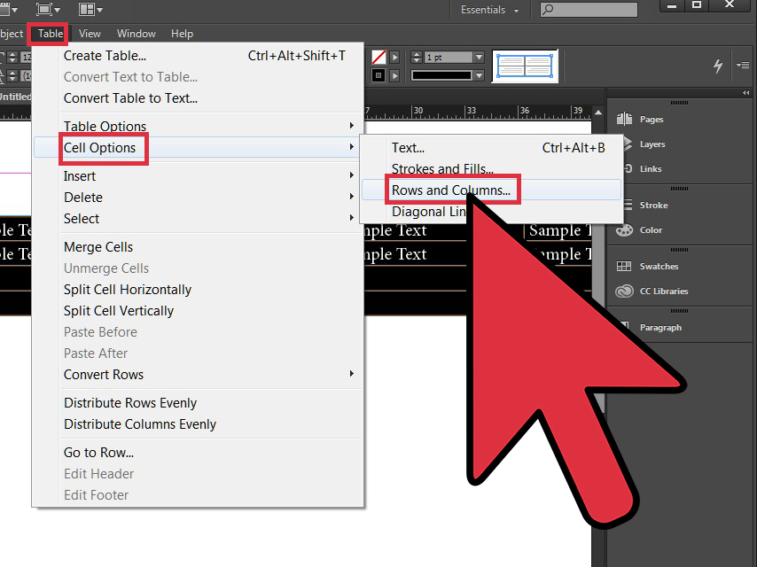
- Go to Layout > Margins and Columns.
- Enter the number of columns you want.
- Set the gutter value, which controls the space between columns.
- Click OK.
This changes the column guides on the selected page or spread. It is especially useful when building a structured layout from scratch. For example, a two-column setup might work well for a simple newsletter, while a three-column grid can support more flexible magazine designs.
How to Adjust Text Frame Columns in InDesign
To change the columns inside a text frame, follow these steps:
- Select the text frame with the Selection Tool.
- Go to Object > Text Frame Options, or press Ctrl+B on Windows or Command+B on Mac.
- In the General section, find the Columns settings.
- Change the number of columns.
- Adjust the gutter value.
- Choose a column width behavior if needed, such as fixed or flexible width.
- Click OK.
This is the fastest way to turn one wide text block into clean, readable columns. It is also safer than creating multiple separate text frames because the story remains inside one frame. That means fewer threading mistakes, fewer accidental gaps, and fewer moments where you mutter at your screen like it personally betrayed you.
Fixed Column Width vs. Flexible Column Width
InDesign gives you control over how columns behave when a text frame is resized. If you use a flexible column setup, the columns can stretch or shrink as the frame changes size. If you use fixed column width, InDesign tries to preserve the column width and may add or remove columns when the frame becomes wider or narrower.
For most everyday layouts, flexible columns are easier. They keep the number of columns stable while allowing the frame to adjust. Fixed column width is useful when you need strict consistency across multiple frames, such as in catalogs, directories, technical documents, or grid-heavy editorial layouts.
Recommended Column and Gutter Settings
There is no single perfect setting for every design, but there are practical guidelines. For standard letter-size pages, two columns often work well for reports and newsletters. Three columns can work for magazines, brochures, and feature layouts. Four or more columns are usually better as a design grid rather than as actual body text columns, unless the page is large.
For body text, avoid making columns too narrow. If each line contains only a few words, the reader’s eyes have to jump constantly, which feels choppy. If each line is too long, reading becomes tiring. A comfortable column width keeps the reading rhythm smooth.
The gutter should be wide enough to clearly separate columns. If your body text uses larger leading, the gutter usually needs to increase as well. A tiny gutter between dense columns is like seating two strangers shoulder-to-shoulder on a small bus: technically possible, socially questionable.
Step 3: Check the Text Flow, Alignment, and Readability
After adjusting columns, do not immediately export the file and celebrate with snacks. First, inspect the layout. Column changes can affect text flow, line breaks, overset text, image placement, and overall balance.
Look for Overset Text
Overset text happens when a frame contains more text than it can display. InDesign shows this with a small red plus sign near the text frame’s out port. If you see it, your text is hiding. It is not being shy; it has simply run out of room.
To fix overset text, you can enlarge the frame, reduce the number of columns, adjust the font size or leading, edit the copy, or thread the text into another frame. Do not ignore overset text. It is one of the easiest ways to accidentally publish a missing paragraph.
Check Column Balance
Balanced columns look intentional. Uneven columns can be fine in some layouts, especially if the article continues elsewhere, but a short final column may look awkward. In text-heavy designs, try adjusting frame height, column count, paragraph spacing, or text edits until the columns feel visually stable.
Watch for Widows and Orphans
Widows and orphans are lonely bits of text stranded at the top or bottom of a column. They make a page look unfinished. Use paragraph controls, subtle tracking adjustments, keep options, or small copy edits to clean them up. A tiny adjustment can make a big difference.
Use Span Columns for Headlines
Sometimes a headline or subheading should stretch across multiple columns while the body text remains divided. InDesign supports paragraph options that allow text to span or split columns. This is especially helpful in newsletters, magazine articles, and editorial layouts where a heading needs more breathing room.
Use Column Rules Carefully
Column rules are vertical lines between columns. They can help separate dense information, such as schedules, directories, menus, product listings, or comparison content. However, do not overuse them. A column rule should support readability, not make the page look like a tax form wearing a tie.
Common Mistakes When Adjusting Columns in InDesign
Mistake 1: Confusing Guides with Text Columns
One of the most common beginner mistakes is changing page columns and expecting existing text to automatically split into columns. Page columns are guides. Text frame columns control the text inside a frame. They are related, but they are not the same thing.
Mistake 2: Making Columns Too Narrow
Narrow columns may look stylish at first, but they can quickly become hard to read. If your lines contain only two or three words, your layout may feel jumpy. Use narrow columns for short snippets, captions, or sidebarsnot long body copy.
Mistake 3: Ignoring Parent Pages
If you are working on a multi-page document, adjust columns on parent pages whenever possible. Parent pages help maintain consistency across the document. Changing every page manually is possible, but it is also how designers develop a thousand-yard stare.
Mistake 4: Forgetting the Gutter
A poor gutter setting can ruin an otherwise clean layout. Too small, and columns blur together. Too large, and the page feels disconnected. Always review the gutter after changing column count.
Mistake 5: Not Checking Print or PDF Output
Columns can look fine on screen but feel different when printed or viewed as a PDF. Always proof the final format. Zoom out to judge overall rhythm, then zoom in to check details like alignment, overset text, and awkward breaks.
Best Practices for Professional InDesign Column Layouts
Good column design is not just about pressing the right buttons. It is about creating a reading experience that feels natural. The best layouts guide the eye smoothly from headline to body text, from image to caption, and from one section to the next.
Start With the Content
Before choosing a column count, look at the content. A short event flyer may only need one or two columns. A magazine feature may need a flexible grid. A financial report may benefit from structured columns and consistent spacing. Let the content lead the layout, not the other way around.
Use Grids for Alignment
Column guides are powerful because they help align multiple elements. Text frames, images, charts, pull quotes, and sidebars all look more polished when they share a common structure. Even creative layouts usually rely on an invisible grid.
Keep Body Text Comfortable
Readable text beats decorative text almost every time. Choose a sensible font size, comfortable leading, and column width that supports easy reading. The goal is not to impress other designers with microscopic typography. The goal is to help people read without needing a magnifying glass and emotional support.
Use Object Styles for Repeated Frames
If you use the same kind of multi-column text frame throughout a document, consider creating an object style. Object styles can store frame settings, including text frame behavior, inset spacing, and other formatting details. This keeps your layout consistent and speeds up revisions.
Preview Without Guides
Guides are helpful while designing, but they can distract you from the actual reading experience. Use preview mode to hide guides and see the page as your audience will see it. If the columns still feel balanced without the visual scaffolding, you are in good shape.
Quick Troubleshooting Guide
My Text Did Not Split Into Columns
You probably changed page columns instead of text frame columns. Select the text frame, open Object > Text Frame Options, and adjust the column number there.
My Column Guides Changed, But My Text Stayed Put
That is normal. Column guides are alignment guides. Move or resize your text frames to match the new grid, or adjust the text frame columns separately.
My Text Frame Added Extra Columns When Resized
Check whether fixed column width is enabled. Fixed width can preserve the column size and change the number of columns when the frame changes width.
My Columns Look Crowded
Increase the gutter, reduce the number of columns, widen the text frame, or adjust the font size and leading. Crowded columns are a readability problem, not a badge of efficiency.
My Layout Is Inconsistent Across Pages
Use parent pages and consistent margins and columns. If every page is adjusted individually, small differences can creep in and make the document feel uneven.
Experience Notes: What I’ve Learned from Adjusting Columns in InDesign
The first lesson from working with columns in InDesign is that the “simple” layout decision is rarely simple once real content arrives. A two-column design may look perfect with placeholder text, then suddenly fall apart when the actual article includes long subheads, pull quotes, captions, product names, footnotes, and one paragraph that appears to have trained for a marathon. This is why I never treat column settings as final until real content is placed.
In practical design work, I like to start with a flexible grid rather than a rigid answer. For example, on a brochure or magazine page, I may set up three or six page columns as guides, even if the body text itself only uses two columns. This gives more alignment options for images, captions, icons, and sidebars. A six-column grid can support one wide text area, two medium columns, or three narrow content blocks. It feels like giving the layout a toolbox instead of one lonely screwdriver.
Another experience-based tip is to adjust gutters visually, not just mathematically. Yes, measurements matter. Consistency matters. But the eye has the final vote. A gutter that is technically correct may still feel too tight if the type is bold, the leading is compact, or the page includes lots of visual elements. When in doubt, I print a test page or export a PDF and view it at a realistic size. What looks roomy at 175% zoom may feel crowded on an actual page.
I have also learned that one multi-column text frame is often better than several separate frames when the story needs to flow continuously. Separate frames can be useful for modular layouts, but they can also create extra work if the copy changes. A single text frame with columns keeps the story connected. When an editor adds a sentence, the text reflows naturally instead of forcing you to chase paragraphs across the page like escaped hamsters.
Parent pages are another major time-saver. If a document has ten, twenty, or two hundred pages, manually changing columns on each page is asking for trouble. By setting margins and columns on parent pages, you can update the structure more consistently. This is especially important for books, reports, catalogs, manuals, and recurring publication templates.
One mistake I see often is choosing too many columns because the page looks “designed” that way. More columns do not automatically mean more sophistication. Sometimes one strong column with generous margins looks cleaner than three skinny columns gasping for air. The best column count is the one that supports the content, the audience, and the format.
Finally, I recommend saving versions before major column changes. InDesign is powerful, but layout changes can ripple through a document. If you are adjusting margins, columns, frame widths, and text flow at the same time, duplicate the file or save a version first. Future you will be grateful. Future you may even buy present you coffee.
Conclusion
Learning how to adjust columns in InDesign is a foundational skill for cleaner, more readable, and more professional layouts. The key is understanding the difference between page columns and text frame columns. Page columns guide the overall structure; text frame columns control how text flows inside a frame.
In three quick steps, you can decide which column type you need, adjust the settings in the correct dialog box, and review the final layout for text flow, alignment, and readability. Once you add smart gutter spacing, parent pages, object styles, and careful proofreading, your InDesign layouts become much easier to manage.
Columns should never feel like decoration thrown onto a page at the last minute. They are part of the reading experience. When used well, they help readers move through content comfortably, give your designs structure, and make even complex documents feel organized. And honestly, any feature that makes a 40-page layout behave better deserves a small round of applause.