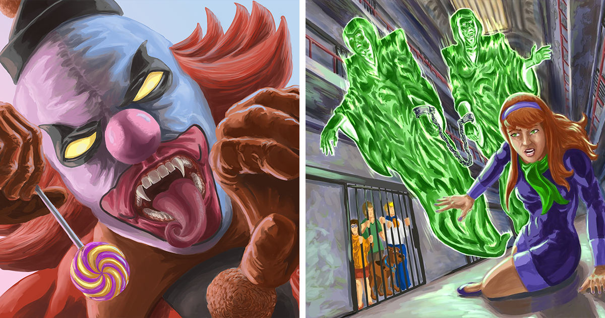
There are childhood cartoons that stay sweet forever, like a warm bowl of cereal on a Saturday morning. And then there is Scooby-Doo, a show that looked friendly on the surface but quietly handed an entire generation its first haunted-house starter kit. A foggy mansion? Check. A suspicious lighthouse? Check. A glowing skeleton screaming in the hallway like he just saw his own electric bill? Absolutely check.
That is why the idea behind “My Nightmare-Fueled Versions Of Scooby-Doo Villains (21 Pics)” works so well. The original Scooby-Doo villains were usually criminals in rubber masks, fake ghosts, or grumpy adults with the business ethics of a raccoon in a jewelry store. But before the mask came off, those monsters were genuinely eerie. This project takes that brief childhood panic and asks: what if the villains were not just spooky for kids, but actually terrifying?
The result is a dark, imaginative redesign concept that turns familiar cartoon monsters into horror-fantasy nightmares. It is fan art with claws, nostalgia with bad posture, and a loving tribute to the moment every viewer thought, “Wait, maybe this episode is a little scarier than I remember.”
Why Scooby-Doo Villains Are Perfect for Horror Redesigns
Scooby-Doo, Where Are You! first arrived in 1969 with a formula that became animation gold: four teenagers, one talking Great Dane, a van, a mystery, a monster, a chase scene, and a final unmasking. The formula was simple, but the atmosphere did a lot of heavy lifting. Abandoned amusement parks, foggy docks, empty museums, spooky castles, and moonlit graveyards gave the show a horror wrapper, even when the filling was comedy.
That balance is exactly why Scooby-Doo villains are such strong material for nightmare art. They are not blank monsters. They already have silhouettes, colors, costumes, legends, and memorable entrances. A redesign does not need to invent the fear from scratch. It simply turns the volume up until the friendly Saturday-morning ghost becomes the thing standing at the foot of your bed at 3:17 a.m.
Classic monsters like the Black Knight, the Ghost of Captain Cutler, the Space Kook, the Creeper, the Phantom Shadows, and the Miner Forty-Niner were already designed to be instantly recognizable. Their shapes were bold. Their faces were expressive. Their gimmicks were clear. In horror art, that is a gift. A strong silhouette can make a monster readable even in darkness, and a clear theme helps the audience understand the threat before a single word is spoken.
The Charm of Making Cartoon Villains Actually Scary
Part of the fun of these nightmare-fueled versions is the contrast. We remember Scooby and Shaggy sprinting through hallways, hiding in barrels, dressing up as waiters, or accidentally serving sandwiches to the monster. The comedy softened the fear. But when an artist removes the laugh track energy and replaces it with dramatic lighting, textured skin, broken armor, sunken eyes, and cinematic shadows, the same villain becomes completely different.
Take the Black Knight as an example. In the original cartoon world, he is a clanking suit of armor with a medieval attitude problem. In a nightmare redesign, he can become a towering rusted warrior, his metal plates cracked, his visor glowing, his sword looking less like a prop and more like a medical emergency waiting to happen. The idea is still recognizable, but the mood shifts from “Zoinks!” to “Please update my will.”
The Ghost of Captain Cutler works the same way. He already has one of the most haunting visual ideas in the early series: a glowing deep-sea diver rising out of the water. Make the diving suit heavier, corroded, barnacle-covered, and half-swallowed by the ocean, and suddenly he feels like something dredged from a shipwreck no one should have touched.
21 Pics, 21 Different Kinds of Childhood Terror
A strong gallery of nightmare Scooby-Doo villains should not make every creature scary in the same way. The best redesigns understand that horror has flavors. Some monsters are frightening because they are huge. Some are frightening because they are quiet. Some are frightening because their smile suggests they know exactly where you hide the emergency snacks.
1. The Armored Nightmare
The Black Knight is perfect for a heavy, gothic interpretation. Rust, dents, darkness inside the helmet, and oversized proportions can make him feel like a cursed museum exhibit that has grown tired of velvet ropes.
2. The Drowned Ghost
Captain Cutler’s ghost becomes more unsettling when the ocean is treated like part of the monster. Wet textures, glowing algae, cracked glass, and slow movement can turn him into a deep-sea warning sign with legs.
3. The Laughing Alien Skull
The Space Kook was already one of the strangest classic villains, with a skull-like helmet and a high-pitched mechanical laugh. A horror version can lean into cosmic dread: stretched limbs, starless eyes, and a suit that looks less like technology and more like a coffin from orbit.
4. The Rotting Miner
The Miner Forty-Niner has the folklore flavor of a ghost story told beside a campfire. With a gaunt face, cracked lantern, dusty coat, and pickaxe dragged across stone, he becomes a warning about digging too greedily and forgetting to check whether the mine is emotionally stable.
5. The Forest Curse
The Witch Doctor can be redesigned with ritualistic shapes, exaggerated masks, tangled feathers, and unnatural posture. The goal is not just “scary costume,” but the feeling that the forest itself is watching and taking notes.
6. The Carnival Wrong Turn
The Ghost Clown is a natural candidate for nightmare treatment because clowns already stand one squeaky shoe away from horror. Lengthen the smile, deepen the shadows around the eyes, and suddenly the circus tent becomes less “family fun” and more “why is the calliope music getting closer?”
7. The Mechanical Monster
Charlie the Robot shows how science-fiction villains can become creepy through broken movement and uncanny design. A redesign might expose wires, dent the metal, twist the limbs, and give him the cheerful expression of a toaster that has discovered revenge.
8. The Swamp Thing That Should Have Stayed Mud
Any swamp-based Scooby villain benefits from texture: moss, slime, roots, wet leaves, and shapes that blur the line between person and landscape. This kind of monster should look like it did not walk out of the swamp. It should look like the swamp stood up.
What Makes These Redesigns Feel Fresh?
The magic of Scooby-Doo horror fan art is not simply making characters uglier. Anyone can add teeth. The real craft is preserving the identity of the original villain while changing the emotional temperature. A successful redesign says, “You know this character,” and then immediately adds, “but you may want to know them from a safer distance.”
That means the key details must survive. The Space Kook still needs that space-age skull presence. Captain Cutler still needs the diver suit. The Creeper still needs his hunched, stalking personality. The Phantom Shadows still need their theatrical ghostly elegance. If those features disappear, the artwork becomes a random monster collection. If they remain, the viewer gets the delicious shock of recognition.
Color also matters. The original villains often used strong, simple palettes because television animation had to be readable. Nightmare versions can keep those iconic colors but dirty them up. Bright green becomes sickly swamp glow. Purple becomes bruised twilight. White becomes bone, fog, or old cloth. Red becomes warning, rust, or something we will politely call “not ketchup.”
The Nostalgia Factor: Why We Love Being Scared by Old Cartoons
Nostalgia is not just about remembering what made us happy. Sometimes it is about revisiting what made us nervous from behind a couch cushion. For many fans, Scooby-Doo was the first safe introduction to horror. The monsters looked dangerous, but the ending promised order. The ghost was fake. The clues mattered. The villain could be caught. The dog would survive. The sandwich might not, but sacrifices must be made.
When artists create creepy Scooby-Doo villain redesigns, they are playing with that memory. They ask what those monsters felt like before we understood the formula. Before we knew the glowing ghoul was probably a real estate developer. Before we understood that every haunted property apparently came with a financial motive and poor lighting. These redesigns return the villains to that first emotional impression: mysterious, massive, and possibly not interested in being unmasked.
Why the Gallery Format Works So Well
The “21 pics” format is ideal because Scooby-Doo villains were always episodic. Each monster had its own setting, gimmick, and legend. Seeing them in a gallery creates a visual parade of nightmares, almost like walking through a haunted museum curated by someone who grew up on cartoons and now owns too many black paint markers.
A gallery also lets the viewer compare design choices. Which villain becomes scarier with realism? Which one benefits from exaggeration? Which one should remain slightly cartoonish because the weirdness is the point? The strongest pieces are often the ones that do not over-explain themselves. They show a monster in a single dramatic moment and let your imagination fill in the scream.
Specific Examples That Deserve Nightmare Treatment
The Creeper is one of the most famous Scooby-Doo villains because his design is simple and memorable: green skin, hunched shoulders, heavy brow, and a stalking presence. A nightmare version could make him feel more like a silent pursuer from a folk-horror film. He does not need giant fangs or fireworks. He needs patience. That is worse.
The Phantom Shadows are another perfect choice because they already feel theatrical. Their glowing faces and cloaked bodies can be redesigned as elegant, floating specters with elongated fingers and hollow expressions. They should look like they came from a stage play performed in a cemetery with very committed lighting design.
The Snow Ghost can become a mountain horror creature with frostbitten fur, icy breath, and eyes that glow through a blizzard. The original design was furry and frightening in a classic cartoon way. A darker version could feel ancient, hungry, and extremely uninterested in hot cocoa.
The Headless Specter offers pure gothic horror. A redesign can emphasize the empty space where the head should be, the stiff formal clothing, and the eerie confidence of something that has misplaced its face but not its sense of drama.
How Humor Keeps the Horror Fun
Even when the artwork becomes darker, the best Scooby-Doo-inspired horror keeps a little wink in the shadows. That is part of the franchise’s DNA. Fear and comedy have always shared a hallway, usually while Shaggy and Scooby run through every door in it. A nightmare redesign does not have to become joyless. In fact, the humor makes the scares more enjoyable.
There is something funny about taking a villain who once chased teenagers through a hallway and giving him the visual intensity of a prestige horror movie poster. It is dramatic. It is affectionate. It is also a little ridiculous in the best possible way. After all, many Scooby-Doo monsters were ultimately defeated by snacks, trap doors, and Velma’s ability to notice obvious footprints. That contrast keeps the project from becoming too grim.
The Art Experience: Creating Nightmare-Fueled Scooby-Doo Villains
Working on a series like “My Nightmare-Fueled Versions Of Scooby-Doo Villains (21 Pics)” would feel like opening a toy box in a haunted basement. The first challenge is deciding how far to push the horror. If the redesign becomes too realistic, it may lose the charm of the original cartoon. If it stays too cute, it may not feel nightmare-fueled enough. The sweet spot is somewhere between “I remember this episode” and “I would like to leave this episode immediately.”
The process usually begins with research. You look at the original villain and identify the non-negotiable features: the helmet, the mask, the posture, the color, the prop, the setting. Then you ask what that character would look like if the episode were directed as a dark fantasy short film. What materials would the costume be made from? How would the monster move? Would it run, float, crawl, limp, or simply appear behind you while you are trying to enjoy soup?
Lighting is one of the biggest tools. A flat cartoon villain becomes instantly more cinematic when lit from below, partly hidden by fog, or framed by a doorway. Texture is another major upgrade. Rust, wet fabric, cracked stone, dirty fur, old leather, torn cloth, and glowing eyes all help sell the illusion. But too much detail can be a trap. The viewer should recognize the villain quickly. If they need a museum guide and three cups of coffee to identify the character, the redesign has wandered too far into the woods.
Another experience is emotional memory. Artists who grew up with Scooby-Doo often remember the villains not as they actually looked, but as they felt. A monster might have seemed enormous when you were six. A glowing ghost might have felt impossible to defeat. A laugh echoing through a hallway might have been fun in daylight and deeply rude after bedtime. Nightmare redesigns translate that childhood feeling into adult visual language.
There is also a surprising amount of comedy in the work. While painting or imagining a terrifying version of a classic villain, you may suddenly remember that this horrifying creature was probably just a guy named Mr. Jenkins trying to scare people away from an abandoned pier. That makes the art more entertaining, not less. It creates a playful tension between the fake villain and the real fear. The mask may be fake, but the mood is real.
For fans, looking through the 21 pictures can feel like comparing nightmares with friends. One person may find Captain Cutler the scariest because deep water is already a hard no. Another may vote for the Space Kook because skull-faced astronauts are not generally invited to birthday parties. Someone else may insist the Ghost Clown wins because clowns have been operating on borrowed trust for decades. The discussion becomes part of the fun.
Most importantly, this kind of fan-art experience shows how flexible classic characters can be. Scooby-Doo villains were built with simple shapes and strong concepts, which makes them perfect for reinterpretation. They can be funny, spooky, stylish, grotesque, or cinematic without losing their identity. That is the mark of lasting design. A great cartoon monster can survive a glow-up, a grime layer, and a full nightmare makeover.
Conclusion: The Monsters Were Always Scarier Than We Admitted
My Nightmare-Fueled Versions Of Scooby-Doo Villains (21 Pics) is more than a creepy fan-art idea. It is a celebration of why Scooby-Doo still works. The franchise gave audiences monsters that were simple enough for kids to understand but memorable enough to last for decades. By redesigning them as darker, more realistic, and more unsettling creatures, the artwork reveals something fans have known all along: those villains had horror potential from the beginning.
The unmasking may have taught us that the ghost was fake, but the atmosphere was real. The fog, the footsteps, the glowing eyes, the empty hallways, the suspicious laughterthose things stayed with us. Turning classic Scooby-Doo villains into nightmare-fueled monsters does not betray the original cartoon. It honors the exact feeling that made it unforgettable.
And honestly, if Mystery Inc. ever walked into one of these redesigned scenes, Fred would still suggest splitting up. That man fears neither ghosts nor basic safety procedures.