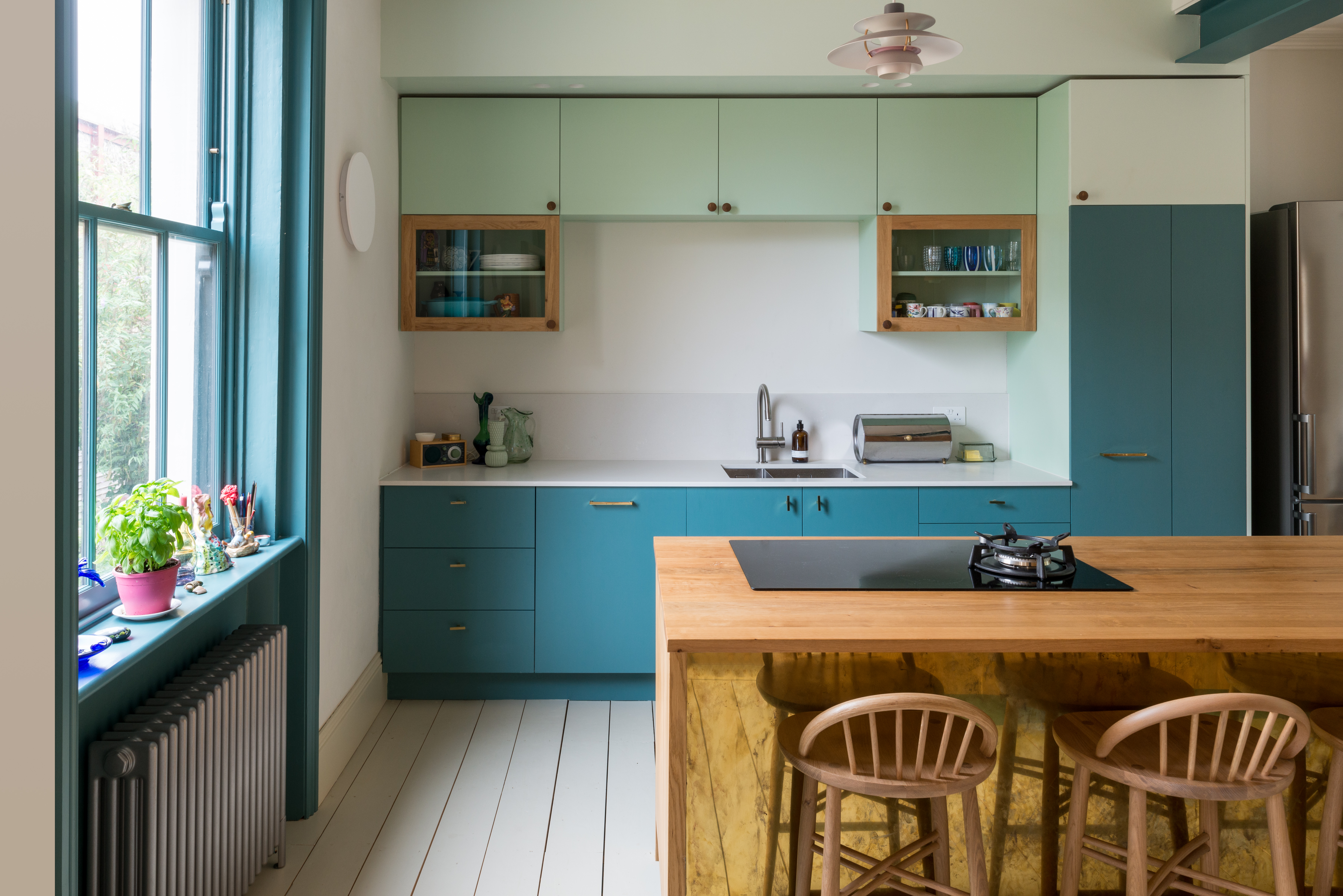
A small kitchen does not have to dress like it is apologizing for taking up space. The compact London kitchen that inspires this look proves the opposite: limited square footage can handle color, contrast, warm wood, gleaming metal, and statement lighting without becoming a visual traffic jam.
Designed by Bradley Van Der Straeten, the original kitchen brings together pale mint cabinetry, deeper teal-blue cabinet fronts, solid oak panels, unfinished brass, and orange-and-gray Louis Poulsen pendant lights. Painted birch-plywood fronts introduce color while timber cabinet bodies and oak surfaces add warmth. Instead of using one finish everywhere, the design assigns different materials and colors to separate parts of the room, making the small kitchen feel organized, intentional, and full of personality.
The best news is that you do not need a London address, a custom architectural budget, or a kettle that whistles with a British accent to borrow the idea. The essential ingredients are thoughtful color placement, a controlled material palette, practical lighting, and enough restraint to let the bold details breathe.
Why Two-Tone Color Works So Well in a Small Kitchen
Two-tone kitchen cabinets are often treated as a decorative trend, but in a compact room they can perform a useful architectural job. Color can visually divide storage, preparation, cooking, and dining areas even when there are no walls between them.
In the London kitchen, mint and teal belong to the same blue-green family, so they feel related rather than random. The lighter shade lifts the upper portion of the room, while the darker color gives visual weight to the lower cabinetry. This approach creates depth without forcing the eye to process two completely unrelated palettes.
Design guidance commonly recommends placing the darker or more saturated tone on base cabinets and using the lighter tone above. Dark lower cabinets help anchor a room and conceal some everyday wear, while lighter upper cabinets reduce visual heaviness at eye level. Related shades, shared undertones, or a neutral connecting color can prevent the combination from clashing.
Color Creates Zones Without Adding Walls
In a narrow kitchen, another partition is usually about as welcome as a grand piano. Two-tone cabinetry offers a subtler way to define zones. One color can identify the main cooking run, while another highlights an island, pantry bank, breakfast bar, or freestanding cabinet.
The distinction does not need to follow the standard upper-versus-lower formula. You might paint one entire wall teal and keep the opposite side in natural oak. Another option is to reserve the stronger shade for the cabinets surrounding the range, visually turning the cooking area into a focal point.
Similar Undertones Keep the Palette Calm
Mint and teal work because both contain green and blue. One is airy and chalky; the other is rich and grounding. They have contrast, but they still speak the same language.
When choosing your own pair, compare undertones before comparing color names. A warm, yellow-based mint may look uneasy beside a sharp, blue-based teal. A muted sage and smoky blue-green will usually cooperate more gracefully because both have softened gray undertones.
The same principle applies to neutrals. Cream and mushroom can look sophisticated together, while icy white and yellow-beige may argue across the room like relatives at a holiday dinner.
Build the London-Inspired Color Palette
Start With a Pale Mint or Soft Green
Use the lighter color where you want the room to feel open. Upper cabinets are the obvious choice, but pale mint can also work on tall pantry doors, open-shelf brackets, walls, or the back of a glass-front cabinet.
Choose a shade with enough pigment to remain visible in bright daylight. A green that looks charming on a small paint card can disappear into plain off-white once it covers an entire cabinet wall. Look for descriptions such as muted mint, eucalyptus, mineral green, or pale celadon rather than the iciest pastel available.
Add Teal for Depth
The darker color should feel substantial without becoming nearly black. Medium or deep teal works especially well because it provides drama while retaining a lively connection to the mint.
Use teal on base cabinets, an island, a compact peninsula, or a short run of drawers. Repeating it once elsewhereperhaps on a door frame, shelf edge, or piece of artwill make the choice feel deliberate.
Give the Eye a Neutral Resting Place
White, off-white, pale gray, or softly painted flooring provides breathing room between the colorful elements. The London kitchen uses restrained surrounding surfaces so the cabinetry remains the star.
A warm off-white generally pairs more comfortably with oak and unfinished brass than a brilliant blue-white. Before committing, compare samples against your countertop, flooring, and natural light. Countertop and backsplash undertones are particularly important because they occupy large horizontal and vertical surfaces. Benjamin Moore’s color guidance likewise recommends coordinating cabinet colors with the undertones already present in countertops and backsplashes.
Use Oak to Warm Up the Blue-Green Scheme
Mint and teal can feel cool, particularly in a north-facing kitchen. Oak prevents the palette from drifting into dental-office territory.
Natural oak introduces grain, variation, and a tactile quality that painted cabinetry cannot supply. In the inspiration kitchen, solid oak panels sit beside painted birch-plywood cabinet fronts. That mix makes the room feel collected rather than purchased as one giant matching set.
You can bring in oak through:
- Cabinet doors or end panels
- Floating shelves
- A butcher-block worktop
- Bar stools or a small dining bench
- Wooden knobs or handles
- A freestanding work table
One or two wood applications are enough. Covering every available surface in oak may weaken the crisp color blocking that makes the look successful.
Let Brass Provide a Small Flash of Glamour
Unfinished or aged brass works beautifully with blue-green cabinets because the warm metal sits opposite those cool tones visually. The contrast makes both finishes appear richer.
Brass does not need to arrive wearing a top hat. A narrow sheet beneath a counter edge, a faucet, simple drawer pulls, or a small wall light can provide sufficient warmth. Unlacquered brass will gradually darken and develop variation, so it is ideal for homeowners who appreciate materials that look lived-in.
For a lower-maintenance alternative, choose aged brass or brushed bronze with a sealed finish. Keep the hardware shapes simple. Slim bars, rounded knobs, and recessed pulls complement the clean cabinetry without adding unnecessary ornament.
Make Statement Lighting Part of the Color Story
The orange and gray pendant lights in the London kitchen are not merely illumination devices. They are hovering pieces of color that connect the cool cabinets with the warm wood and brass.
Orange is particularly effective because it sits opposite blue on the color wheel. A small amount creates lively contrast without demanding another orange cabinet or countertop. Gray keeps the lighting composition from becoming too sugary.
Use One Statement Fixture Instead of Several Small Distractions
A sculptural pendant can make a compact kitchen feel finished. Choose a fixture with a shallow or layered profile that distributes light without blocking views through the room. In a narrow galley, a single pendant over a table or peninsula is often more effective than a row of oversized fixtures.
Layer Decorative and Task Lighting
Beautiful pendants should not be expected to illuminate every chopping board and shadowy corner. Add under-cabinet LED strips, focused ceiling lights, or a compact wall sconce so work surfaces remain clearly lit.
Kitchen planning guidance recommends illuminating every work surface with appropriate task lighting and using multiple adjustable light sources. This layered approach is especially valuable in a small kitchen, where shadows from upper cabinets can quickly make counters feel cramped.
Choose Materials That Can Survive Real Cooking
Painted Cabinet Fronts
Flat or minimally detailed fronts show off two-tone color particularly well. Birch plywood is a practical choice because its edges can be exposed for a subtle layered detail, while the face can be painted for a smooth finish.
Existing cabinets can also be repainted. Proper preparation matters more than owning an heroic collection of paintbrushes. Remove doors and drawer fronts, label every piece, clean away grease, repair damage, sand or degloss shiny surfaces, apply a suitable primer, and allow each coat to cure fully. Cabinet painting typically takes several days rather than one enthusiastic Saturday afternoon.
Countertops and Backsplashes
A quiet countertop keeps the palette from becoming crowded. Consider pale quartz, honed stone, stainless steel, light terrazzo, or sealed wood. Avoid heavily patterned stone unless its colors clearly connect to the cabinetry.
For the backsplash, simple tile, painted glass, stainless steel, or a short stone upstand will preserve visual calm. Handmade tile can work, but choose a restrained glaze and uncomplicated layout. The kitchen already has two cabinet colors, natural wood, brass, and statement lighting; it does not also need a backsplash performing jazz hands.
Plan the Small-Kitchen Layout Before Choosing Paint
A gorgeous palette cannot rescue a cabinet door that collides with the refrigerator every morning. Begin with circulation, storage, and work zones.
Protect the Main Walkway
Keep cabinet handles, open appliance doors, stools, and movable furniture out of the primary route. For extremely tight rooms, integrated pulls or compact knobs can reduce snagging. A narrow peninsula or freestanding table may offer preparation space without the bulk of a full island.
Use Vertical Storage Selectively
Floor-to-ceiling cabinets can hold a remarkable amount, but a solid wall of tall dark cabinetry may overwhelm a small room. Limit tall storage to one concentrated zone and use the lighter color there. Elsewhere, combine standard uppers with one or two open shelves to create visual relief.
Small-kitchen guidance frequently recommends minimizing bulky upper cabinetry where possible, using open shelving strategically, incorporating compact furniture, and adding under-cabinet lighting to maintain openness and function.
Choose Appliances That Fit the Room
A 24-inch refrigerator, slim dishwasher, compact cooktop, or combination oven may provide everything a small household needs while freeing valuable cabinet and counter space. Measure appliance-door swings, ventilation requirements, and surrounding clearances before placing an order.
Do not shrink every appliance automatically. Frequent cooks may value a full-width range more than an extra storage cabinet. The goal is not to miniaturize your life; it is to stop paying square-footage rent to equipment you rarely use.
Three Budget Levels for Stealing the Look
Low-Budget Refresh
Paint the lower cabinets teal and leave the uppers in their existing light finish. Replace a few handles with aged-brass hardware, add a wood shelf, and introduce orange through a pendant shade, tea kettle, framed print, or café curtain.
Midrange Makeover
Reface cabinet doors in two coordinated colors, add oak end panels, install under-cabinet lighting, and replace the faucet. A light countertop or backsplash can complete the transformation without changing the layout.
Full Renovation
Use custom painted-plywood fronts, solid wood cabinetry, integrated appliances, layered lighting, and carefully planned storage. Keep the number of materials controlled even when the budget grows. More money should buy better details and functionnot seventeen finishes competing for custody of the kitchen.
Common Two-Tone Kitchen Mistakes
Choosing Colors From Tiny Samples
Paint large boards and move them around the room for several days. View them in morning light, evening light, and artificial light. Cabinets have many vertical planes, so colors often appear darker and more intense than they do on a small chip.
Splitting the Colors Exactly in Half
A rigid 50-50 division can look static. Let one tone dominate and use the other strategically. A roughly 60-30-10 balancedominant color, secondary color, and accentprovides an easier starting point.
Adding Too Many Other Finishes
Once you have two cabinet colors, limit competing materials. One main wood, one dominant metal finish, and one quiet countertop will usually be enough.
Ignoring Adjacent Rooms
A small kitchen is often visible from a dining or living area. Repeat a cabinet color in nearby art, upholstery, ceramics, or trim so the kitchen feels connected to the rest of the home.
Experience Notes: What This Look Is Like to Live With
The most useful lessons about a two-tone small kitchen appear after the paint has dried and the first week of cooking begins. Across compact-kitchen renovations, one experience comes up repeatedly: color can make a small room feel more organized, but only when each color has a clear job.
The Darker Base Cabinets Are Surprisingly Forgiving
Lower cabinets receive shoes, spills, pets, grocery bags, and mysterious marks that nobody in the household remembers creating. A medium or deep teal generally hides minor scuffs better than pale paint. It also makes the lower portion of the room feel visually stable.
There is a practical limit, however. Very dark paint can reveal flour, dust, and dried water spots. A softened teal with a satin finish often provides a better compromise than an almost-black navy. Satin or durable cabinet enamel is usually easier to clean than a dead-flat surface, especially around handles and the sink.
The Lighter Uppers Change the Perception of Height
When pale mint or off-white upper cabinets blend gently with the walls, the ceiling can appear higher and the cabinetry less imposing. This difference is especially noticeable in a galley kitchen, where dark cabinets on both sides may otherwise create a tunnel effect.
The effect depends on contrast. A mint that is dramatically darker than the wall will still read as a solid block. Keeping the upper color close in value to the wall allows the eye to move upward without encountering a hard visual stop.
Wood Becomes More Important Than Expected
On a mood board, oak may appear to be a supporting material. In daily life, it often becomes the feature that makes the colorful kitchen feel comfortable. Wood grain softens painted surfaces, disguises some wear, and gives hands a warmer material to touch.
Homeowners also tend to appreciate wood shelves because frequently used glasses, bowls, and spices remain visible and easy to reach. The challenge is preventing open storage from becoming an exhibition titled “Things We Forgot to Put Away.” Limiting each shelf to useful, attractive objects keeps the kitchen relaxed rather than cluttered.
Good Lighting Determines Whether the Colors Succeed
Blue-green paint can change dramatically throughout the day. In cool daylight, teal may look bluer; under warm evening bulbs, it may appear greener and softer. This movement is part of the appeal, but mismatched bulb temperatures can make adjoining cabinets look unrelated.
Using consistent light temperatures across pendants, sconces, and under-cabinet strips creates a more coherent result. Dimmers are equally useful. Bright task lighting supports cooking, while softer ambient light lets the color palette feel cozy during breakfast or late-night tea.
Small Details Carry More Visual Weight
In a large kitchen, one awkward handle may disappear into the background. In a compact room, every detail is practically sitting in the front row. Handle alignment, cabinet gaps, exposed plywood edges, outlet covers, caulk lines, and paint transitions deserve careful attention.
This does not mean every component must be expensive. It means the visible pieces should appear intentional. Matching inexpensive knobs, neatly installed lighting, and well-prepared cabinet paint can look more polished than costly materials installed without discipline.
The Best Result Feels Personal, Not Perfect
The London kitchen works because it does not resemble a generic showroom. The orange pendant, evolving brass finish, oak grain, and unusual mint-and-teal pairing create character. Over time, the brass may patinate, the wood may deepen, and painted cabinets may collect tiny signs of use.
Those changes are not necessarily defects. They can make the room feel owned and enjoyed. A successful small kitchen should support cooking, conversation, storage, and everyday messnot demand that everyone behave like nervous visitors in a design museum.
Conclusion: Color Is a Space-Making Tool
The lesson from this small London kitchen is not simply to paint one set of cabinets mint and another teal. The real idea worth stealing is the disciplined use of contrast. Light color lifts the room, deeper color anchors it, oak supplies warmth, brass contributes glow, and statement lighting adds one controlled spark of surprise.
Begin with function, choose related colors, test them in the actual room, and keep surrounding materials relatively quiet. The result can feel colorful without becoming chaotic and compact without feeling compromised.
Note: Product availability, finishes, paint formulas, building requirements, and appliance specifications can change. Confirm samples, measurements, ventilation needs, electrical requirements, and local codes before beginning a renovation.