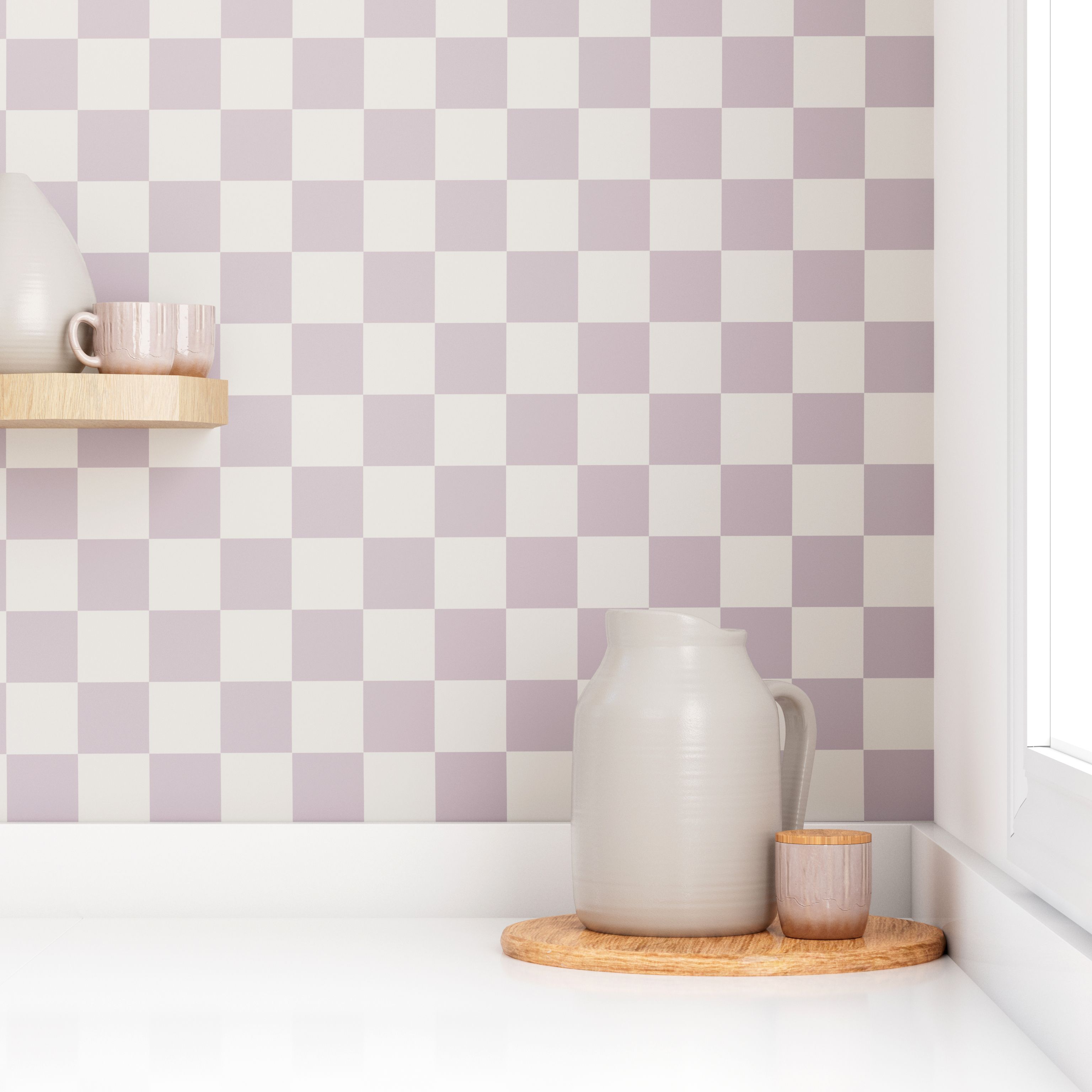
Some patterns whisper. Checkerboard walks into the room, kicks off its shoes, and somehow still looks polished. That is exactly why this classic motif is having such a strong return in modern interiors. After years of soft neutrals, safe solids, and enough beige to make a latte blush, homeowners and designers are bringing back checkerboard in ways that feel fresh, layered, and surprisingly versatile.
The old version of checkerboard often gets boxed into one mental image: black-and-white kitchen floors, retro diners, and maybe a little bit of “did Elvis live here?” energy. But the new wave is broader and smarter. Today’s checkerboard pattern shows up in warm stone pairings, earthy painted floors, muted rugs, sculptural tile, playful wall treatments, ceramic decor, and even subtle textiles. It can lean vintage, modern, European, artsy, or quietly luxurious depending on how you use it.
In other words, checkerboard is not back because it is trendy. It is back because it never really stopped working. Designers are simply giving it better lighting, more interesting colors, and a much more sophisticated supporting cast.
Why Checkerboard Feels So Right Right Now
Great design comebacks usually happen when people get tired of rooms that feel too flat, too perfect, or too anonymous. That is part of the story here. Checkerboard brings rhythm to a space. It creates movement without chaos, contrast without clutter, and personality without requiring every object in the room to scream for attention.
That balance matters in modern homes. Many people want rooms that feel collected and expressive, but they do not want visual overload. Checkerboard solves that problem beautifully. It is geometric and orderly, so it reads as structured. But it is also bold enough to keep a room from falling asleep.
The pattern also plays nicely with the broader decorating mood of the moment. Homes are getting warmer, more personal, and less obsessed with looking like a furniture showroom. Vintage details, nostalgic touches, painted surfaces, decorative floors, layered textiles, and statement accents are all part of that shift. Checkerboard fits right in, whether you want one dramatic moment or a dozen tiny nods.
A Pattern With History, Not Just Hype
One reason checkerboard feels timeless is simple: it has been around for a very long time. Versions of the grid have appeared across architecture, textiles, mosaics, and decorative arts in many cultures. That long design history gives the pattern a depth that trendier prints often lack. It is familiar without being boring, and graphic without feeling gimmicky.
In interiors, checkerboard has worn many costumes over the years. It has appeared in grand European entryways, classic stone floors, midcentury kitchens, painted wood floors, and cheerful retro spaces. That range is part of the magic. The same basic motif can read formal in marble, rustic in paint, soft in wool, playful in wallpaper, or modern in tonal tile.
And that is the secret sauce: the checkerboard pattern is not one style. It is a framework. Change the material, scale, palette, finish, or placement, and it becomes something new.
How Designers Are Updating the Checkerboard Look
1. Softer color palettes
Modern checkerboard is no longer chained to stark black and white. Designers are warming it up with cream and taupe, brown and beige, sage and ivory, terracotta and sand, dusty blue and soft white, and even green-on-green combinations that feel rich instead of loud. Tonal versions make the pattern easier to live with because the contrast is gentler. You still get the movement of the grid, but with less visual shouting.
2. Better materials
Material choice changes everything. Marble checkerboard feels elegant. Zellige checkerboard feels handmade and soulful. Painted wood checkerboard feels casual and creative. A woven checkerboard rug feels cozy. Ceramic accessories bring a little wink of pattern without requiring a renovation. Today’s comeback works so well because designers are using the motif in materials that add texture, depth, and subtlety.
3. Unexpected placements
The floor is still the classic place to use checkerboard, but it is not the only one. Backsplashes, mudrooms, breakfast nooks, stair risers, accent walls, shower niches, laundry rooms, mirrors, ceramics, planters, throw pillows, and doormats are all fair game. This is where the pattern gets fun. A tiny checkerboard detail can energize a room just as effectively as a full-on tiled floor, without the commitment level of, say, tattooing your kitchen.
4. Bigger or looser scale
Traditional checkerboard can feel formal when the squares are tight and even. Larger-scale checks feel more relaxed and contemporary. Some designers are also skewing the pattern, softening the edges through handmade materials, or mixing checkerboard with organic shapes so the room does not feel too rigid. It is still a grid, but it knows how to loosen its tie.
Where Checkerboard Works Best in a Modern Home
Entryways
If a home gets only one checkerboard moment, the entryway is an excellent candidate. The pattern instantly sets a tone. It says this home has personality, but also knows how to make an entrance. In stone or tile, checkerboard gives an entry classic structure. In paint, it can turn an ordinary foyer into something memorable on a smaller budget.
Kitchens
Kitchens and checkerboard go together like coffee and ambitious renovation budgets. The good news is you do not need a full vintage diner look to make it work. A soft cream-and-brown floor, a muted tile backsplash, or even a simple runner with a checkerboard motif can add life to a kitchen without making it feel theme-y. Pair it with warm woods, brass, plaster finishes, and simple cabinetry for a look that feels current instead of costume-like.
Bathrooms and powder rooms
Smaller rooms are ideal for stronger patterns because they can handle a little drama. A checkerboard floor in a powder room feels intentional and stylish. A checkerboard wall treatment in a guest bath can be playful without overwhelming the whole house. Powder rooms, in particular, are where many homeowners feel brave enough to try something bold, and checkerboard rewards that bravery.
Laundry rooms and mudrooms
These hardworking spaces are often overlooked, which is a shame because they are perfect for fun design choices. A checkerboard floor or rug can make a utility room feel more finished and cheerful. Suddenly, folding towels feels less like a chore and more like a scene from a very optimistic home commercial.
Living rooms and bedrooms
In softer spaces, checkerboard usually works best through textiles and accessories. Rugs, blankets, lampshades, pillows, upholstery details, and art can bring in the motif without overpowering the room. This is especially effective if you like a calmer palette but still want a little graphic punch.
How to Use Checkerboard Without Overdoing It
This is where good taste earns its paycheck. Checkerboard is strong, so it needs a little breathing room. If you install a bold checkerboard floor, you probably do not also need checkerboard wallpaper, checkerboard chairs, checkerboard dishes, and checkerboard curtains unless your goal is to live inside a very stylish optical illusion.
A smart rule of thumb is to choose one dominant checkerboard feature and let the rest of the room support it. If the floor is the star, keep other patterns quieter. If your checkerboard shows up in a rug or wall treatment, balance it with solid upholstery, natural woods, and softer textures. Contrast is what makes the pattern sing, but restraint is what keeps it from turning into karaoke at midnight.
Scale also matters. Large squares usually feel calmer and more modern. Small, high-contrast checks can feel busy if used across a huge area. Likewise, soft colors make a checkerboard pattern easier to live with in open-plan spaces, while dramatic black and white is often best when used in targeted moments.
The Best Color Combinations for a Modern Checkerboard Look
Black and white
The classic. Still sharp, still beautiful, still impossible to ignore. It works best when you want crisp contrast and a bit of old-world drama.
Cream and taupe
This pairing is one of the most appealing modern updates. It gives you the structure of checkerboard with a softer, warmer effect that fits today’s more relaxed interiors.
Brown and beige
Earthy, grounded, and surprisingly chic. This is a great choice if you want the pattern to feel retro-adjacent without going full soda fountain.
Sage and off-white
Fresh and easy. This combination works especially well in kitchens, mudrooms, and casual spaces where you want something light but still distinctive.
Terracotta and sand
Warm, Mediterranean, and a little sun-kissed. Perfect for spaces that already feature natural materials, rustic wood, or handmade tile.
Blue and ivory
Clean, classic, and slightly coastal without requiring a single decorative anchor. That alone is a public service.
Why This Pattern Appeals to Both Minimalists and Maximalists
Checkerboard is one of those rare design moves that can satisfy opposite personalities. Minimalists love it because it is geometric, disciplined, and easy to integrate into simple rooms. A checkerboard rug in a mostly neutral space can act as the one bold move that keeps everything else feeling intentional.
Maximalists love it because it layers beautifully with color, art, vintage finds, florals, stripes, and eclectic objects. Because checkerboard is such a familiar structure, it can actually help organize a busier room. Think of it as the friend who brings snacks and also somehow keeps the party on schedule.
That flexibility explains a lot about its comeback. The pattern adapts. It does not demand one decorating ideology. It just shows up, does the job, and looks good in the photos.
Mistakes to Avoid Before You Commit
Do not confuse bold with timeless
Checkerboard can be timeless, but not every execution will be. Neon vinyl checks across an entire open-plan first floor might feel thrilling for six months and exhausting after that. Classic materials and balanced palettes usually have more staying power.
Do not ignore your home’s architecture
A Parisian-style marble checkerboard can look gorgeous in a traditional home, while a painted, slightly imperfect version may suit a cottage or eclectic space better. The trick is matching the mood of the pattern to the personality of the house.
Do not forget resale reality
Not every buyer wants a highly stylized floor or bold permanent pattern. If resale matters, consider using checkerboard in areas that are easy to update or in materials and colors that feel classic rather than extreme. Rugs, painted accents, removable wallpaper, and smaller decorative pieces can give you the look with less long-term risk.
The Modern Comeback, in One Sentence
The checkerboard pattern is making a modern comeback because it offers what so many homeowners want right now: character, contrast, history, and flexibility. It can be refined or playful, subtle or bold, vintage or contemporary. Best of all, it makes a room feel considered without making it feel stiff.
That is not easy to pull off. Plenty of patterns are fun for a minute. Checkerboard has stayed relevant because it understands design’s greatest trick: if something is simple enough, it can keep reinventing itself forever.
Experiences With the Checkerboard Trend in Real Life
If you have ever walked into a room with checkerboard flooring or a bold checkered rug, you probably remember the feeling. Not the exact dimensions of the tile. Not the grout color. The feeling. That is part of why this pattern keeps returning. It creates an instant mood. A plain room becomes more energetic. A polished room becomes more approachable. A small room suddenly has rhythm. It is a pattern that changes atmosphere before you even sit down.
One of the most common experiences people have with checkerboard is surprise. They assume it will feel too loud, too retro, or too costume-like, and then they see it used well in a real home. Suddenly it clicks. In a soft cream-and-tan entryway, it feels elegant. In a painted mudroom floor, it feels cheerful. In a woven brown-and-ivory rug, it feels relaxed and current. The lesson is simple: checkerboard rarely behaves the way your stereotype expects.
Another real-life experience is how much the pattern depends on context. In a room full of cold finishes, checkerboard can feel harsh. In a room with wood, linen, plaster, brass, and natural light, the same pattern feels layered and inviting. People often discover that checkerboard works best when it is not trying to do all the work alone. It loves company. Warm textures soften it. Vintage furniture gives it soul. Curves and organic forms keep it from feeling too strict.
Renter-friendly versions of the trend also create a different kind of satisfaction. A checkered rug, a painted thrifted side table, a DIY doormat, or a set of checkerboard planters can scratch the same design itch without requiring demolition, contractor quotes, or emotional support snacks. That matters because not everyone wants to marry the trend. Some people just want to date it casually and see where things go.
There is also the experience of living with checkerboard over time. Unlike some trendy prints that start to feel chaotic, checkerboard often becomes part of the room’s structure. You stop seeing it as decoration and start seeing it as architecture, even when it is only a rug or painted floor. That visual stability is one reason many people end up liking it more after installation than before.
Of course, there are cautionary tales too. A checkerboard pattern in colors that are too high-contrast for the rest of the house can start to dominate everything. A tiny check in a large room can feel jittery. And when the pattern is repeated too often in the same space, it stops feeling confident and starts feeling like it is trying very hard to be noticed. The best experiences usually come from restraint: one strong move, a few thoughtful echoes, and enough quiet around it to let it breathe.
In the end, people respond to checkerboard because it feels both familiar and fresh. It taps into memory, nostalgia, and design history, but it also leaves room for reinterpretation. That is a powerful combination. A good checkerboard room does not feel trapped in the past. It feels alive in the present, with just enough attitude to keep things interesting.
Conclusion
The checkerboard pattern is not enjoying a comeback because designers ran out of other ideas. It is returning because it solves modern decorating problems in a very old, very elegant way. It adds movement to quiet rooms, order to expressive rooms, and personality to spaces that might otherwise feel flat. Whether it appears on a foyer floor, a kitchen runner, a powder room wall, or a single ceramic accent, checkerboard proves that classic design does not need to stay frozen in history. Sometimes it just needs new colors, better materials, and a little confidence.
If you want a home that feels collected rather than copied, checkerboard is worth a second look. Or a first one, if you have spent the past decade hiding safely behind beige. No judgment. The squares are ready when you are.