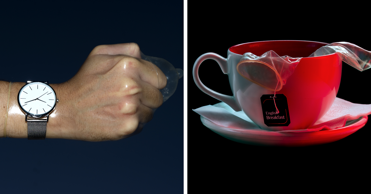
Note: This article discusses condoms as everyday design objects from a public-health, marketing, and cultural perspective. The focus is on gender, symbolism, packaging, and social behaviornot explicit content.
Some objects enter our lives quietly. A chair supports us. A toothbrush judges us before coffee. A shopping cart develops one wheel with a personal grudge. Then there are condoms: tiny, ordinary products carrying an absurd amount of cultural baggage for something sold beside cough drops and lip balm.
The title “Condoms And Culture: Exploring Gender In Everyday Objects (16 Pics)” sounds playful, but the topic is surprisingly deep. Everyday objects are never just objects. They are designed, packaged, named, priced, advertised, and placed on shelves by people who make assumptions about who will use them. Sometimes those assumptions are helpful. Sometimes they are lazy. Sometimes they are pink, blue, glittery, “for men,” “for women,” and somehow three dollars more expensive.
Condoms make a fascinating starting point because they sit at the intersection of health, responsibility, intimacy, gender norms, embarrassment, and branding. They are public-health tools, but they are also cultural symbols. They can represent care, confidence, anxiety, stigma, maturity, awkwardness, safety, or, depending on the packaging, a cologne commercial that got lost on its way to a motorcycle ad.
This article explores how condoms and other everyday objects reveal the way gender gets built into the world around ussometimes loudly, sometimes invisibly, and sometimes so unnecessarily that you want to ask a shampoo bottle, “Who hurt you?”
Why Everyday Objects Are Never Neutral
Design feels neutral when it works for you. A phone fits your hand. A seat belt sits correctly. A tool feels balanced. A public restroom has enough space, hooks, trash bins, and lighting. When those details fail, the object suddenly stops being invisible. It becomes a reminder that someone imagined a “default user,” and that default user may not be you.
Gender appears in products through color, size, shape, language, pricing, advertising, store placement, and even silence. A razor may be sold in dark gray packaging with words like “power,” “sport,” and “extreme,” while a nearly identical version is sold in pastel packaging with words like “smooth,” “soft,” and “silky.” The blade does not know your gender. It is a blade. It has one job. Yet the shelf performs a tiny theater production called Masculinity vs. Moisture Strip.
Condoms show this performance clearly. Many are still marketed with masculine-coded language: strength, conquest, control, endurance, performance. That framing can make protection feel like something one gender “provides” rather than something both partners value. It also reduces a health product to a personality test. Are you responsible? Are you embarrassed? Are you “man enough”? Are you “too prepared”? The object becomes social.
Condoms as Culture: A Small Package With a Big Message
At the simplest level, condoms are barrier devices used to reduce the risk of sexually transmitted infections and unintended pregnancy. That fact is straightforward. The culture around them is not.
For decades, condoms have carried gendered expectations. Men are often expected to buy them, carry them, and decide when they are used. Women and girls may be unfairly judged if they carry them, even though being prepared is a responsible health choice. Nonbinary people, LGBTQ+ people, and anyone outside traditional marketing categories are often treated as afterthoughts in packaging and public conversations.
This is where design matters. A product can quietly invite people in or quietly push them away. Packaging that screams “alpha victory fuel” may amuse one buyer and alienate another. A health aisle that hides condoms behind a counter may add shame to something that should be normal. Language that only says “male” and “female” may erase people who need accurate, inclusive information. Even the location of the product in a store can send a message: public health should not require a side quest.
The 16-Picture Lens: What Everyday Objects Reveal About Gender
A visual collection like “16 Pics” works because images make invisible rules visible. You can read a culture through its shelves. Below are sixteen everyday-object examples that show how gender sneaks into design, marketing, and public expectations.
-
Pic 1: Condoms With “Performance” Branding
When condom packaging borrows language from sports cars and energy drinks, it turns a health product into a masculinity badge. The message is not just “be safe.” It becomes “perform, dominate, prove.” That may sell, but it also narrows who feels addressed.
-
Pic 2: Pastel “For Her” Products
Many products aimed at women are softened with pink, lavender, flowers, and words like “gentle” or “delicate.” There is nothing wrong with liking pastel colors. The problem begins when softness becomes the only script offered.
-
Pic 3: Razors That Do the Same Job Differently Priced
Gendered razors are the classic museum exhibit of unnecessary difference. One promises battle-ready precision. The other promises satin clouds. Both remove hair. One may cost more because the market believes “for women” can be treated as a premium category.
-
Pic 4: Pens Marketed “For Women”
A pen does not require a gender identity to move across paper. Yet gendered pens have appeared with slimmer barrels, pastel colors, and branding that suggests regular pens were somehow bench-pressing too aggressively.
-
Pic 5: Toys Divided Into Blue Action and Pink Care
Children’s aisles often teach gender before children can spell it. Construction kits, science toys, dolls, kitchens, vehicles, and art supplies are sometimes divided by color and stereotype. That matters because toys help children imagine what they are allowed to become.
-
Pic 6: Toolkits Made “Cute” for Women
A hammer does not become more useful because it is pink. A drill does not become less intimidating because it has floral packaging. Gendered toolkits often assume women need tools to feel decorative before they can feel practical.
-
Pic 7: Deodorant With Opposite Personalities
Men’s deodorant often smells like “Arctic Thunder Mountain Engine.” Women’s deodorant often smells like “Morning Blossom Whisper.” Apparently, sweat has a screenplay. The language teaches people which emotions and environments are acceptable for them.
-
Pic 8: Shampoo Bottles That Divide Confidence by Gender
Men’s shampoo is often sold as efficient and no-nonsense: 3-in-1, 5-in-1, possibly 12-in-1 if it can also do taxes. Women’s shampoo is sold with beauty, repair, softness, shine, and perfection. The gender story is speed versus scrutiny.
-
Pic 9: Clothing Sizes That Make No Peace With Reality
Women’s clothing sizes can feel like a personality quiz designed by a haunted tape measure. Men’s sizing is often more measurement-based. The difference shows how even labels can reflect cultural pressure around bodies, appearance, and control.
-
Pic 10: Safety Gear Designed Around One Body Type
Work gloves, helmets, uniforms, and protective equipment have historically been designed around a default body. When gear does not fit, safety becomes unequal. Inclusive design is not politeness; it can be protection.
-
Pic 11: Smartphones That Assume a Large Hand
Big screens are useful, but devices designed around larger hands can become awkward for many users. A product can be “standard” and still exclude millions of people through something as ordinary as grip width.
-
Pic 12: Office Temperatures and the Invisible Default
Even thermostats can reflect assumptions. Many offices have long been calibrated around metabolic averages that do not fit everyone equally. The result is a workplace where one person is comfortable and another is typing inside a cardigan fortress.
-
Pic 13: Bags With Pockets Versus Clothes Without Them
Men’s clothing often contains useful pockets. Women’s clothing often contains decorative lies. The missing pocket is not just a fashion annoyance; it affects convenience, safety, and the need to buy additional accessories.
-
Pic 14: “Masculine” Food and “Feminine” Food
Advertising has often coded big portions, meat, spice, and black packaging as masculine, while yogurt, salads, and low-calorie snacks get coded feminine. Food becomes identity theater instead of, you know, lunch.
-
Pic 15: Beauty Products That Sell Anxiety
Many beauty products do not simply promise care; they sell correction. Wrinkles, pores, texture, hair, and aging become problems to manage. Gendered marketing often profits by making normal bodies feel like unfinished homework.
-
Pic 16: Condoms Placed Where People Feel Watched
Store layout matters. If condoms are locked up, hidden, or placed in a highly visible awkward corner, the design adds embarrassment. A responsible product should be easy to access without turning a pharmacy trip into a courtroom drama.
What Condoms Teach Us About Responsibility
One of the most important cultural questions around condoms is simple: who is expected to be responsible?
Old gender norms often frame condoms as a man’s item. That framing can make protection seem like one person’s duty and the other person’s negotiation. It can also create unfair judgments. A man carrying condoms may be praised as prepared. A woman carrying condoms may be judged by outdated standards. This double standard is not just unfair; it can discourage practical health behavior.
A healthier cultural message is shared responsibility. Condoms are not a symbol of mistrust, shame, or “bad behavior.” They are a normal health product. The same culture that accepts sunscreen, seat belts, bike helmets, and hand sanitizer should be able to accept protection without turning into a Victorian aunt clutching pearls in a grocery aisle.
Gendered Marketing: Helpful Shortcut or Lazy Stereotype?
Marketing teams love categories because categories make selling easier. The trouble is that gender is often used as a shortcut when better categories exist.
Instead of “for men” and “for women,” many products could be organized by size, function, scent, strength, fit, skin type, age range, lifestyle, budget, or design preference. A person buying deodorant may care more about sensitive skin than gender. A person buying a backpack may care more about laptop size and shoulder comfort than whether the tag whispers “rugged explorer” or “urban muse.”
Gendered marketing becomes harmful when it limits imagination. It tells boys not to nurture, girls not to build, men not to care about appearance, women to care too much, and everyone else that they do not fit the shelf. That is a lot of emotional labor for a deodorant display.
The Pink Tax Problem: When Gender Costs Money
The “pink tax” is not usually an actual tax. It is a term for the pattern in which products marketed toward women often cost more than comparable products marketed toward men. Examples may include razors, shampoo, clothing, personal care items, and even services.
This matters because the price difference is rarely announced honestly. The product may be nearly the same, but the branding creates a separate category. The shopper pays for gendered packaging, not necessarily better performance. Over time, these small differences can become a real financial burden.
Condoms add a different twist. Traditional external condoms have often been marketed toward men, while internal condoms and other sexual-health products can be less visible, less familiar, or more expensive. When one option dominates the shelf, it shapes what people think is normal, available, or socially acceptable.
Inclusive Design Is Not BoringIt Is Better
Some people hear “gender-neutral design” and imagine a beige world where every package looks like a government form. That is not the goal. Inclusive design does not mean removing personality. It means removing unnecessary exclusion.
A condom brand can be funny, stylish, bold, discreet, colorful, clinical, elegant, or playful without implying that responsibility belongs to one gender. A razor can be ergonomic without needing to announce a gender destiny. A toy can be exciting without telling a child which dreams are “for them.”
Better design asks better questions: Who is missing? Who might feel embarrassed? Who cannot use this safely? Who is paying more? Who is being stereotyped? Who is being treated as the default? Those questions do not ruin creativity. They sharpen it.
Why the “Everyday” Part Matters
Grand debates about gender often happen in politics, media, and universities. But everyday objects may shape behavior more quietly and consistently. A person may not read a policy paper about gender norms, but they will walk through a store, buy shampoo, choose a toy, sit in a car, use a phone, wear a uniform, and notice what the world assumes about them.
That is why condoms are such a useful cultural object. They remind us that health does not exist outside society. A condom is small, but the assumptions around it are huge. The product asks practical questions about safety, but culture adds questions about masculinity, femininity, shame, trust, and confidence.
When we improve the culture around everyday objects, we improve more than shelves. We make responsibility easier. We make choice broader. We make design smarter. And sometimes, blessedly, we make packaging less ridiculous.
Experience Section: What People Notice When They Start Looking
Once people begin noticing gender in everyday objects, they often cannot unsee it. A quick trip to the store becomes a scavenger hunt for strange assumptions. Suddenly the razor aisle looks like a divided kingdom: one side dark, metallic, and “extreme”; the other side pastel, floral, and suspiciously more expensive. The deodorant aisle smells like two different planets. One promises victory over mountains. The other promises a peaceful meadow where no human has ever had a stressful email.
Condoms can create an even stronger reaction because the product is tied to privacy and social judgment. Many people remember the awkwardness of buying them for the first time, even as adults. The product itself is ordinary, but the environment can make it feel dramatic. Bright lights, locked cases, long lines, and a cashier who suddenly seems like a judge on a reality show can turn a simple health decision into an emotional obstacle course.
Some people describe feeling proud when they choose to be prepared. Others describe feeling watched. Women may talk about the double standard of being responsible but not wanting to be judged for it. Men may talk about pressure to appear confident even when they are nervous or uninformed. LGBTQ+ shoppers may notice that packaging and education often assume heterosexual relationships. Nonbinary people may notice that product language rarely imagines them at all. These experiences are different, but they point to the same issue: design and culture can either reduce shame or add to it.
Everyday objects also reveal how early these lessons begin. A child may learn from toy aisles that building is for boys and caring is for girls. A teenager may learn from clothing that pockets are optional if you are expected to carry a purse. An adult may learn from office design that comfort was calculated around someone else’s body. These lessons are rarely announced. They accumulate quietly, like app updates for your worldview.
The encouraging part is that people can change how they respond. Shoppers can compare products by function instead of gender labels. Parents can choose toys based on curiosity and skill, not aisle color. Brands can design packaging that welcomes more people. Schools and health educators can talk about condoms as normal health tools rather than taboo objects. Retailers can place products in ways that respect privacy without creating shame.
One useful experience is to walk through a store and ask, “What is this product assuming about me?” Does it assume your body size, your income, your gender, your family role, your confidence, your fears, or your sense of style? Sometimes the answer is harmless. Sometimes it is hilarious. Sometimes it reveals a bias hiding in plain sight.
That is the real value of a topic like Condoms And Culture. It is not only about condoms. It is about learning to read the world more carefully. A shelf is not just a shelf. A package is not just a package. A price tag is not just a price tag. Everyday objects are tiny cultural documents, and some of them desperately need an editor.
Conclusion
Condoms and other everyday objects show how gender is built into ordinary life through design, language, price, access, and expectation. A condom can be a public-health tool, but culture can turn it into a symbol loaded with pressure. A razor can be a razor, but marketing can turn it into a gender performance. A toy can be a toy, but a shelf can turn it into a lesson about who gets to build, nurture, lead, or explore.
The solution is not to make every object dull or identical. The solution is to design with more imagination and fewer stereotypes. Products should be organized around real human needs: fit, function, safety, comfort, affordability, privacy, and choice. When brands, stores, educators, and consumers start asking better questions, everyday objects become less restrictive and more useful.
And honestly, that is good news for everyone. Nobody loses when condoms are treated as normal health products. Nobody loses when razors stop charging extra for pastel plastic. Nobody loses when toys invite all children to create, care, build, and explore. The only thing at risk is bad marketingand it had a suspiciously strong scent of “Arctic Thunder” anyway.