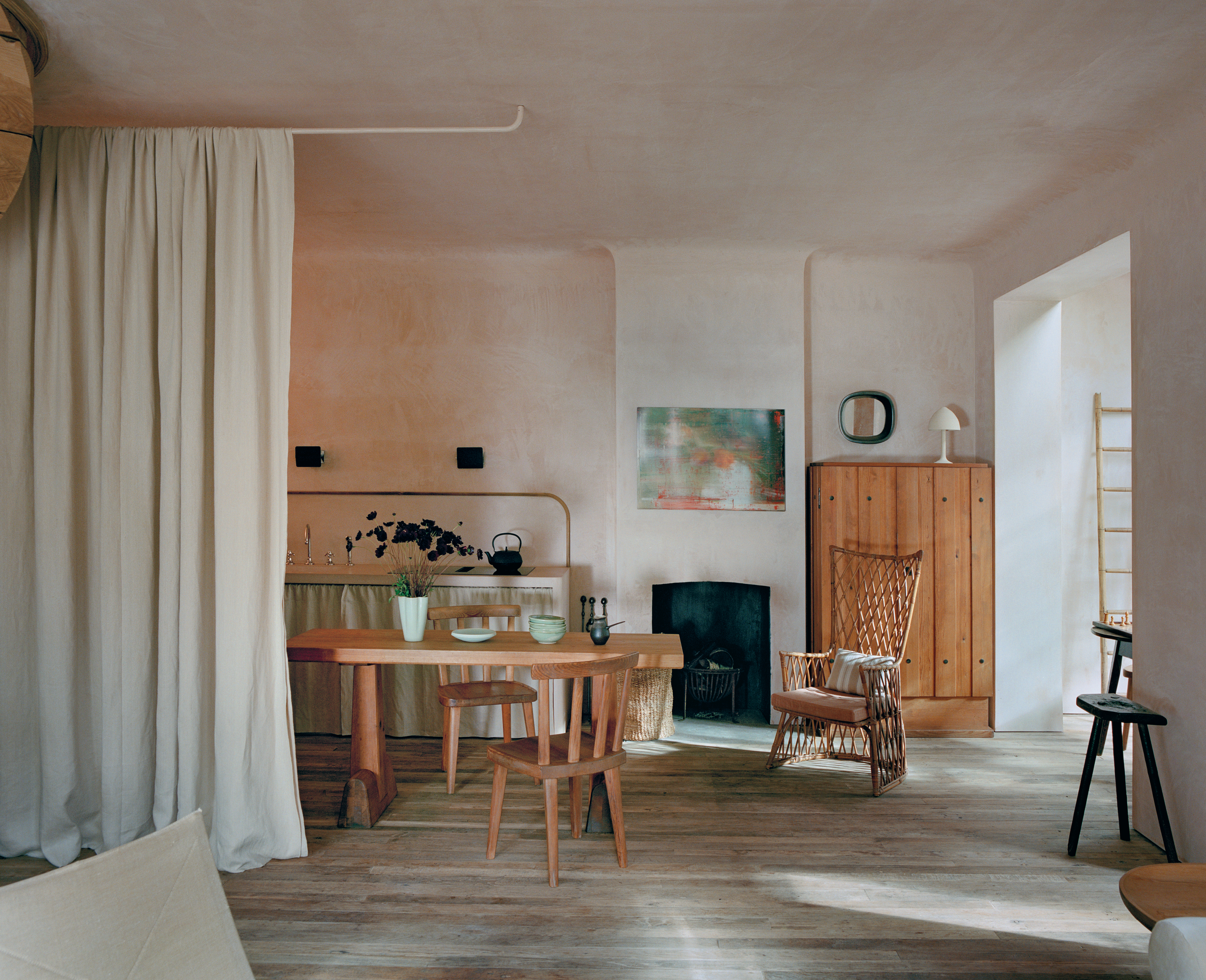
Some kitchens announce themselves with a marble waterfall island, eight pendant lights, and enough polished brass to signal passing aircraft. Rose Uniacke’s serene kitchen takes the opposite route. It whispers. Pale plaster, weathered wood, sculptural antiques, quiet lighting, and a curtain that can make the working zone disappear create a room that feels calm without becoming precious.
The kitchen and dining area in Uniacke’s 1860 Pimlico property in central London captures the designer’s signature balance of history and modern ease. Original-looking plaster surfaces meet discreet contemporary appliances; rare Swedish furniture shares space with humble rattan; and empty wall area is treated as a design material rather than a problem waiting for another shelf. The result is a lesson in restraint, not a shopping list. You do not need museum-grade furniture or a London townhouse to borrow the ideas. You need warm materials, useful antiques, edited storage, and the courage to leave a little breathing room.
Why the Rose Uniacke Kitchen Feels So Calm
Uniacke began as a furniture restorer and antiques dealer before becoming an interior designer, and that history is visible in the way she composes rooms. Instead of filling a blank shell with coordinated products, she lets architecture, age, and patina participate. Her work is known for pale hand-finished walls, unfinished or softly worn floors, Scandinavian furniture, and a selective mix of old and new. In this kitchen, serenity comes from relationships: rough beside refined, substantial beside delicate, and practical beside poetic.
Negative space does real work
The room is not empty, but it is edited. There is enough open wall and floor area for the eye to rest between the dining table, cabinet, artwork, and kitchen fittings. This is a useful correction to the modern habit of treating every wall as storage real estate. A calm kitchen still needs cupboards; it simply does not need every utensil auditioning for attention.
The palette is warm, not clinically white
The walls read as soft plaster pink, putty, and chalk rather than crisp builder white. These low-contrast tones catch daylight gently and flatter old wood, dark metal, and handmade ceramics. The effect is airy because the surfaces are light, yet cozy because the undertones are earthy. It is quiet luxury without the suspiciously untouched fruit bowl.
Age is allowed to show
Wood grain, rubbed edges, woven fibers, and irregular plaster keep the neutral palette from becoming flat. Patina supplies visual detail that printed patterns often provide in busier rooms. That is why an old pine table can carry an entire space while a brand-new neutral table may look as though it is waiting for a personality delivery.
The Defining Elements to Steal
1. Plaster-Like Walls With Subtle Movement
The original room is associated with natural plaster walls, and limewash is a practical way to suggest similar depth. Unlike a perfectly uniform paint film, a mineral-style finish creates soft tonal variation as light moves across it. For a convincing result, choose a warm off-white, faded blush, pale clay, or mushroom shade. Test a large sample because a color that looks beige on a chip can turn surprisingly peachy across an entire wall.
Historic plaster is worth repairing when possible rather than automatically covering it. In a newer home, the goal is not to fake cracks or stage an archaeological dig. Use a breathable mineral finish, Roman clay, or a matte paint applied with a broad brush in overlapping strokes. Keep trim close in color to the walls so the room reads as one continuous envelope.
2. A Curtain That Hides the Hardworking Kitchen
One of the room’s smartest ideas is custom drapery used to divide the kitchen zone. A full-height curtain softens architecture, filters sightlines, and can conceal preparation clutter when the dining area needs to feel composed. It is a gentler alternative to a permanent wall and a far more forgiving one when someone has abandoned a saucepan “to soak” for three business days.
To reproduce the effect, install a ceiling-mounted track and use generous yardage so the fabric looks substantial when closed. Linen, washed cotton, or a linen-cotton blend in vellum, oatmeal, or chalk works well. The hem should just meet the floor rather than hover awkwardly above it. Before installation, confirm that the fabric remains safely distant from burners, heat sources, and wet work areas.
3. A Sculptural Pine Dining Table
Uniacke selected an Axel Einar Hjorth Utö dining table, a pine design produced by Swedish department store Nordiska Kompaniet around 1932. Its appeal lies in blunt geometry, visible construction, and the warmth of solid pine. It looks important without looking delicate, which is exactly what a kitchen table should do when faced with elbows, homework, bread crumbs, and the occasional overly enthusiastic bottle opener.
An original is collectible and priced accordingly, but the design lesson is affordable: look for a thick solid-wood top, simple trestle or block legs, honest joinery, and a matte finish. Vintage farm tables, worktables, monastery tables, and restrained contemporary pine pieces can all create the same grounded center of gravity.
4. Mismatched Seating With a Common Language
The kitchen combines Swedish wood chairs with woven rattan seating. The pieces do not match literally, yet they relate through natural materials, modest scale, and handmade texture. This is how to mix antique kitchen chairs without making the room resemble the lost-and-found department of an estate sale.
Choose one connecting thread: similar wood tones, repeated woven seats, related back heights, or a shared rustic simplicity. Keep at least half the chairs visually quiet. A single rattan armchair or low woven chair can become the eccentric cousin at the table; six competing statement chairs will turn dinner into a furniture conference.
5. A Freestanding Cabinet Instead of a Wall of Built-Ins
A warm wooden cabinet adds storage while reading as furniture rather than kitchen infrastructure. This distinction matters. Freestanding pieces introduce depth, shadow, legs, hardware, and a sense that the room evolved over time.
Search for an antique linen press, pine cupboard, shallow armoire, apothecary cabinet, or vintage school cupboard. Check the interior depth carefully so dinner plates fit, and make sure the doors can open without colliding with the dining chairs or circulation paths.
6. Modern Appliances That Do Not Dominate
The room includes contemporary cooking technology, but the visual emphasis remains on materials and furniture. Follow that hierarchy by choosing integrated appliances, dark or low-sheen finishes, and simple controls. An induction cooktop can almost disappear into a counter, while a concealed hood or understated extraction system prevents the kitchen from looking like a restaurant line.
This is not an argument against high-performance appliances. It is an argument against allowing the refrigerator to become the largest decorative object in the home. Let technology work hard and pose less.
7. Lighting That Feels Collected
Vintage Charlotte Perriand CP1 wall sconces and a sculptural table lamp are among the reference points associated with the room. Their value is not merely pedigree; it is the way small pools of light create intimacy. A kitchen needs ambient, task, and accent lighting, but those layers do not have to come from a ceiling crowded with recessed cans.
Use discreet ceiling or under-shelf task lighting for food preparation, then add a directional wall sconce near the sink, a shaded lamp on a cabinet, or a pendant over the table. Dimmers are essential. At night, the room should be able to shift from “chop an onion safely” to “eat soup and forget the inbox exists.”
8. A Few Humble, Tactile Accessories
A cast-iron teapot, a pale fluted vase, handmade bowls, and simple glassware suit this look because they are useful and visually quiet. Avoid styling every surface. Group objects by function and leave air around them. A dark teapot against a pale wall carries more presence than twelve tiny accessories arranged with military precision.
How to Build a Rose Uniacke-Inspired Kitchen on a Realistic Budget
Start With Surfaces, Not Collectibles
Spend first on the backdrop: wall finish, floor, countertop, and cabinetry color. A $40 flea-market chair can look exceptional against a thoughtful plaster-like wall; a $4,000 chair cannot rescue icy lighting and shiny gray vinyl flooring. Warm, matte surfaces create the atmosphere before a single antique arrives.
Buy One Strong Antique, Then Pause
Choose one anchor piece such as a dining table, cupboard, or oversized chair. Live with it before adding more. Antiques need visual space, and a room gains credibility when objects appear collected over time. Shopping for everything in one weekend often produces a themed set, which is less “English designer” and more “period-drama restaurant near the freeway.”
Search by Material and Shape
Do not search only for famous names. Use phrases such as “solid pine trestle table,” “Swedish rustic chair,” “vintage rattan armchair,” “antique pine cupboard,” and “black metal wall sconce.” Local auctions, architectural salvage stores, estate sales, online marketplaces, and consignment shops can deliver the right visual language without collector-level prices.
Let Inexpensive Pieces Remain Simple
Budget substitutes work best when they are honest. A plain woven chair is more convincing than a heavily distressed reproduction pretending to have survived a century in Provence. Choose solid materials, straightforward construction, and finishes that will age naturally. Skip faux wormholes. Actual worms have never been considered a premium upgrade.
A Practical Design Plan, Step by Step
- Edit the room. Remove countertop appliances, extra wall decor, and unnecessary furniture temporarily. Photograph the cleared space so you can see its proportions.
- Choose the atmospheric color. Sample warm chalk, pale clay, plaster pink, and mushroom tones on several walls. Observe them in morning, afternoon, and evening light.
- Unify the hard finishes. Favor matte wood, honed stone, aged brass, blackened metal, and handmade tile. Limit highly glossy surfaces.
- Place the anchor table. Center it according to circulation, not merely the room’s geometry. Leave comfortable paths to the sink, refrigerator, and doors.
- Add storage as furniture. Introduce one freestanding cabinet before ordering another bank of built-ins.
- Mix seating carefully. Use a restrained family of wood and woven pieces, testing seat heights before buying.
- Layer the lighting. Provide bright task light where knives and heat are involved, then add warmer decorative sources on separate controls.
- Consider a curtain divider. Use it to screen storage, a scullery zone, laundry equipment, or an office kitchenette while preserving flexibility.
- Style only what earns its place. Display objects that are beautiful, useful, or emotionally meaningful. Ideally, two out of three.
Common Mistakes That Break the Serene Effect
Using cold white everywhere: Airy does not mean blue-white. Warm undertones make wood and antiques feel intentional rather than dingy.
Buying too many “old-looking” objects: A few authentic vintage pieces carry more authority than a room full of distressed reproductions.
Sacrificing task lighting: Moody lighting is lovely until you cannot distinguish parsley from your thumb. Hide practical light; do not eliminate it.
Ignoring scale: Heavy furniture needs enough room around it. In a small kitchen, use one robust piece and keep the remaining elements visually light.
Confusing calm with inconvenience: Store daily equipment near the point of use. Serenity disappears quickly when the coffee grinder lives three rooms away for aesthetic reasons.
What Living With This Look Actually Feels Like
The first noticeable experience is visual quiet. When walls, floors, and cabinetry sit within a narrow family of warm neutrals, your eye stops bouncing between high-contrast finishes. Morning light spreads across the plaster-like surface instead of reflecting sharply from glossy paint. The kitchen feels awake before it feels busy. Even a modest room can seem larger because fewer edges are loudly outlined.
The next change is behavioral. A substantial wood table invites activities that a pristine island sometimes discourages. People sit down. Mail is opened, vegetables are trimmed, laptops appear, and someone inevitably leaves a mug exactly where it will form a ring. That mark can be irritating on a flawless lacquered surface; on oiled or timeworn wood, it becomes part of maintenance and use. The room asks for care, but not reverence.
Antique and vintage furniture also changes the emotional temperature. A cupboard with old hinges or a chair with a repaired woven seat reminds you that useful things can survive imperfection. This tends to make a kitchen feel less like a showroom and more like a place with a past. The trade-off is practical: old drawers may stick, seats must be checked for looseness, and vintage tables are rarely level enough to satisfy a rolling marble. Felt pads, careful repairs, and a willingness to accept a slight wobble become part of the experience.
The curtain divider is surprisingly transformative in daily life. Open, it adds softness and movement. Closed, it can hide a sink full of dishes, reduce visual distraction during a meal, or separate work from rest in a multipurpose room. Fabric near a kitchen will collect dust and cooking residue, so washable material or professional cleaning access matters. The romantic sweep of linen is less romantic when it smells permanently of last Tuesday’s salmon.
Lighting determines whether the room remains serene after sunset. A shaded lamp on a cabinet makes dinner feel intimate, but it cannot replace focused illumination at the counter. The best experience comes from separate layers: bright task lights for cooking, low wall lights for circulation, and a warm lamp or pendant for atmosphere. Once the meal is served, turning off the work lights creates a small but meaningful ritual. The kitchen stops performing and begins relaxing.
Finally, living with this look requires ongoing editing. Pale rooms reveal clutter quickly, and open space only feels luxurious when it stays reasonably open. That does not mean maintaining monastic perfection. It means giving appliances a home, limiting decorative objects, and letting a bowl, branch, painting, or teapot stand alone.
Over time, the room becomes more personal as wood darkens, linen softens, and useful objects earn their place. That gradual improvement is the real appeal of Rose Uniacke’s approach: the kitchen is not finished on installation day. It becomes better through light, touch, repair, and ordinary life.
Final takeaway: To steal this serene and airy kitchen look, copy the principles rather than the price tags. Preserve character, choose warm natural materials, hide visual noise, mix one or two strong antiques with quiet modern function, and leave enough empty space for the room to breathe. Calm is not created by owning less personality. It is created by giving the right pieces enough room to speak.