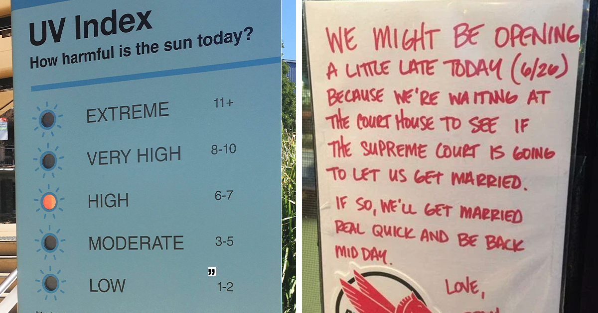
Some people collect stamps. Others collect vinyl. And then there’s the wildly underrated hobby of collecting signsthe kind that make you stop mid-step,
laugh out loud in public, and immediately reach for your camera like you’ve just discovered a rare bird that only appears near the condiment station.
Genius signs are the perfect mix of useful and hilarious: they solve a real problem (lost customers, confused visitors, chaos in the parking lot) while also
proving that at least one person in the building has a personality. They’re tiny works of public communicationpart design, part psychology, and part “we have
tried this the nice way and it did not work.”
Why We Can’t Resist Photographing a Great Sign
We document genius signs for the same reason we screenshot a perfect text message: it’s a moment of clarity in a noisy world. Great signage does three things
really well: it grabs attention, communicates fast, and sticks in your brain long enough to share.
Humor helps, toowhen it’s used wisely. Research on humor in messaging suggests it can increase attention and make messages feel more acceptable and persuasive,
especially when the topic isn’t heavy or sensitive. That’s basically the sweet spot for “Please don’t do that weird thing you keep doing.” When a sign makes us
smile, we’re more likely to remember (and obey) it.
But even when the sign isn’t trying to be funny, “genius” often comes from its precision: the right words, the right placement, and a layout
that doesn’t require a second read. In other words, the sign respects your timewhile still being a little dramatic.
What Makes a Sign “Genius” (Not Just Loud)
1) It delivers the message in under three seconds
The best signs are built for real life: people walking, juggling bags, half-reading, and thinking about lunch. Clear communication guidance often emphasizes
putting the main message up front, using plain language, and making the “what to do” obvious. Your sign isn’t a novel. It’s a helpful interruption.
2) It uses design like a shortcut for the brain
Strong contrast, readable typography, and simple icons aren’t just “nice.” They’re the difference between “Wow, that was helpful” and “I stared at it for six
seconds and still opened the wrong door.” Wayfinding best practices consistently point to visibility, consistency, and hierarchy: what matters most should look
most important.
3) It follows the rules when rules matter
Some signs are pure fun (like a witty chalkboard). Others are safety and accessibility-critical. In the U.S., safety signage standards and guidance commonly
rely on recognizable color meanings (danger/caution/safety), and ADA guidance covers tactile characters and braille placement and mounting heights. Traffic and
roadway signage follows detailed federal guidance for legibility (like letter sizing) and visibility.
4) It feels human without being confusing
A sign can be friendly without becoming vague. “Please” is nice. “PLEASE FOR THE LOVE OF EVERYONE’S SHOES, DON’T…” is funnybut only if the actual instruction
is still unmistakable.
50 Genius Signs People Had To Document
Below are 50 original, real-world-inspired examples of the kinds of signs people love to photographbecause they’re clever, oddly specific, or so perfectly
practical you can almost hear the backstory.
- At a café tip jar: “Tips: Because therapy is expensive.”
- On a door that looks like an exit: “Not an exit. Just vibes.”
- At a freshly mopped floor: “Caution: The floor is practicing being a mirror.”
- In a parking lot: “Park between the lines. It’s not interpretive dance.”
- By the trash can: “This is a bin. Your pocket is not.”
- At a library: “Whispering encouraged. Opinions… less so.”
- On a breakroom fridge: “If it’s not yours, don’t adopt it.”
- At an office printer: “This machine runs on paper and your patience.”
- Next to a light switch: “Please turn off. Darkness builds character.”
- On a “push/pull” door: “We labeled it because we believe in you.”
- At a bakery display: “Yes, it’s fresh. No, we won’t fight about it.”
- On a bathroom mirror: “Wash your hands like you just chopped jalapeños.”
- Near the hand sanitizer: “High-five later. Sanitize now.”
- At a gym: “Re-rack your weights. Future-you is watching.”
- At a dog park: “Leash rules apply. Your dog is not an exception.”
- At a hotel breakfast bar: “One waffle at a time. This is civilization.”
- At a quiet study room: “Silence: now available in this room.”
- On an elevator: “If we stop, remain calm. Dramatic sighing allowed.”
- At a spill station: “If you see it, you own it (until it’s clean).”
- At a store entrance: “No shirt, no shoes, no problems… for us.”
- On a narrow hallway: “Single file, like penguins with deadlines.”
- At a meeting room: “Leave the room as you found it: available.”
- At a charging station: “Charge your phone. Not your grudges.”
- On a plant: “Do not water. Yes, it looks thirsty. It’s plastic.”
- Near an overflowing donation box: “We’re full. We’re flattered. Please stop.”
- On a locked closet: “Authorized staff only. Curiosity is not authorization.”
- At a museum: “Do not touch. Your fingerprints are not part of the exhibit.”
- At a coffee station: “Cream and sugar are not a competitive sport.”
- On a squeaky door: “Yes, it squeaks. No, it’s not haunted.”
- At a checkout line: “Have payment ready. Your wallet hates surprises.”
- On a crowded bus stop: “Move in. The back is not lava.”
- At a community pool: “No running. Water is already excited.”
- On a thermostat: “Touching this won’t fix your problems.”
- In a shared kitchen: “Label your food. Mystery is for novels.”
- On a classroom door: “Late? Enter quietly like you’re in a spy movie.”
- At a recycling bin: “Recycle right. The planet is reading.”
- At a fancy restaurant restroom: “You look great. Now wash your hands.”
- At a hiking trailhead: “Take only photos. Leave only footprints. (Not trash.)”
- Near a slow computer: “Processing… just like all of us.”
- At an ice machine: “One scoop, not a snowstorm.”
- On a “wet paint” bench: “Sit if you want a souvenir.”
- At a front desk: “Ring bell once. More than once and it becomes a concert.”
- On a storage shelf: “If you move it, put it back. Chaos isn’t a system.”
- At a coworking space: “Phone calls: yes. Speakerphone: absolutely not.”
- Near a glass wall: “This is glass. It’s winning. Please stop walking into it.”
- At a drive-thru speaker: “Please speak clearly. We’re good, not psychic.”
- At a rental return: “Return items here. Regret elsewhere.”
- On a staff-only door: “Staff only. If you have to ask, you’re not staff.”
- At a queue divider: “Line starts here. Yes, here. That’s why the sign exists.”
- On a community bulletin board: “Take a flyer. Leave the staples. We beg you.”
The Secret Sauce Behind These Signs
Notice the pattern? The most “document-worthy” signs usually have:
one clear instruction, a specific reason, and just enough personality to feel like a real human wrote it.
They’re short because short works. They’re specific because vague signs get ignored. And they’re placed where the behavior happensbecause timing matters.
Steal These Sign Design Moves (Legally)
Use color with intention, not decoration
In safety contexts, color isn’t a vibeit’s a cue. U.S. safety standards and guidance commonly associate red with danger/stop and fire-related equipment,
yellow with caution, and green with safety. If your sign is warning someone about a real hazard, make sure it reads like one.
Make it accessible (and not just “technically”)
ADA guidance covers tactile characters and braille, including mounting height ranges that support tactile reading. Even if your sign isn’t required to be
tactile, you can still borrow the spirit: clear contrast, predictable placement, and easy-to-scan formatting.
Design for distance and speed
Roadway and guide signage standards emphasize legibilitylike minimum letter heights and visibility practices. You don’t need to build a highway sign for your
hallway, but the principle is gold: if people need to read it while moving, make it bigger and simpler than you think.
Write like a human who likes other humans
Plain language guidance is basically a cheat code for signage: use familiar words, keep sentences short, put the main message first, and make the action
obvious. Humor is optional. Clarity is not.
Where Genius Signs Shine in Real Life
Genius signs aren’t just internet contentthey’re practical tools in spaces where people get confused or rules get bent:
- Retail: returns, fitting rooms, “please don’t open sealed products,” and line flow.
- Offices: shared kitchens, meeting rooms, printers, noise boundaries, and thermostat wars.
- Schools: traffic flow, quiet zones, lab safety reminders, and “yes, you must sign in.”
- Parks & public spaces: trail etiquette, litter prevention, pet rules, and “nature is not a trash can.”
- Restaurants: pickup shelves, allergy notices, restrooms, and “please don’t move the tables.”
Common Mistakes That Turn Signs Into Background Noise
Too many words
If your sign has three paragraphs, it’s no longer a sign. It’s a hostage situation. Keep it to one idea, one action.
Passive voice and vague instructions
“This area should be kept clean” is a wish. “Please put trash in the bin” is a request someone can actually follow.
Sarcasm without clarity
Snark is fun until people miss the point. If humor is used, the instruction still needs to be crystal clear.
Ignoring accessibility and visibility
Low contrast, tiny type, and bad placement are basically the holy trinity of “why doesn’t anyone read the sign?” Design for real humans in real lighting.
of Relatable Sign-Spotting Experiences (Because You’ve Seen These People)
You know you’ve entered a new level of adulthood when you start appreciating signage the way you used to appreciate memes. Suddenly, you’re in a grocery store
and you feel genuine gratitude for a little laminated note that says “Line starts here.” Not because it’s fancybut because it prevents the ancient human ritual
of pretending not to know who was next.
If you’ve ever worked a job where the public interacts with… anything, you’ve watched the entire life cycle of a sign. It starts as optimism:
“Please close the door.” Then it becomes realism: “Please keep the door closed.” Then it becomes exhausted honesty: “KEEP. THE. DOOR. CLOSED.”
And finally, the comedic acceptance phase: “Close the door. The A/C is not trying to cool the whole neighborhood.”
The funniest part is how signs reveal what people do when they think nobody is watching. Somewhere, right now, a manager is printing a note that exists only
because someone tried to microwave aluminum foil. Somewhere else, an employee is taping “Do not remove this sign” directly under a sign that was removed three
times alreadylike a tiny office thriller with a recurring villain.
And then there are the signs that quietly narrate the drama of shared spaces. The breakroom fridge is basically a museum exhibit titled “We Live In A Society,”
featuring artifacts like an unmarked container of something formerly edible, a suspicious half-lemon, and a yogurt that expired during a past administration.
That’s why the best fridge signs are equal parts instruction and emotional support: “Please label your food” paired with “Mystery is for detective novels.”
You also start noticing how placement is half the battle. A “Please wash your hands” sign inside the restroom is expected. A “Please wash your hands” sign
outside the restroom, right next to the door handle everyone touches, is a sign written by someone who has seen too much and decided to become a hero.
The same goes for signs at the exact moment of temptation: “Please don’t sample the grapes” near the produce, “Return carts here” at the cart corral, and “No,
you cannot park here” on the patch of curb that somehow makes otherwise responsible people temporarily forget how laws work.
The best sign-spotting moment, though, is when you catch one that’s both helpful and strangely wholesome. A bookstore that says “Need a recommendation? Ask us!”
A park sign that reminds you to stay on the trailthen adds a line about protecting wildflowers. A café note that asks you to bus your table, but says thank you
like it actually means it. Those signs don’t just control behavior. They set a tone. They make a space feel like it’s run by humans, for humans.
So yes, keep photographing the genius signs. They’re funny, surebut they’re also tiny public service announcements that prove civilization is mostly held
together by tape, patience, and someone who finally said, “Fine. I’ll make a sign.”
Conclusion
Genius signs are small but powerful: they reduce confusion, prevent messes, keep people safe, and occasionally make strangers laugh in the same aisle. The best
ones respect how people actually move and thinkfast, distracted, and allergic to paragraphswhile still delivering a clear instruction at the exact right time.
If you’re making your own, remember: clarity first, personality second, and design always. Your future self (and your visitors) will thank you. Probably by
obeying the sign. And if you’re lucky, by documenting it.